Whitepaw Branding
Leigh Anne Dunbar
Published
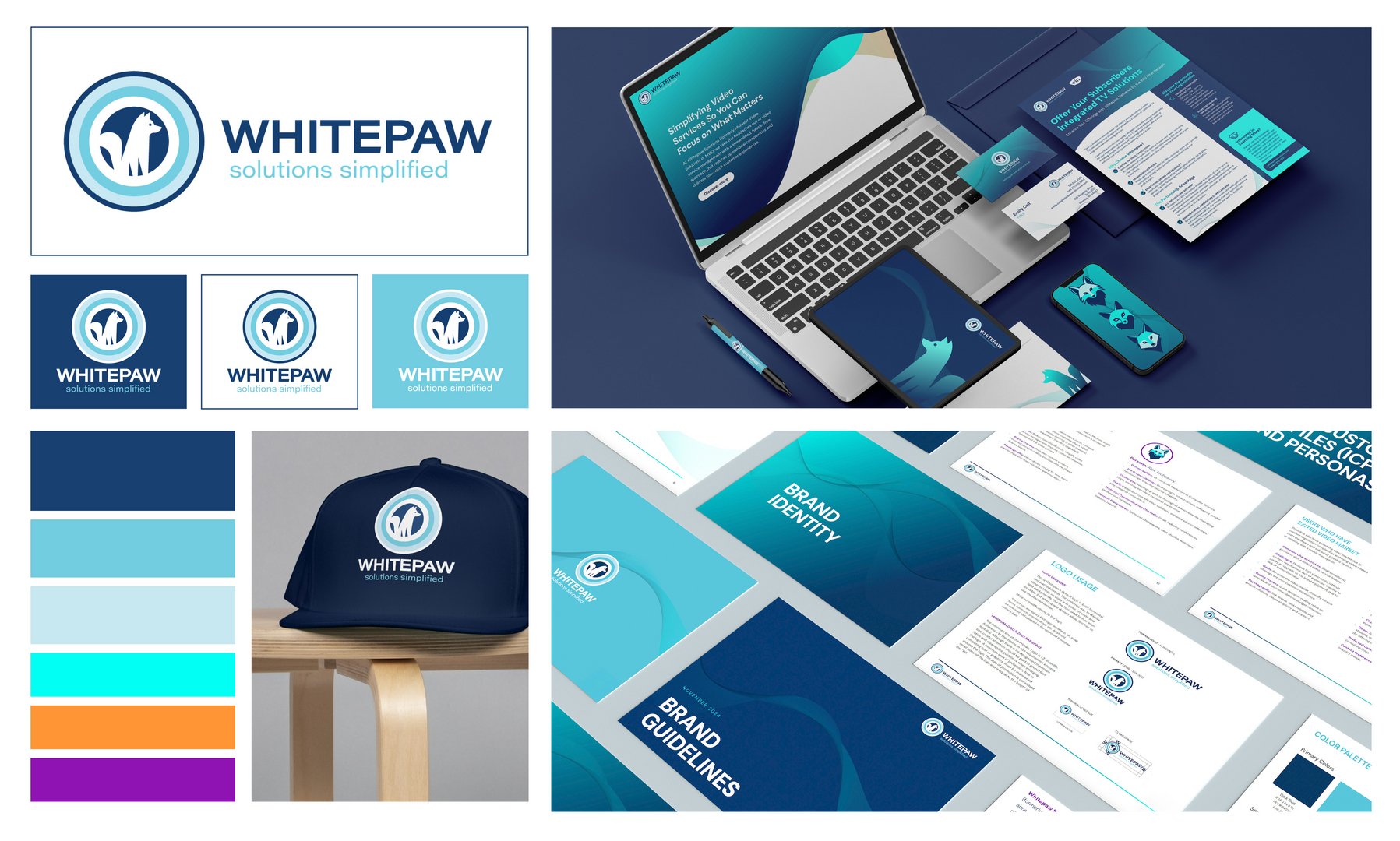
Recently, I led a full brand transformation for a client called Midwest Video Solutions, who were ready to move away from a dated, corporate identity and reinvent themselves as ‘Whitepaw Solutions.’ They wanted a brand that felt fun, modern, and distinct from competitors, and I was given creative ownership over the evolution of their visual identity. I introduced a fresh, energetic color palette with neon accents like blue and purple to add vibrancy, while grounding the core colors to avoid anything too trendy or short-lived. I also developed a set of consistent brand elements, including a stylized fox logo and a wave-inspired line motif, that could flex across digital and print touchpoints. The key was finding a balance: pushing the brand in a bold new direction while ensuring enough structure and cohesion so that every asset still felt unmistakably ‘Whitepaw.’ The client has been thrilled with how unified—and standout—their new brand feels. #branding #logo