Building a data-driven brand identity and charting library for a mobility company
Elena Etter
Published
A visual system built around one core
element, flexible enough to carry a brand
across every touchpoint and turn any dataset legible and immediately recognisable.
Challenge
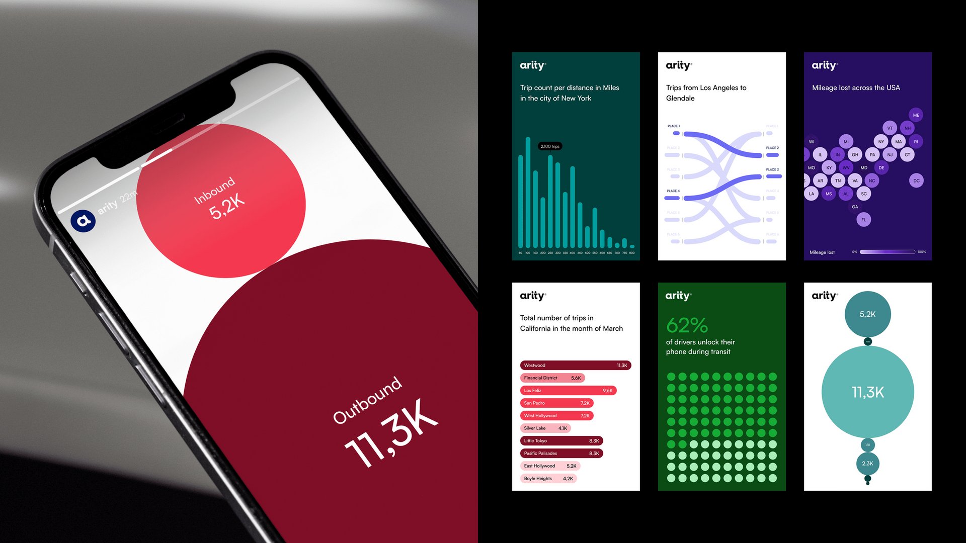
The brief called for a complete system, covering two distinct but connected needs. On one side, a visual identity built for brand: something dynamic, recognisable, and strong enough to attract attention and build character over time; and, on the other, a data design system that could stretch from the simplest chart to highly specialised data outputs, without losing consistency along the way.
Solution
We built the identity around a single core element: the ‘dot-dash’, a symbol that denotes data and movement. Framed within a parametric framework and a flexible motion system, it shifts comfortably between expressive storytelling and everyday functional use. The result is a system that stays coherent without feeling rigid, and gives data a visual language that’s distinct enough to own.