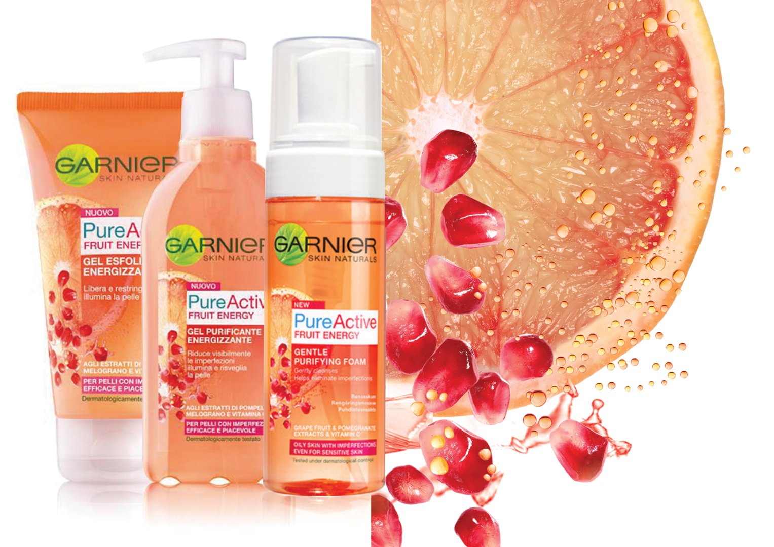
Pure active ranges by Garnier
Elodie Nerot
Published
Garnier Skincare visual system
Revamp the Garnier Face Mask boxes to better express ingredient science and efficacy for the Asian market, a region where consumers value both visible results and natural authenticity.
Adaptation of Garnier’s new identity for the European market through the Pure Active Fruit Energy range.
Created key visuals for Grapefruit and Pomegranate SKUs, combining dynamic composition and ingredient storytelling. Art-directed photoshoot to achieve a fresh, sensorial aesthetic aligned with the new Garnier identity.
This new packaging visual system elevated Garnier’s perception across Asia and became the foundation for the brand’s global packaging system. Today, this design chart defines how Garnier brand visually expresses efficacy and care — scientific yet sensorial, structured yet human.
https://www.twine.net/signin
#graphicdesigner #branding #designer