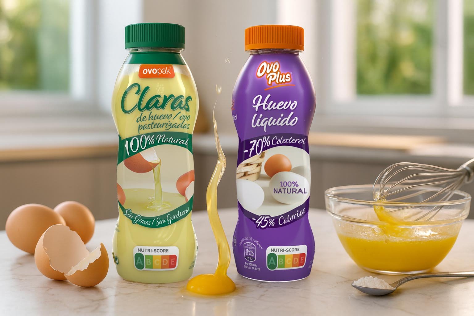
Packaging design for Ovoplus
Esaú Pintor Martín
Published
0
In this project of packaging design for the brand Ovoplus, we developed two products: egg whites and liquid egg. Our goal was to establish a common visual architecture that would allow the range to be quickly identified while reinforcing brand consistency on the shelf. To achieve this, we used a purple background as the base, creating an attractive contrast with Ovoplus’ corporate orange. This combination enhances product visibility while maintaining a strong link to the brand’s identity. The result is a packaging design that is modern, consistent, and functional.