FUTR — Strategic Rebrand & Visual System
Fabian Flores
Published
The brief
Future Digital Consult was evolving into FUTR, a sharper and more forward-looking identity for a Poland-based technology and digital innovation company. The rebrand needed to feel premium, bold, and contemporary while avoiding the predictable visual conventions often associated with technology brands.
What I created
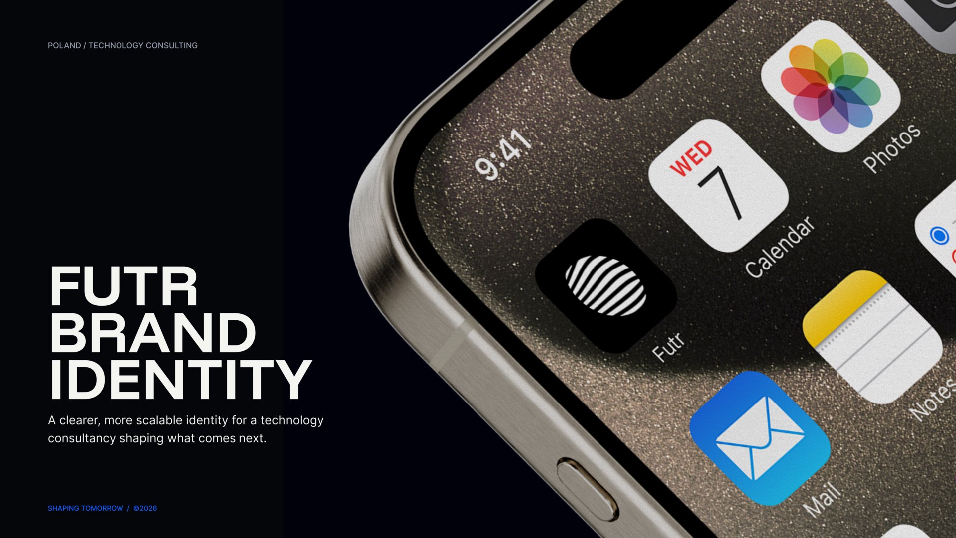
My role covered creative direction, brand strategy, and visual identity. The new system was built around the FUTR wordmark and a fluid globe symbol representing connection, movement, and a global digital perspective.
I developed a high-contrast color system combining Obsidian and Future White with Electric Blue, Digital Cyan, and Signal Violet. Space Grotesk and Inter established a clear typographic hierarchy, while the “Shaping Tomorrow” message gave the identity a concise and future-facing narrative.
The system was extended across website direction, digital touchpoints, and corporate communication, creating a consistent visual language that could adapt across different formats.
The outcome
The resulting rebrand gives FUTR a more focused, recognizable, and digitally relevant presence. Its visual system provides a flexible foundation for communicating innovation, strategic thinking, and global ambition without relying on generic technology aesthetics.
Role: Creative Direction, Brand Strategy, Visual Identity
Industry: Technology / Software & Internet / Digital Innovation
Deliverables: Rebrand strategy, logo system, globe symbol, color system, typography, messaging, website direction, and digital applications