Nuna Nina Apartments - Logo Design
Gabriela Pranjić
Published
The Challenge
Nuna Nina had a name worth keeping, but its old logo belonged to a different chapter.
The previous identity used bubble letters, a bed icon and a sky full of stars. It clearly said “apartments”, but very little about the people now running them. When Marija and her husband took over the business, the goal was not to start from zero. The name already had recognition. It simply needed a new face that matched where Nuna Nina was going.
The challenge was finding the sweet spot between feeling like home and feeling professional enough to trust with your stay. Warm, but not overly cosy. Refined, but not cold.
What I Did
The whole identity started with something hiding in plain sight: the name itself.
In this part of Croatia, “nuna” is what you whisper while rocking someone to sleep. Nuna Nina already sounded like a lullaby, so instead of adding another obvious hospitality symbol, I built the visual identity around that feeling.
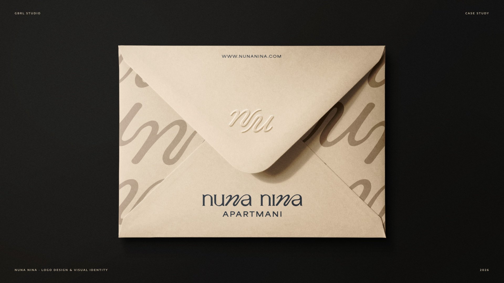
I redesigned the wordmark using a soft curve inspired by the movement of a cradle. The curve appears in both words, giving the name a gentle rhythm, while the rest of the letterforms stay structured and calm. Lowercase typography keeps the identity familiar and approachable, while “APARTMANI” in widely spaced capitals brings clarity and balance.
From there, I developed the complete logo family, including horizontal, stacked and monogram versions, so the identity could work across everything from web headers and signage to social profiles, key cards and property markings.
The colour palette follows the same idea: warm white, beige, golden brown and anthracite. Soft, calm and familiar, like fresh linen, morning light and warm wood.
The Result
The result is a visual identity that feels like Nuna Nina sounds.
Instead of telling guests what an apartment should feel like through predictable hospitality symbols, the identity creates that feeling through typography, rhythm, colour and restraint.
It feels warm enough to feel like home, but steady enough to trust with your stay.
A name that already sounded like a lullaby now finally looks like one too.
Check out on Behance: