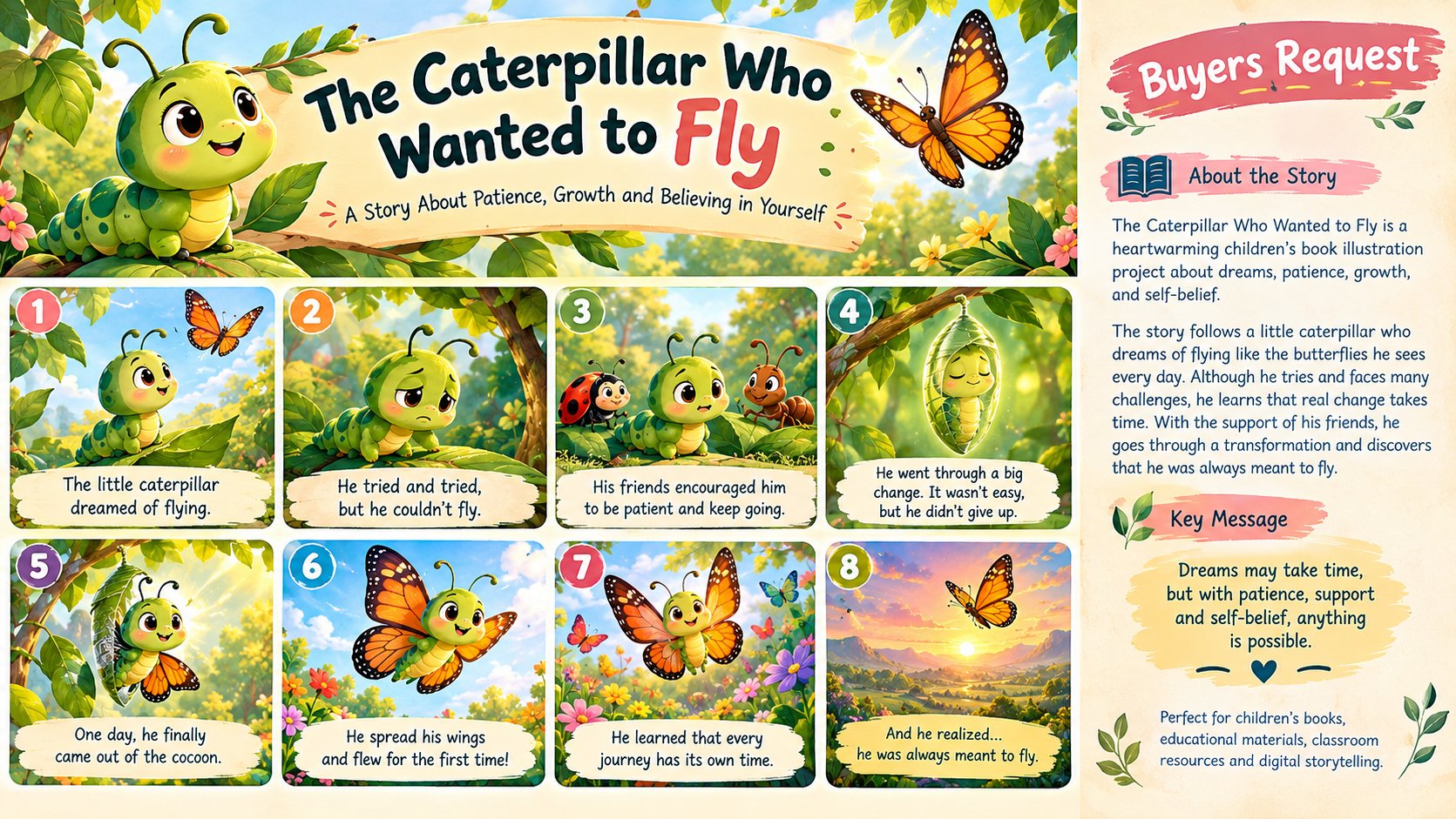
Title: The Caterpillar Who Wanted to Fly — Children’s Book Illustration
Glory
Published
The Caterpillar Who Wanted to Fly is a colorful and heartwarming children’s book illustration project created to tell a simple story about dreams, patience, courage, and believing in yourself. The visual concept follows a small caterpillar who dreams of flying like the beautiful butterflies it sees around the garden. Although the caterpillar feels different and sometimes becomes discouraged, it continues to believe that something wonderful is possible.
The illustrations are designed with a warm, playful, and expressive children’s-book style. Bright colors, friendly characters, soft environments, and engaging facial expressions help make the story approachable for young readers while creating an imaginative world that encourages curiosity. Each scene is carefully arranged to move the story forward and help children understand the character’s emotions without relying only on written words.
The project combines character design, storytelling, environmental illustration, page composition, and children’s book layout. The caterpillar is designed as the main character with a recognizable personality and expressive appearance, allowing readers to connect with its journey. Supporting elements such as flowers, leaves, trees, butterflies, sunlight, and garden scenery create a cheerful environment that complements the story.
The visual storytelling focuses on the caterpillar’s transformation from feeling uncertain about its abilities to discovering its own potential. The progression of the illustrations is intended to create a sense of anticipation and emotional connection, making the final transformation feel meaningful and rewarding.
For the portfolio presentation, the artwork can be adapted into book-cover designs, interior story pages, character scenes, educational storytelling graphics, and realistic book mock-ups. The layout is designed to demonstrate how an illustration can work across different parts of a complete children’s publishing project rather than functioning as a single standalone image.
The color direction uses a bright, friendly palette suitable for children while maintaining enough contrast for important characters and storytelling elements to remain clear.
Typography and visual hierarchy are kept simple and readable so the illustrations remain the main focus.
This project demonstrates my ability to develop illustrations that are not only visually attractive but also support a complete narrative. From the initial character concept to the final page composition, every element is considered with the reader and story in mind.