HeartRadiance | Brand Strategy, Brand Design, Packaging Design
Laura Richter
Published
HeartRadiance is the long established home of handmade flower essences designed to balance body, mind and spirit through vibrational medicine. Created by hand in Mt Nebo, the brand features a huge range of pure floral essences alongside considered blends and innovative room sprays.
The Challenge
Initially looking to rework some existing label designs, this project became a full rebrand and redirection for the family-owned HeartRadiance team. After years of thinking small with outdated visuals and packaging, this rebrand saw a confident relaunch of the company inline with their industry credibility and to help build traction for future goals of educational content.
The Solution
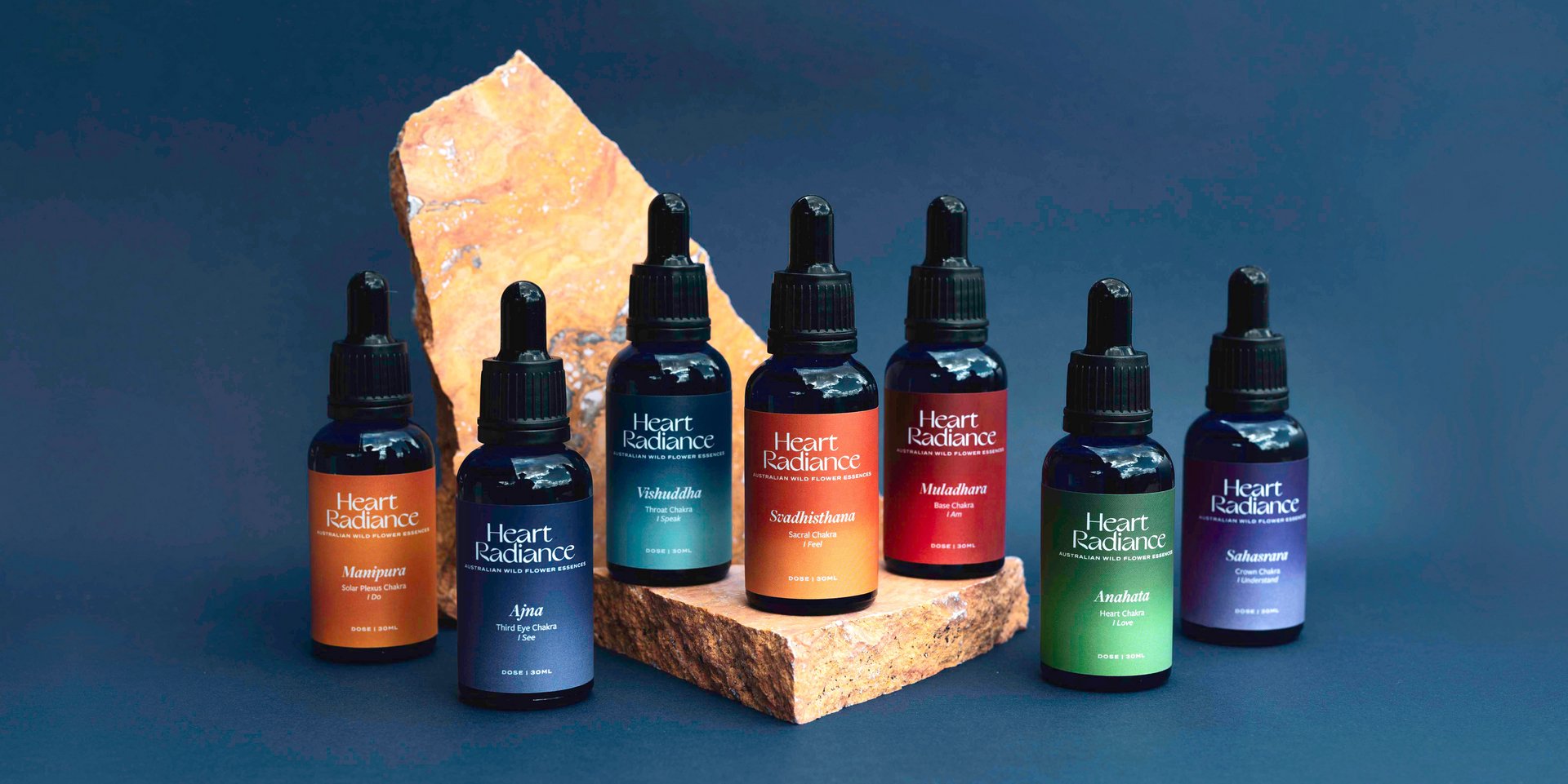
The elegant logotype and flower-inspired icon were developed to better connect with those who may be new to flower essences- they feel contemporary and sophisticated inline with other high-end wellness products. Grainy and directional gradients form the most striking parts of the brand identity and capture the vibrational energy that is at the core of HeartRadiance’s product range and values. With some packaging outcomes being particularly tiny, the intense label hierarchy system meant there was consistency across the range even with content needing to change between product lines.
See the full project-https://www.twine.net/signin