Parallel | Brand Strategy, Brand Identity, Packaging Design, Shopify Design
Laura Richter
Published
Located in Auckland (New Zealand), Parallel is a bookstore, coffee house and community space celebrating a love of speculative fiction and the hopeful optimism that comes with it. Inclusivity is at the core of the brand through diverse events and experiences as well as thoughtful genre curation that highlights authors of LGBTQIA+, indigenous, neurodivergent and disabled backgrounds.
The Challenge
Launching as a brand new business, Parallel needed a distinctive look and feel to stand apart from established online and in-person bookstores. With the speculative fiction genre traditionally being seen as nerdy and for ‘certain kinds of people’, it was essential that the brand felt welcoming and open to new audiences so as to help build community. Inline with the brand values, accessibility and inclusivity needed to be at the heart of all decision making with the brand identity required to balance a more minimal, clean interior aesthetic.
The Solution
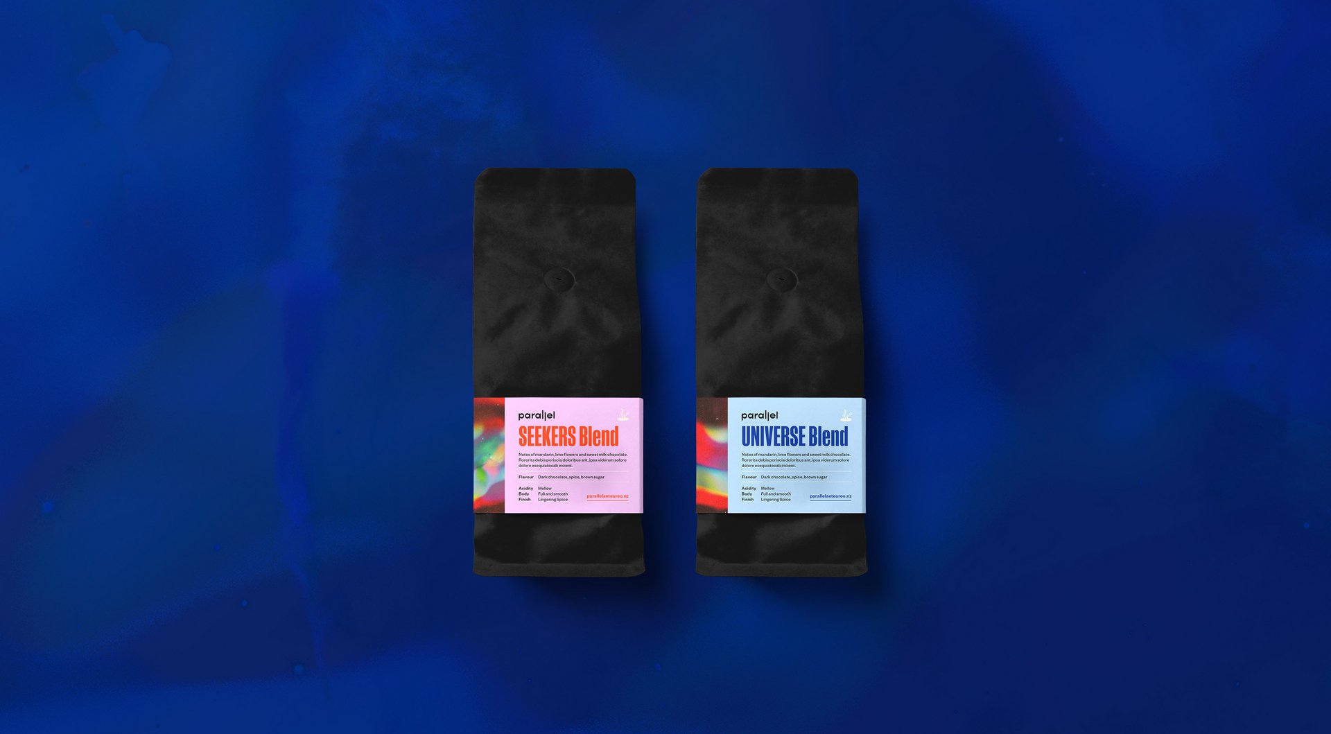
Communicating the joyful, fun perspective of the genre was the most important element of the brand visuals so a vibrant, primary-colour leading palette was a non-negotiable. A simple logotype with quirky proportions (and use of parallel lines) was the perfect minimal accompaniment to the brand icon- a set of legs showing a person falling into an alternative universe. Textured gradients overlay with NASA space photography to create supporting brand textures that balance the clean colour palette with a more traditional sci-fi aesthetic. Brand touchpoints exhibit bold and confident typography that is set in Manuka and Founders Grotesk- typefaces that were designed in New Zealand by Klim Type Foundry.
See the full project: https://www.twine.net/signin