Acryl Primer Advanced - Packaging Design
Mariia Chepliaka
Published
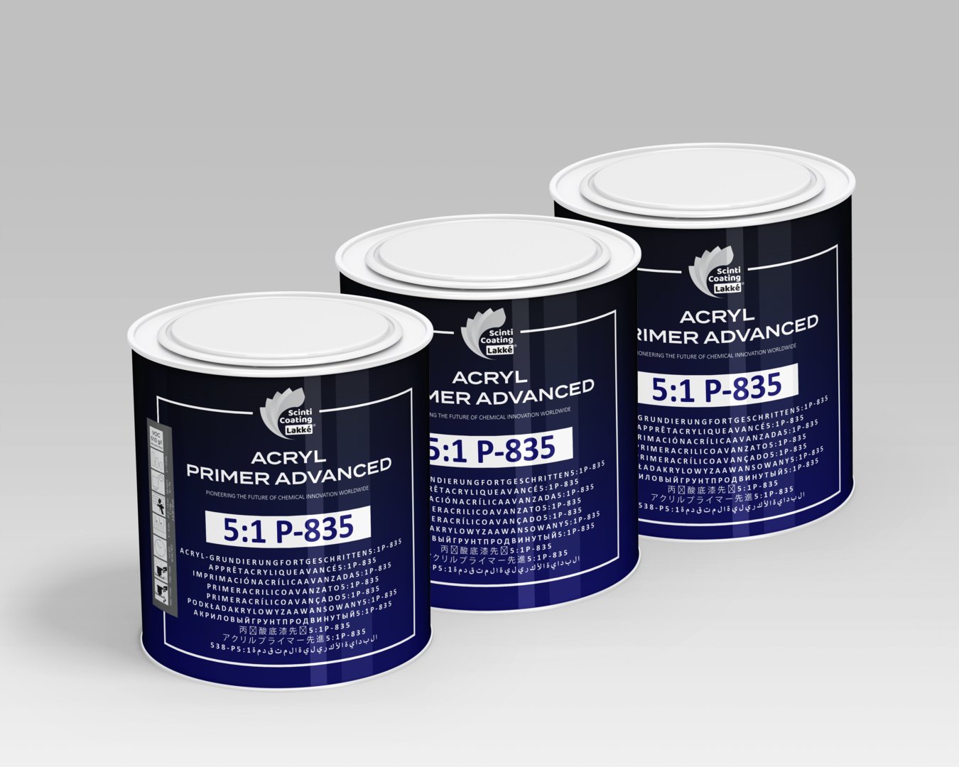
This project involved creating a packaging and label design for “Acryl Primer Advanced,” a high-performance industrial coating.
The Challenge:
The primary challenge here was information density. The label needed to clearly display a large volume of critical, technical information:
Product Name & Model (P-835)
The key 5:1 mixing ratio
Detailed application instructions
Extensive multi-language safety warnings
All of this had to be presented in a way that was clean, perfectly legible, and communicated professionalism and reliability.
My Solution:
I designed a strong, grid-based layout that creates a clear visual hierarchy. By using bold, clean typography and a simple, high-contrast color palette, the design guides the user’s eye.
The most important information (the product name and ratio) is visible at a glance, while the secondary text is neatly structured and easy to read. This “no-nonsense” approach builds customer trust by reinforcing the product’s high-quality, technical nature.
#packagingdesign
#labeldesign
#branding
#graphicdesign
#industrialdesign
#typography