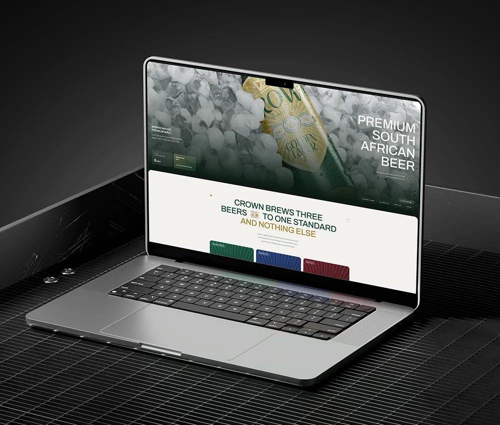
Crown Brewing Co.: Heritage Rebrand, Packaging & Website
Matthew
Published
The brief: A South African brewery had fifty years of a much-loved mark, the original 1977 crest, but no rules for using it. They needed a system that could run as smoothly as their brewing operation, without changing what customers already recognise on the shelf.
What I made: Brand identity and a 20-slide brand guidelines book, packaging for a three-beer range (Golden Lager, Blonde Ale and Pale Ale) built so a fourth beer can join on one new colour field without a redraw, a responsive website for desktop and mobile, and a social media launch set.
The result: One consistent brand across pack, site and feed. New artwork now takes days instead of weeks.
“We had fifty years of the mark and no rules for it. Spaark wrote the rules without changing a thing on the shelf.” - Johan Bekker, Managing Director, Crown Brewing Co.
![Crown primary logo](https://www.twine.net/signin
![Crown Royal Batch packaging](https://www.twine.net/signin
![Crown website home](https://www.twine.net/signin
![Crown brand history](https://www.twine.net/signin
![Crown brand vision](https://www.twine.net/signin
![Crown website on mobile](https://www.twine.net/signin
![Crown Beer of the Year social post](https://www.twine.net/signin
Full case study: https://www.twine.net/signin