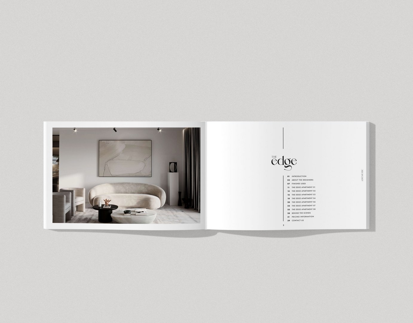
Edge Apartments Branding
Penelope Cooras
Published
0
Logo Design & branding for Edge Apartments.
When conceptualising a name & design for the apartments, I factored in the following:
- The contemporary architectural exterior of the building
- The luxurious soft colours and organic shaped furniture used internally
- The juxtaposition between the two (organic vs structural)
With these points in mind, I chose the following name :
THE EDGE.
Sticking with the concept of juxtaposition & contrast, I designed the logo for ‘The Edge’ in a rounded lowercase contemporary style, paying tribute to the organic and natural flowing interior, whilst the name itself correlates with the exterior’s prominent features, being ‘edgy’ and block like. #graphicdesigner #designer #logo #branding #brochure #website