Evergreen Field Notes: Publisher Brand Identity, Book Cover and Botanical Illustration
Abdul Qobid
Published
0
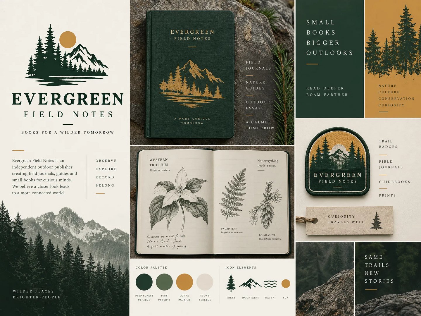
What does an outdoor publisher look like before it prints a single page? This concept answers that: a forest green and ochre identity for Evergreen Field Notes, an independent publisher of field journals, nature guides, and outdoor essays.
The brand starts with a mountain and pines emblem and grows into everything a book brand needs. I designed a gold foil hardcover journal, hand drawn style botanical pages (trillium, sword fern, and Douglas-fir), an embroidered trail patch, a hang tag, and a color palette and icon set that keep every piece consistent.
Inside the system:
- Logo and emblem with the tagline “Books for a wilder tomorrow”
- Journal cover design with gold detailing
Interior page spread with botanical illustrations and handwritten notes - Patch, tag, and brand statement panels
- Four color palette and icon elements (trees, mountains, water, sun)
- Created as a concept to show how I connect illustration, cover design, and branding for authors and small publishers.
Publishing a nature book, a journal, or a series that needs a cohesive look? Send me your idea and I’ll reply with a free sketch.