Dorset Council
Rain Lyall
Published
CHALLENGE
Dorset Council and the broader region required a unifying
place brand that could represent growth, aspiration, and
long-term opportunity – not simply a geographic marker.
APPROACH
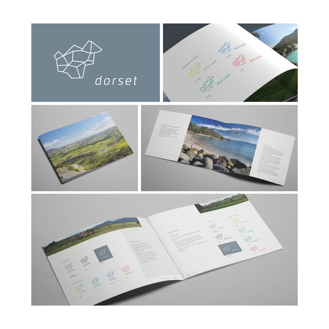
I designed the Dorset Region brand mark, initially
inspired by the physical shape of the region and its major
connecting roads. This evolved into the Facets of Dorset
device – an abstract system designed to unfold from the
region’s form.
The device was intentionally conceived to function like
origami – allowing it to transform into a wide range
of objects and shapes across marketing, reinforcing
possibility and momentum.
I also helped develop the tagline it’s in the making,
which speaks to Dorset as a place of becoming – where
people build homes, raise families, grow businesses, and
leave legacies.
OUTCOME
The resulting identity is flexible, future-focused, and
distinctly regional. I delivered the logo, visual system, and
brand style guide to support consistent rollout and longterm
use across council and regional communications.