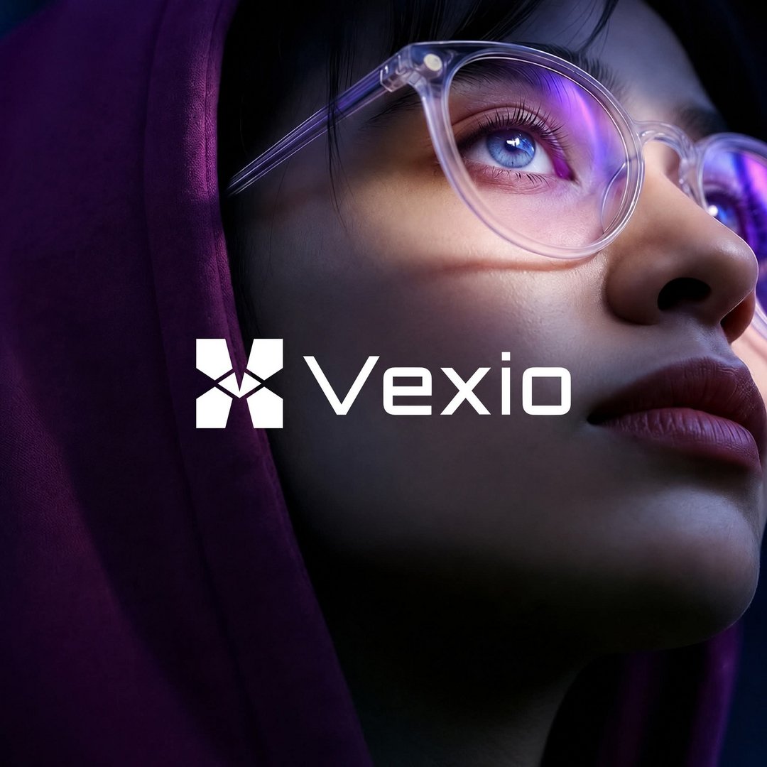
Vexio — Software & Technology Brand Identity
Mohamed Raza
Published
Vexio is a software and technology brand created to represent the connection between people, ideas, and intelligent digital solutions.
The visual identity follows a minimal and futuristic direction, combining a geometric symbol with a custom-feeling wordmark. The result is a flexible identity designed to communicate innovation while remaining simple, professional, and recognizable across digital environments.
The visual language uses a technology-inspired aesthetic with deep tones, vibrant purple highlights, and clean compositions to establish Vexio as a contemporary software brand.
Logo concept
Built for Connection. Designed for the Future.
The Vexio symbol is constructed from geometric forms that come together around a central point. This visual structure represents connection, integration, collaboration, and multiple technologies working as one system.
Its symmetrical construction gives the mark a sense of stability, while the angular geometry introduces a modern and technology-focused personality.
Paired with the Vexio wordmark, the symbol creates a distinctive identity that can work independently as an app icon, software icon, favicon, social avatar, or digital brand mark.
Brand concept statement
Connecting ideas. Building digital possibilities.
Vexio represents technology that brings different elements together to create smarter, simpler, and more connected digital experiences.
Visual direction
The Vexio visual system combines futuristic typography, geometric forms, dark environments, and vibrant purple/blue lighting to create a sophisticated technology aesthetic.
The direction is designed to feel modern without becoming overly complex, allowing the identity to remain recognizable across websites, software interfaces, applications, social media, presentations, and other digital touchpoints.