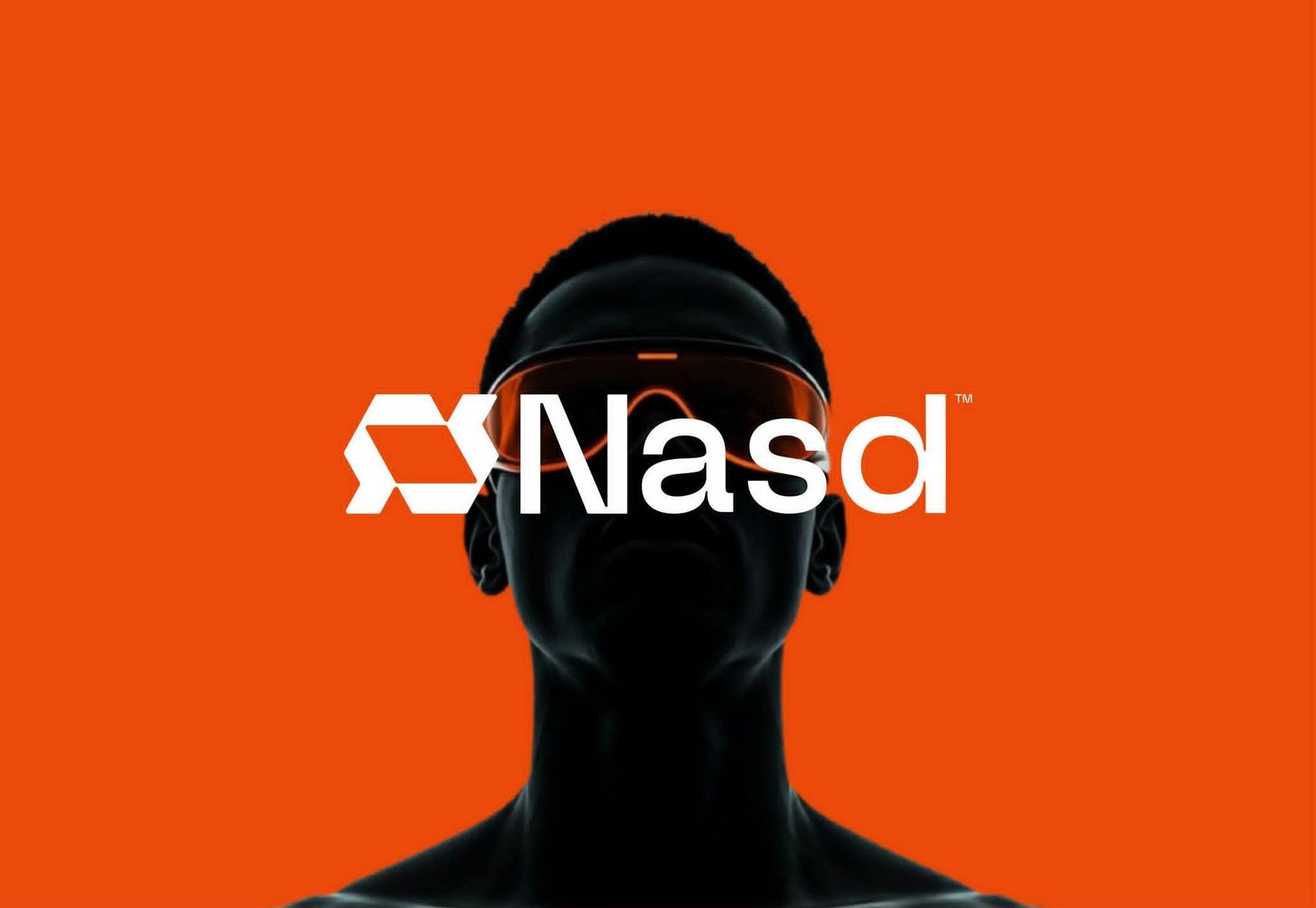
NASD — Technology Brand Identity & Logo Design
Mohamed Raza
Published
NASD is a technology company based in the United Kingdom. The objective of the project was to develop a visual identity that feels modern, innovative and adaptable to an evolving digital landscape.
The identity takes a minimal yet bold approach, combining a geometric brand mark with clean typography and a highly recognizable colour palette.
The result is a flexible identity designed to perform consistently across digital products, websites, applications, social media, presentations and corporate communications.
Logo Concept
Connected Technology. Continuous Progress.
The NASD symbol is built from interconnected geometric forms that create a continuous visual flow.
The concept represents connection, integration, movement and digital transformation — communicating the idea of different technologies working together within one connected ecosystem.
The angular construction introduces a sense of speed and precision, while the continuous structure reinforces reliability and progression.
Logo Mark
The standalone NASD symbol was designed to remain recognizable at different scales.
Its compact geometric structure allows it to function effectively as an app icon, favicon, social media avatar, software icon and digital brand mark, giving the identity flexibility beyond the primary logo.
Colour Direction
Electric Orange • Black • White
Orange brings energy, innovation and momentum to the identity, while black establishes a strong technological foundation. White provides clarity and contrast, creating a simple visual system that works particularly well across digital applications.
Typography
The typography follows the same philosophy as the symbol: clean, modern and technology-driven.
Its minimal construction balances the stronger geometry of the brand mark, allowing NASD to maintain a professional identity without losing its futuristic character.
Brand Personality
Innovative • Connected • Progressive • Bold • Precise • Digital • Modern • Future-Focused
Brand Message
Technology Built to Move Forward.
Alternative tagline:
Connecting Ideas. Powering Progress.
Or a more minimal tech-style option:
Connect. Build. Evolve.