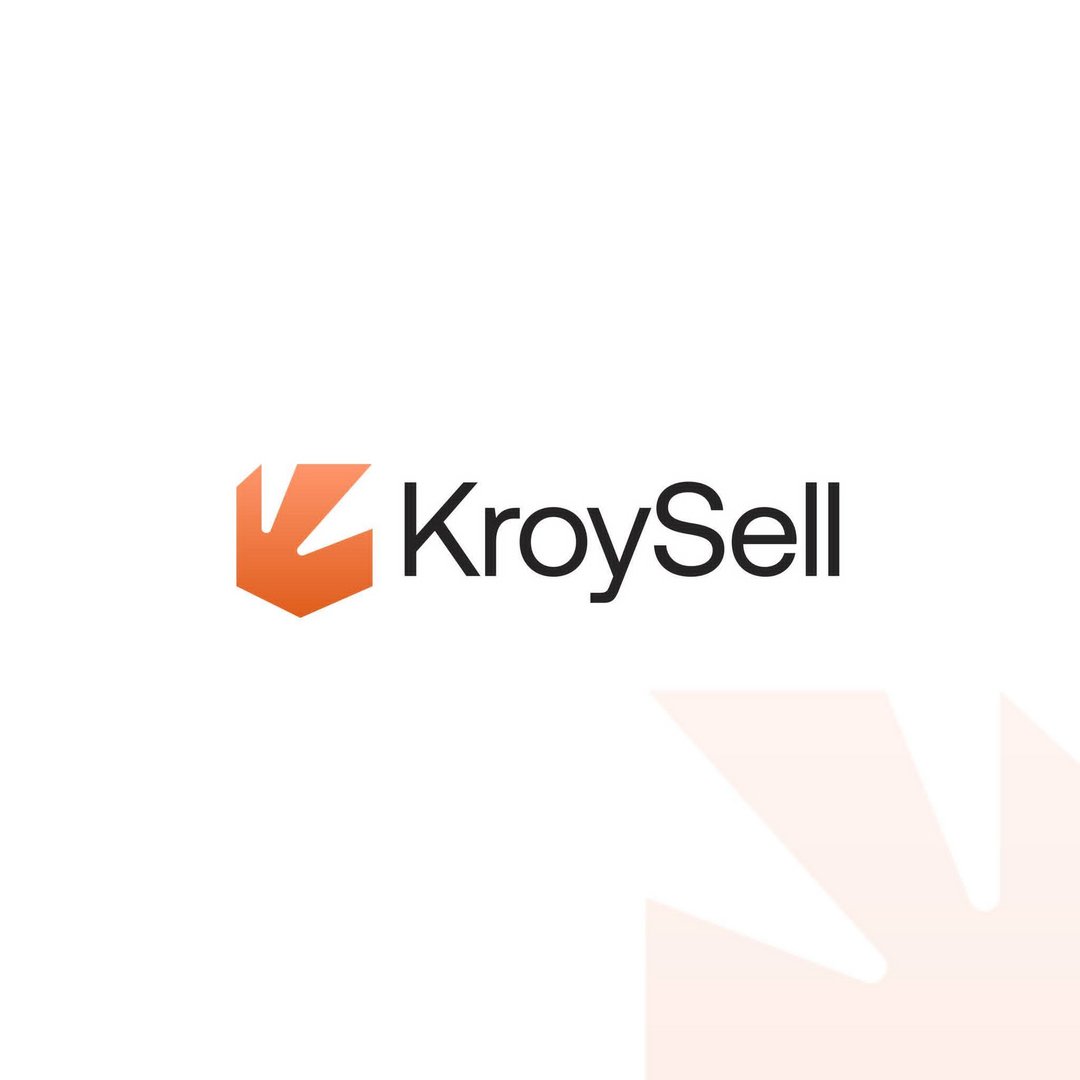
KroySell — Automotive Marketplace Brand Identity
Mohamed Raza
Published
KroySell is an online automotive marketplace created to connect car buyers and sellers through a simple digital experience.
The objective of the identity was to establish a brand that feels modern, approachable, reliable, and technology-driven, while retaining the energy and movement associated with the automotive industry.
The resulting visual system combines a bold geometric mark with minimal typography and a vibrant orange colour direction, allowing KroySell to remain recognizable across its website, mobile platform, advertising, social media, and automotive applications.
Logo Concept — Movement Meets Marketplace
The KroySell symbol uses sharp geometric forms and directional negative space to communicate movement, speed, connection, and forward progress.
The compact structure gives the mark a digital-first character while allowing it to function independently from the wordmark.
Its directional form can also represent the journey between listing, discovering, buying, and selling a vehicle—bringing both sides of the automotive marketplace together through one platform.
Brand Message
Find It. Sell It. Drive It.
Alternative: Your Next Drive Starts Here.
Brand Personality
Modern • Reliable • Fast • Accessible • Digital • Dynamic • Simple • Automotive
Colour Direction
The primary orange introduces energy, movement, confidence, and action. Combined with black, white, and softer neutral tones, it creates a clean digital system that allows vehicles and marketplace content to remain the visual focus.
Typography
A clean sans-serif typography system complements the geometric symbol and keeps the identity highly readable across vehicle listings, pricing information, mobile interfaces, advertisements, and other digital touchpoints.