UXORA — Marketing Agency Brand Identity & Logo Design
Mohamed Raza
Published
UXORA needed a visual identity that could communicate the energy and ambition of a modern marketing company.
The goal was to create a brand that feels bold, progressive, digital, and instantly recognizable, while remaining versatile enough to work across social media, digital campaigns, presentations, websites, and other marketing touchpoints.
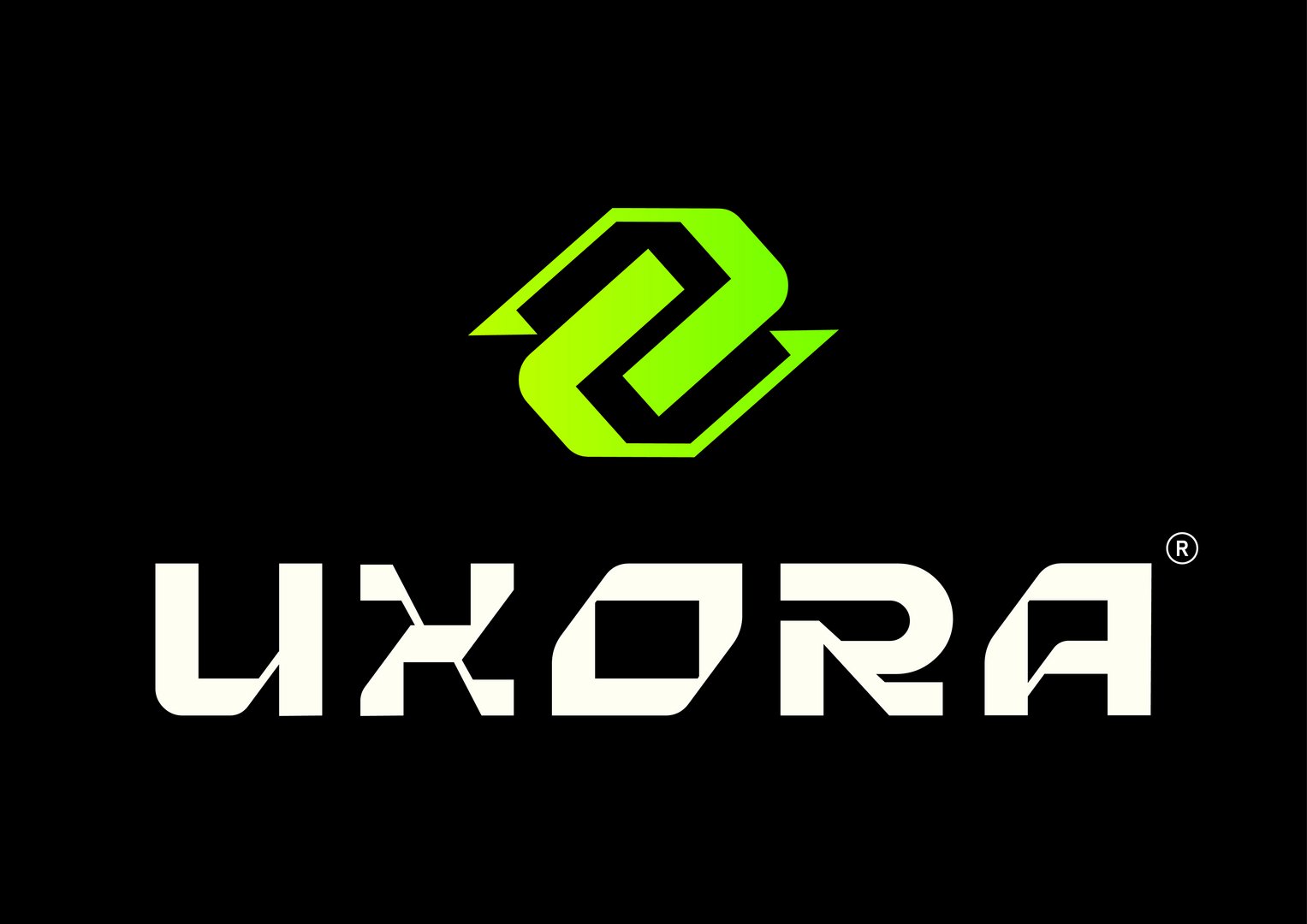
The resulting identity uses strong geometric forms, a distinctive wordmark, and a vibrant neon green against black to establish a confident and contemporary visual presence.
The Concept
Growth Through Connection
The visual concept represents connection, collaboration, momentum, and growth—ideas closely associated with a marketing company helping brands move forward.
The directional forms extending from the symbol reinforce the idea of progress and forward movement, while the interconnected structure represents the relationship between strategy, creativity, brands, and audiences.
Logo Symbol
Connected. Dynamic. Forward.
The UXORA mark was designed to remain recognizable even without the full wordmark. Its compact geometric construction makes it suitable for social media profiles, favicons, digital advertising, merchandise, and other small-format applications.
Typography
The UXORA wordmark uses a bold, futuristic geometric style to complement the symbol.
Angular cuts and distinctive letter construction give the typography a technological and contemporary personality while creating a visual language unique to the brand.
Color Direction
Electric Green × Black × Off-White
The vivid green introduces energy, growth, action, and digital confidence, while black provides contrast and a premium contemporary foundation. Off-white balances the system and improves flexibility across different applications.
Brand Personality
Bold • Progressive • Energetic • Strategic • Digital • Creative • Connected • Confident
Brand Message
Ideas Connected. Brands Accelerated.