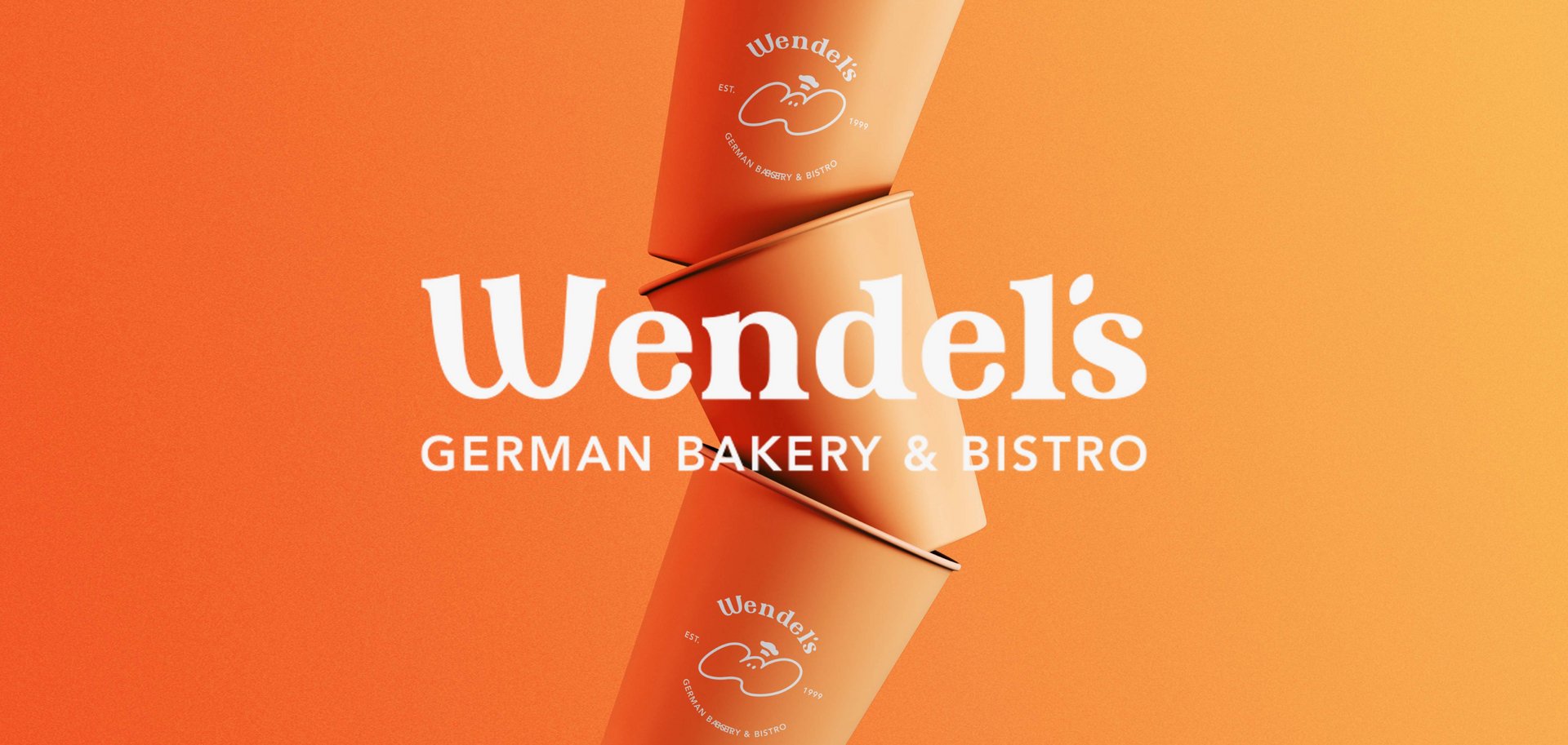
Wendel's Brand Identity & Visual Redesign
Sanny Chien
Published
0
How do you transform a 20-year-old traditional German bakery into a contemporary lifestyle brand through a clear visual strategy—appealing to a younger audience without losing its loyal foundation?
Here is a look into my latest concept side project: Wendel’s Rebranding & Visual Strategy.
The Challenge: As Wendel’s transitions from a formal dining establishment to a daily casual bistro, its classic visual identity faces 3 key issues:
- Digital Legibility: Ultra-fine serif strokes blurred on mobile screens.
- Market Perception Gap: Felt too formal for younger consumers seeking daily brunch.
- Lack of Logomark: No standalone icon for merchandise & social media.
The Visual Strategy
- Refined Wordmark: Increased weight & optimized kerning for mobile legibility. - “The Kneaded Dough” Mascot: A friendly ‘W’ icon bringing organic warmth to younger diners.
- Modern Color Palette: Sun Orange, Prussian Blue, and Flour Cream.
#branding #logodesigner #brandstrategy #motiondesigner