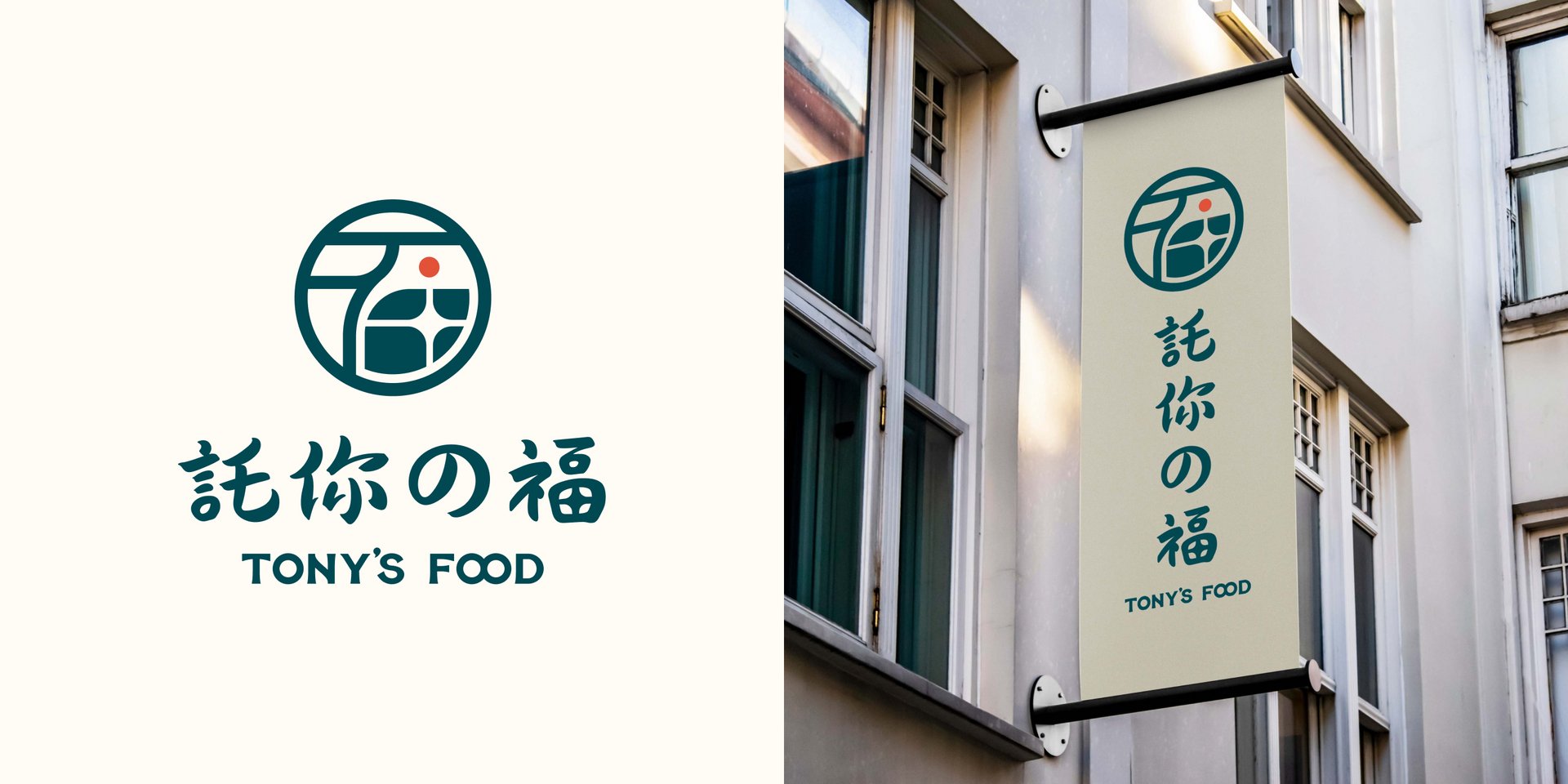
Tony's Food Brand Identity
Sanny Chien
Published
Project Overview & Brand Story
Master Chef Tony has dedicated his career to perfecting culinary formulas. His brand, “Tony’s Food” (Chinese: 託你的福, meaning “Thanks to you, I am blessed with good food”), carries a meaningful double entendre: every dish is a heartfelt expression of his devotion to quality ingredients, crafted to bring joy and happiness to every guest. It is more than a food brand—it is a promise of culinary excellence.
My Role: End-to-End Execution
As the sole freelance lead, I oversaw the entire project lifecycle—from conceptualizing the seal emblem and custom typography to designing the final structural arrangement of the retail packaging, ensuring a seamless translation from brand strategy to tangible assets.
Scope of Work & Deliverables
Brand Strategy & Logo Concept: Conducted visual research, brainstormed concepts, and designed the seal emblem and core brand mark with rationale.
Color Palette & Typography: Established standard brand color guidelines (HEX, CMYK, RGB) and selected custom primary/secondary font pairings for unified branding.
Packaging & Visual Applications: Designed high-fidelity brand mockups and structural packaging layouts, along with digital assets and social media templates to showcase real-world applications.
Brand Style Guide: Compiled a practical brand guidelines document, ensuring consistent visual execution across both digital and physical channels.
Key Outcomes
Delivered a modern, versatile, and scalable visual identity with a strong physical packaging presence.
Provided the client with a complete brand asset library and print-ready vector files for production.
#branding #brandesign #visualdesign #logodesign