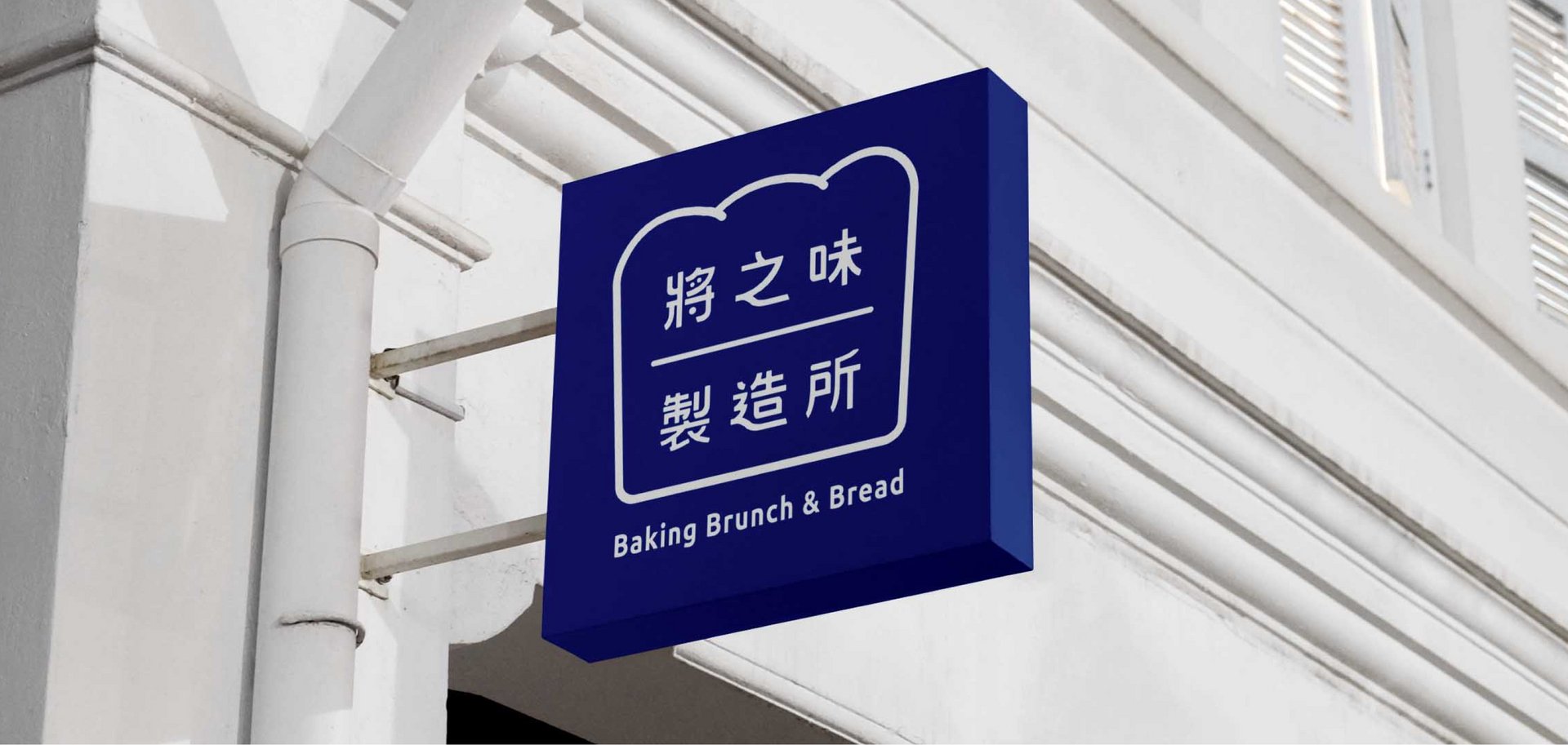
Jiang Zhi Wei Bakery Brand Identity
Sanny Chien
Published
0
Who says a bakery logo has to be warm and brown?
Brand identity project—Jiang Zhi Wei Bakery (將之味製造所)—we challenged industry conventions to
seamlessly align branding with physical architecture:
3 Key Design Breakthroughs:
- European Navy Blue: Built a hygienic, premium, and trustworthy color foundation that enhances the warmth of
freshly baked bread. - Architectural Symbolism: Merged a geometric house frame (representing workshop precision) with soft bread
contours (representing organic growth). - Custom Typography: Blended rigid geometry with subtle breathability to balance modern brunch professionalism
with hand-baked warmth.
When design connects spatial aesthetics with consumer psychology, brand identity becomes a powerful business
asset.
#branding #logodesign #colorstrategy #motiondesign #graphicdesigner