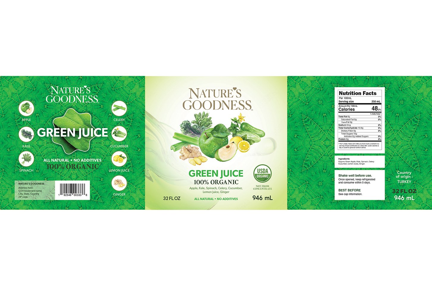
Packaging designs, from POP displays to beverage labels, and plenty in between.
Steve Menard
Published
0
The client was looking for a design that was more representative of their brand, which used bold and saturated colors to emphasize the freshness and purity of their drinks. They also wanted to use realistic depictions of the product ingredients, which was consistent with their style. A basic layout was provided, as well as images of their existing product line.