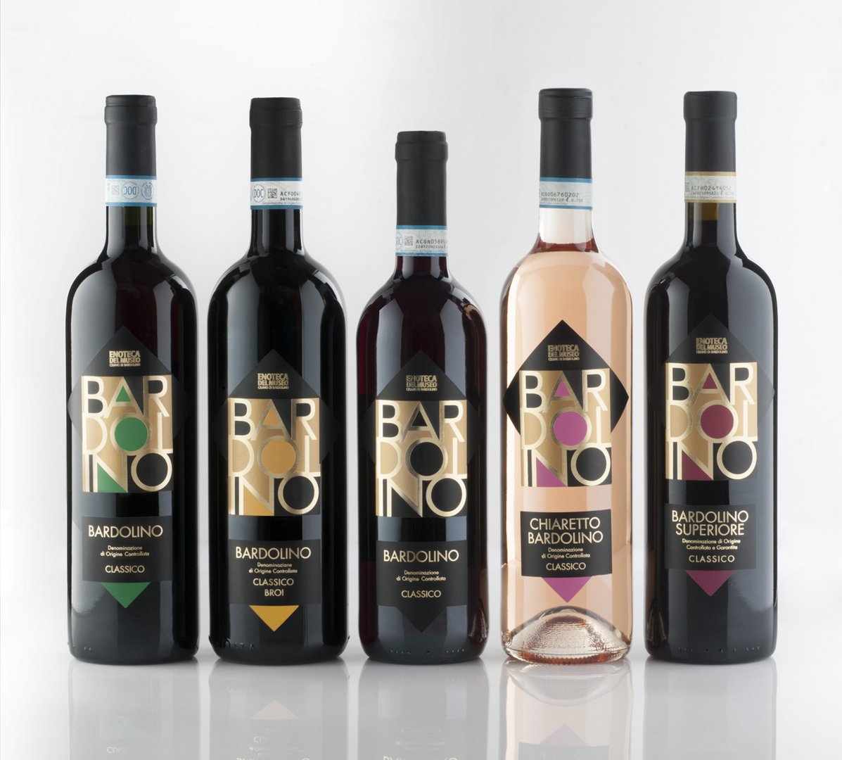
Packaging design of the Bardolino’s wines of Museum
Toni Traglia
Published
The restyling of the packaging design of the wines is intended to re-evaluate the appearance of the line “Bardolino Enoteca del Museo”. The existing product image had shown its limitations compared to the other product lines proposed by the Museum.
The project renewed the line, giving more prestige and authority, aligning the perception of the products with the refined level of the Museum catalogue.
The restyling of the packaging design of the wines is intended to re-evaluate the appearance of the line “Bardolino Enoteca del Museo”. The existing product image had shown its limitations compared to the other product lines proposed by the Museum.
The project renewed the line, giving more prestige and authority, aligning the perception of the products with the refined level of the Museum catalogue.
The label uses typography to assert two functions.
The first is to highlight the territory of origin of the wines: the Bardolino region on Lake Garda in Italy.
The second decade after the first as the highlighting of the name Bardolino reiterates a marking function of the writing. The label was produced in four colors on matt gold paper with the application of hot gold foil.