Brand Indentity
Alison Low
Published
Developing a cohesive brand identity that bridges interior design and construction.
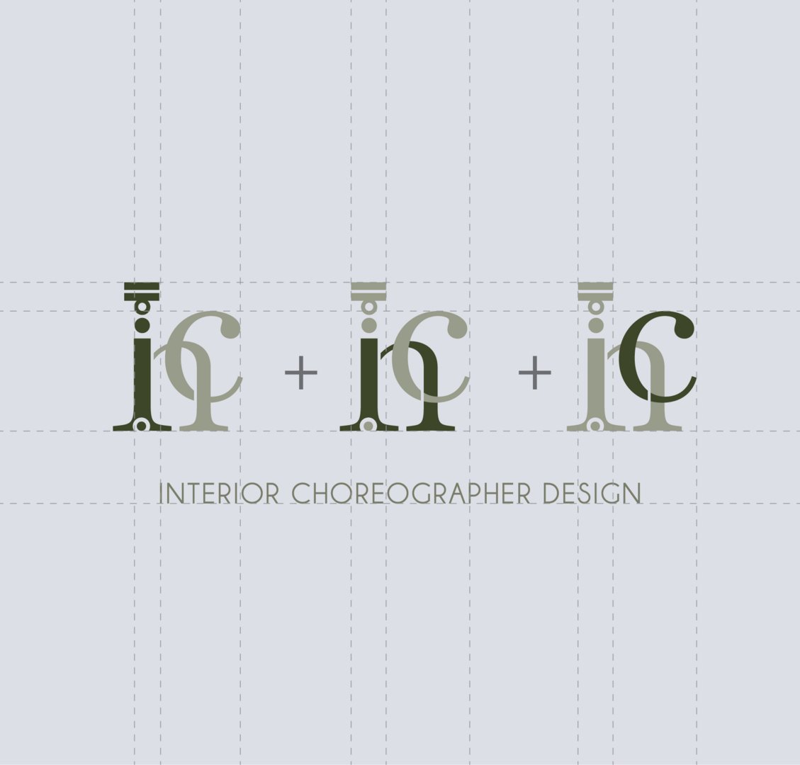
This rebranding project focuses on merging the identities of an interior company and a construction company into a single, cohesive brand. The challenge was to create a visual language that represents both creativity and structural reliability.
Material selection played a key role in extending the brand identity beyond visual design into tangible touchpoints. Careful consideration was given to paper stock, texture, and finish for the business cards, ensuring that the physical output reflects the same level of quality, precision, and intention as the visual identity.
The overall design direction remains rooted in the brand’s philosophy of simplicity and clarity, with a strong emphasis on the intelligent use of space, material, and functionality. This approach mirrors the company’s interior concept design principles, where every element is thoughtfully considered to achieve balance, purpose, and long-term usability.
The logo was designed by synthesising key elements from both entities, resulting in a mark that conveys balance, strength, and integration. Careful consideration was given to form, proportion, and legibility to ensure versatility across applications.
Please click the link to view the project: https://www.twine.net/signin