Packaging Design
Alison Low
Published
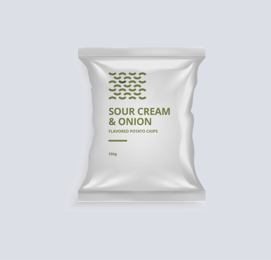
A minimalist packaging that translates flavour identity into clear and distinct visual.
This project explores a minimalist visual system for a potato chips packaging design, using simple vector shapes and carefully selected colours to represent the original and sour cream & onion flavours. The design focuses on clarity and strong visual distinction while maintaining a clean and modern aesthetic.
A light grey metallic background is used to enhance contrast and allow the packaging elements to stand out effectively. By combining restrained colour palettes with geometric forms, the design achieves a balanced composition that feels contemporary, refined, and easily recognisable on shelf.
Please click the link to view the project: https://www.twine.net/signin