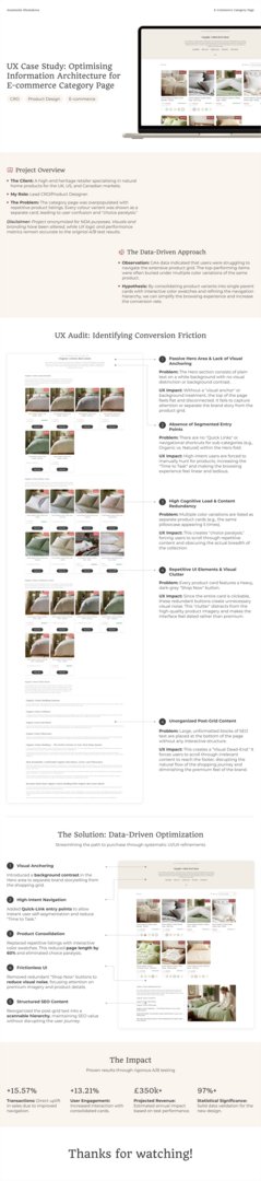
UX Case Study: Optimising Information Architecture for E-commerce Category Page
Anastasiia Shestakova
Published
0
The Problem: The category page was overpopulated with repetitive product listings. Every colour variant was shown as a separate card, leading to user confusion and “choice paralysis.”
Observation: GA4 data indicated that users were struggling to navigate the extensive product grid. The top-performing items were often buried under multiple color variations of the same product.
Hypothesis: By consolidating product variants into single parent cards with interactive color swatches and refining the navigation hierarchy, we can simplify the browsing experience and increase the conversion rate.
My Role: Lead CRO/Product Designer.