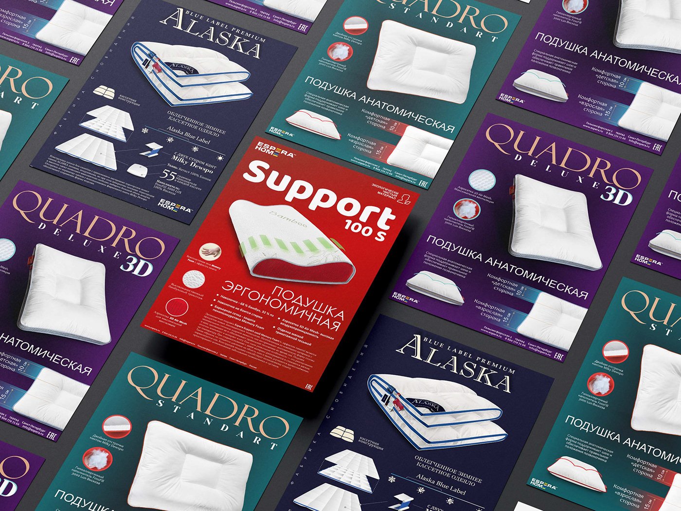
Labels for ESPERA HOME pillows
Aram Soghomonyan
Published
Full project:
Overview:
In a collaborative endeavor with Espera, a renowned home textile producer specializing in pillows, the project aimed to revolutionize their product presentation. Our task was to create visually captivating and informative labels for almost 100 distinct product lines. Each label was meticulously designed to include brand logotypes, high-quality product photographs, concise descriptions, and essential notes. These labels seamlessly integrated into Espera’s soft fabric packaging, elevating the overall visual appeal and market presence of their pillows.
Design Approach:
The design approach was multifaceted, blending aesthetic appeal with functional clarity. Each label was meticulously crafted to encapsulate the essence of the respective product line. Attention to detail was paramount, ensuring that the labels not only showcased the product but also effectively communicated the quality and uniqueness of Espera’s offerings.
Label Components:
Brand Logotypes: Prominently featured on every label, Espera’s brand logotypes were strategically placed to reinforce brand recognition and instill trust among consumers.
Product Photos: High-resolution images of the pillows were incorporated, allowing potential customers to visualize the product within the packaging. These images were meticulously chosen to highlight the textures, colors, and designs of the pillows, creating an immediate connection with buyers.
Short Descriptions: Each label included concise and engaging descriptions that captured the key features and benefits of the respective product line. These descriptions provided vital information without overwhelming the customer, enabling an informed purchasing decision.
Additional Notes: Special emphasis was placed on including unique selling points, care instructions, or other relevant notes specific to each product line. This ensured that customers were well-informed about the pillows they were considering, promoting transparency and customer satisfaction.
Material and Printing:
The labels were meticulously designed to be printed on A4 gloss paper, harmonizing seamlessly with Espera’s soft fabric packaging. The choice of glossy paper added a touch of sophistication, enhancing the overall visual appeal of the labels and, by extension, the products they adorned.
Outcome:
The project yielded a comprehensive collection of visually stunning and informative labels that transformed Espera’s product packaging. Each label served as a powerful representation of the brand identity, product features, and care information. The cohesive design approach established a unified visual language across all product lines, reinforcing Espera’s professionalism and meticulous attention to detail.
#logo #graphicdesigner #branding #designer #label