 Vicky
VickyCreating an intuitive and user-friendly website navigation is essential for any online presence. Whether you’re running a personal blog, an e-commerce store, or a corporate site, effective navigation helps users find what they need quickly and enhances their overall experience. While many business owners attempt to design their navigation systems themselves, working with experienced freelance web developers can often lead to more professional and user-friendly results, as they bring specialized knowledge of best practices and current trends. Here are some top tips to consider when designing your website’s navigation.
Understand Your Audience
Before diving into the design of your website navigation, it’s crucial to understand who your audience is. Different users have different expectations and needs. Conducting user research can provide valuable insights into what your visitors are looking for. By identifying the demographics, interests, and behaviors of your target audience, you can tailor your website’s navigation to better serve their specific requirements, ultimately enhancing user satisfaction and engagement.
Conduct Surveys and Interviews
One effective way to gather information is through surveys and interviews. Ask your audience about their preferences, what they find confusing, and what they would like to see improved. This feedback can guide your navigation design, ensuring it aligns with user expectations. In addition to traditional surveys, consider using interactive tools like polls or focus groups to engage users in a more dynamic way. This approach not only provides quantitative data but also allows for qualitative insights that can reveal deeper motivations and frustrations among your audience.
Analyze User Behavior
Utilizing tools like Google Analytics can help you track how users interact with your site. Look for patterns in page visits, bounce rates, and time spent on pages. This data can highlight which sections of your navigation are working well and which may need adjustments. Furthermore, heat mapping tools can visually illustrate where users click most frequently, giving you a clearer picture of their journey through your site. By combining this behavioral data with your survey results, you can create a more comprehensive understanding of user needs, leading to a more intuitive and effective navigation structure that enhances the overall user experience.
Keep It Simple
Simplicity is key when it comes to website navigation. A cluttered or overly complex navigation bar can overwhelm users and lead to frustration. Aim for a clean and straightforward layout that allows users to find what they need without unnecessary distractions. A well-organized navigation structure not only enhances user experience but also contributes positively to your site’s overall aesthetic. By prioritizing simplicity, you create an inviting atmosphere that encourages exploration rather than confusion.
Limit Menu Items
Too many options can lead to decision fatigue. Try to limit your main navigation menu to five to seven items. This keeps the focus on the most important sections of your site and helps users navigate more efficiently. Additionally, consider grouping related items under dropdown menus or subcategories. This approach not only reduces clutter but also provides a logical flow that guides users through their journey on your site. By streamlining your menu, you can create a more intuitive experience that allows visitors to quickly locate the information they seek.
Use Clear Labels
Each menu item should have a clear and descriptive label. Avoid jargon or overly creative names that might confuse users. For example, instead of using “Solutions,” consider using “Services” or “Products” to make it immediately clear what users can expect. Furthermore, employing consistent terminology across your site can reinforce understanding and familiarity. Using familiar terms helps in building trust and ensures that users feel comfortable navigating through your content. Consider conducting user testing to gather feedback on your labels; this can provide valuable insights into how your audience interprets the terms you choose and can lead to even greater clarity in your navigation.
Prioritize Important Content
Not all content on your website is created equal. Some pages are more critical than others, and your navigation should reflect this hierarchy. By prioritizing important content, you can guide users to the information they need most. This approach not only enhances user experience but also improves engagement and conversion rates, as visitors can easily find what they are looking for without unnecessary frustration.
In addition to guiding users, prioritizing content can also help with search engine optimization (SEO). Search engines tend to favor well-structured websites where important information is easily accessible. By ensuring that your key pages are prioritized in your navigation, you increase their visibility, which can lead to higher rankings in search results and more organic traffic to your site.
Highlight Key Pages
Consider placing your most important pages, such as “About Us,” “Contact,” or “Shop,” in prominent positions within your navigation. These should be easily accessible, ideally placed at the top of the navigation bar, ensuring that users can find them quickly. Additionally, you might want to use visual cues like icons or bold text to make these key pages stand out even more. This not only draws attention but also reinforces their significance within your site’s structure.
Furthermore, regularly reviewing and updating these highlighted pages can keep your content fresh and relevant. For instance, if you have seasonal promotions or new product launches, featuring them prominently can drive traffic and encourage users to explore more of what you offer. This dynamic approach to navigation ensures that returning visitors always find something new and engaging.
Use Dropdown Menus Wisely
Dropdown menus can be a great way to organize subcategories without cluttering the main navigation. However, they should be used judiciously. Too many layers can confuse users, so ensure that dropdowns are logical and easy to navigate. A well-structured dropdown menu should ideally be limited to two or three levels deep, providing a clear path for users to follow without overwhelming them with choices.
Moreover, consider the use of hover effects or animations to enhance the user experience when interacting with dropdowns. Subtle transitions can make the navigation feel more fluid and engaging, encouraging users to explore further. Testing your dropdown menus with real users can also provide valuable insights into how intuitive they are, allowing you to make adjustments based on feedback and improve overall usability.
Make It Responsive
With the increasing use of mobile devices, having a responsive navigation design is more important than ever. A navigation menu that works well on desktops may not translate effectively to smaller screens. Therefore, it’s essential to create a mobile-friendly navigation experience.
Implement a Hamburger Menu
Many mobile websites use a hamburger menu, which is a compact icon that expands to reveal the navigation options. This design saves space and keeps the interface clean. However, ensure that the menu is easily accessible and recognizable to users.
Test on Multiple Devices
After designing your navigation, test it on various devices and screen sizes. This will help identify any usability issues that may arise on different platforms. Make adjustments as necessary to ensure a seamless experience across all devices.
Utilize Visual Hierarchy
Visual hierarchy is the arrangement of elements in a way that signifies importance. By using size, color, and spacing effectively, you can guide users through your navigation and highlight the most critical areas.
Use Font Size and Weight
Make important menu items stand out by using larger font sizes or bolder weights. This draws attention to key sections and helps users quickly identify where they should go. Just be careful not to overdo it; consistency is vital for a professional look.
Incorporate Color and Contrast
Color can be a powerful tool in navigation design. Use contrasting colors for your navigation bar and text to enhance readability. Additionally, consider using color to indicate active or hovered items, providing visual feedback to users as they navigate.
Include a Search Functionality
Even with the best navigation design, some users may still struggle to find what they need. Including a search bar can significantly enhance user experience, allowing visitors to quickly locate specific content without navigating through multiple pages.
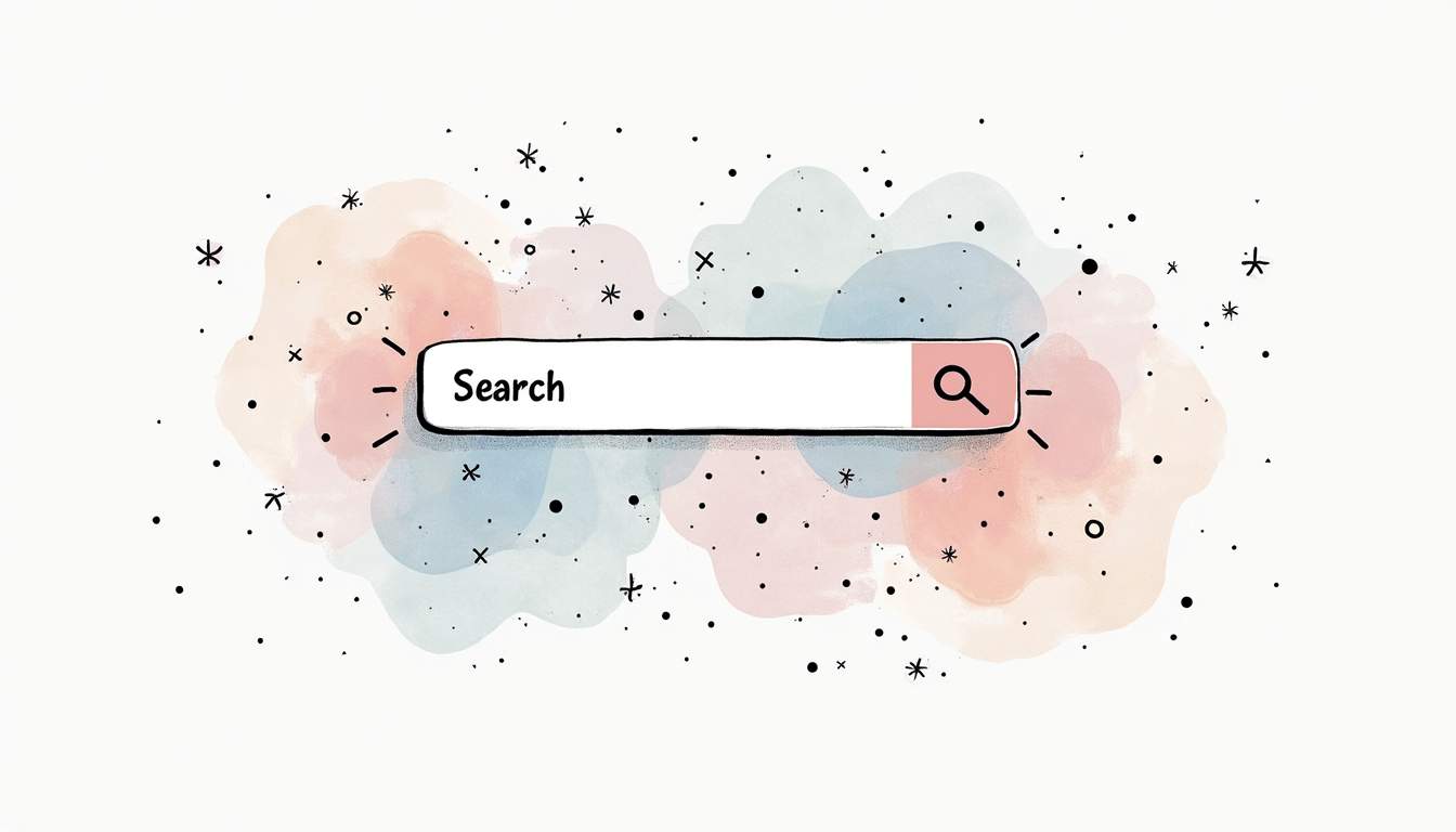
Position the Search Bar Prominently
Place the search bar in a prominent location, typically at the top right of the page. This is where users expect to find it, making it easier for them to use. Ensure that it is easily recognizable and functional across all devices.
Optimize Search Results
Make sure that the search functionality is optimized to deliver relevant results. Consider implementing features like autocomplete or suggestions based on popular searches to help guide users toward their desired content.
Test and Iterate
Creating great website navigation is not a one-time task; it requires ongoing testing and iteration. Regularly assess how users interact with your navigation and be open to making changes based on feedback and analytics.

Conduct Usability Testing
Usability testing involves observing real users as they navigate your site. This can provide invaluable insights into where users struggle and what works well. Use this information to refine your navigation and improve the overall user experience.
Stay Updated with Trends
Web design trends evolve, and what works today may not be as effective in the future. Stay informed about the latest best practices in navigation design and be willing to adapt your site accordingly. This can keep your website feeling fresh and user-friendly.
Conclusion
Creating great website navigation is a blend of understanding your audience, keeping it simple, and continuously testing and refining your approach. By prioritizing user experience and implementing these tips, you can create a navigation system that not only looks good but also enhances usability. Remember, the goal is to make it as easy as possible for users to find what they need, leading to a more satisfying experience on your site.

As you embark on your website navigation journey, keep these principles in mind. A well-structured navigation system can significantly impact user engagement, conversion rates, and overall satisfaction. So take the time to design with care, and watch your website thrive!
Ready to Elevate Your Project’s Navigation?
Great website navigation is just the beginning. At Twine, we understand the importance of every detail in your digital project. Our marketplace is the perfect place to find the freelance expertise you need to ensure your website not only navigates smoothly but also stands out in today’s competitive online landscape. From tech gurus to creative wizards, our community of professionals is here to help you enhance user experience and maximize your site’s potential. Post your requirements for free and start collaborating with top-tier freelancers to make your website truly exceptional.
Related Reads: Web Developer Hourly Rates | Web Developer Job Description Template
 Raksha