DOKU Mobile App: UI Redesign
Dicky Setyawan
Published
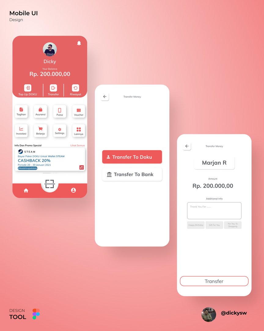
This is a concept redesign of DOKU, an Indonesian e-wallet. The goal was a cleaner, friendlier experience that makes everyday payments feel quick and easy.
The home screen puts the most important things first. The user’s balance sits at the top in large, easy-to-read type, with the three main actions right under it: Top Up, Transfer and Riwayat (history). Below that, the services Tagihan, Asuransi, Pulsa, Voucher, Investasi and Belanja are arranged as soft card icons in a simple grid, so users can find what they need without digging through menus. A promo carousel brings in partner offers without taking over the screen. The QR scanner sits in the middle of the bottom navigation, where the thumb reaches it easily for the most common payment action.
The transfer flow is split into short, focused steps. Users first choose between Transfer to DOKU and Transfer to Bank. Then they confirm the recipient, enter the amount and add an optional note. Quick-pick message chips like “Happy Birthday” and “Gift For You” make sending money feel more personal and save typing.
Visually, the design uses DOKU’s signature coral red as the main color, balanced with plenty of white space, rounded corners and gentle shadows. The result feels modern and approachable while staying consistent with the brand.