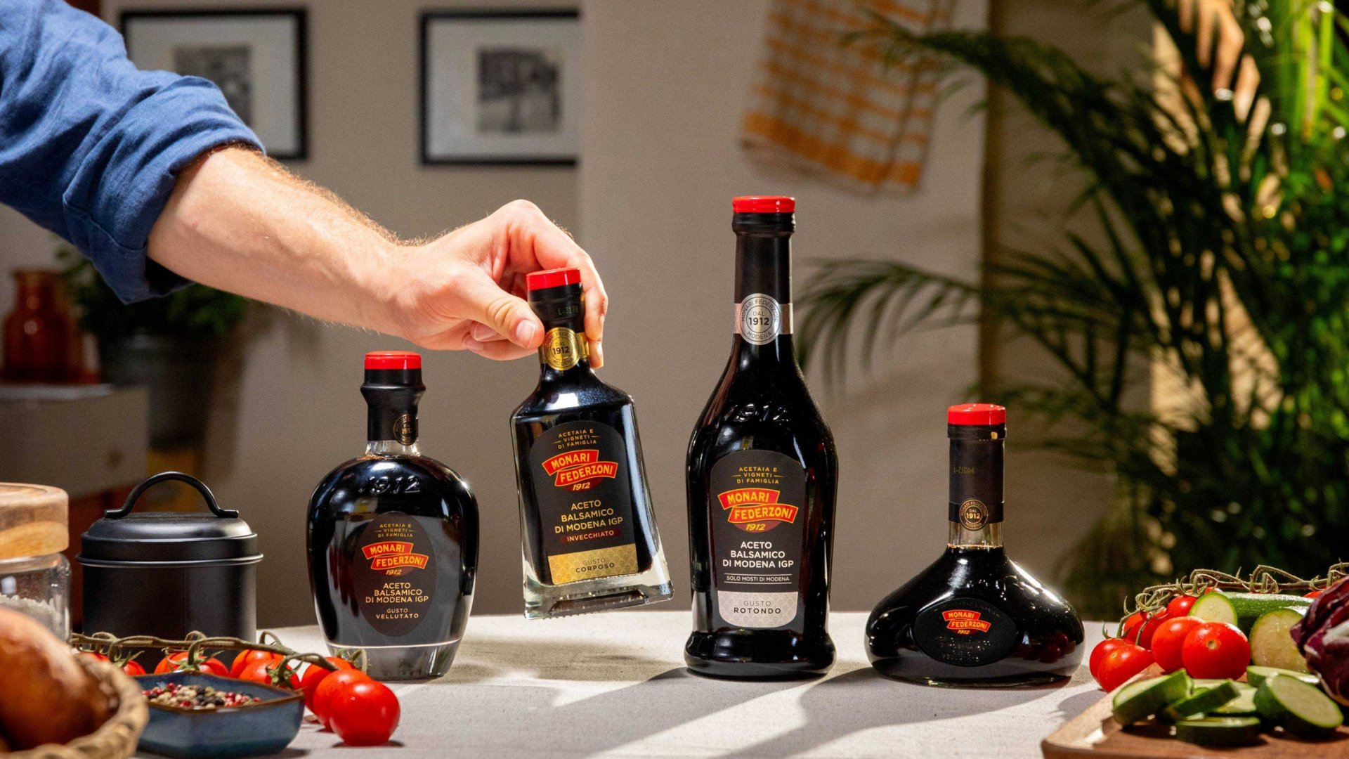
Monari Federzoni rebranding and user friendly website
Dorsa Masghati
Published
To see the full project go to:
In the rebranding project for Monari Federzoni, the main objective was to reposition the brand image to convey a timeless refinement that reflects both the company’s heritage and its innovative capabilities. The choice of an art deco style, reinterpreted with a contemporary graphic language, was central to communicating elegance and quality-key attributes of
the brand.
To give voice to the company’s core values, I also created a custom series of icons. These graphic elements, perfectly aligned with the new visual style, were designed to represent the brand’s fundamental principles: tradition, authenticity, sustainability, and quality. This cohesive and unique visual identity positions Monari Federzoni with a refined and distinctive
presence in the market.
The design of the responsive website embodied this vision, integrating a look that was not only aesthetically sophisticated but also functional and intuitive across all platforms. Every detail was crafted to provide users with a seamless and engaging experience, reflecting the meticulous care and craftsmanship that Monari Federzoni invests in its products.