Hi, I’m a Graphic Designer and Frontend Developer dedicated to creating engaging visuals and user-friendly websites. My expertise covers comprehensive design, including brand identity and web design, alongside extensive experience with modern frontend technologies like React and Vue since 2019.
I lead projects from concept to completion, overseeing branding, digital campaigns, and full-stack web development to deliver impactful digital experiences. I’m eager to discuss how I can contribute to your project.
Experience Level
Language
Work Experience
Education
Qualifications
Industry Experience
As Creative Director and Development Coordinator for the Novanet Studio website, my role encompassed three strategic phases: Content Strategy, Web Design, and Application Development.
My approach prioritized a user-centric methodology, ensuring a sustainable, long-term digital presence that seamlessly integrates content requirements with high-end visual and functional standards.
 |
|---|
| Novanet Studio Home page |
Phase 1: Content Strategy
The goal of the content architecture phase is to define the application’s structure and scope. This is a critical foundation, as it aligns the site’s messaging with the overarching marketing strategy. By mapping out internal navigation and content hierarchies, I enabled the design team to give concrete form to the brand’s narrative.
Key Achievement: For this project, I conducted a market analysis that resulted in a refined brand voice and objective alignment, significantly strengthening the company’s unique value proposition.
Phase 2: UI/UX Design
Building on the strategic insights from Phase 1, the design phase focused on translating strategy into visual interfaces. Using Figma, we developed high-fidelity prototypes to analyze the synergy between copy and brand identity elements. This iterative process ensured that the layout was optimized for the web environment while remaining strictly aligned with marketing objectives.
 |
|---|
| Novanet Studio Figma Mobile views |
Phase 3: Web Application Development
The final phase involved the technical execution of the site. I oversaw the development of the web layout using Tailwind CSS and coordinated the integration between the Strapi CMS (API) and the Nuxt.js frontend framework. This technical orchestration consolidated the work of the previous phases, resulting in a high-performance digital asset that reflects the brand’s visual system and effectively engages the target audience.
 |
|---|
| Novanet Studio Home page |
Software and tools
Adobe Photoshop, Adobe Illustrator, Figma, VS Code, Strapi, Nuxt, Tailwind, Motion.dev
Custom Content Architecture
Responsive UI/UX Layouts
WordPress + Divi Implementation
Client:
UCAB / CIAP
The Concept:
An interdisciplinary hub where gastronomy meets social innovation. “Come” invites chefs and academics to rethink the future of Venezuela.
|  |
|---|
| Altea brand Cover |
The Objective
The goal was to craft an elegant and exclusive image that reflects the heritage of winemaking. By blending traditional artistry with modern branding strategies, Altea establishes itself as a benchmark for quality and curated taste.
 |
|---|
| Altea Label Design |
Market Strategy & Research
Success began with an exhaustive analysis of the mid-range wine sector. By studying consumer behavior and competitor branding, I identified a unique market gap. This research ensured that Altea’s identity wasn’t just beautiful, but strategically positioned to stand out on a crowded shelf.
 |
|---|
| Altea Brand Label Design |
The Creative Concept
The visual heart of the brand is a custom sepia watercolor illustration. This artistic choice evokes the “terroir”—the earth, the soil, and the raw agricultural roots of viticulture.
Logotype: Designed to capture the brand’s essence, the logo balances the weight of tradition with the sleekness of high-end distribution.
Typography: I selected a fluid script typeface to complement the organic nature of the watercolor elements. Its calligraphic rhythm connects the brand to the natural world through both form and color.
Label Design: As the primary touchpoint, the label tells a story.
The Front: Features a structured composition of the primary illustration, elegant typography, and varietal information.
The Back: Utilizes a repeating sepia pattern derived from the original artwork, housing the technical details and brand narrative.
 |
|---|
| Altea Bottle Labels |
The Result
The final identity for Altea is a holistic brand experience. Every element—from the organic textures to the refined type scales—was meticulously curated to appeal to a discerning audience, delivering a brand that is as memorable as the wine it represents.
 |
|---|
| Altea Bottle Wine Glass |
Caracas Multisport is a multidisciplinary sports center offering swimming, karate, yoga, and personalized training. The primary objective of this project was to develop a cohesive and engaging brand identity that reflects the diversity and quality of its services, appealing to a wide demographic—from fitness beginners to advanced athletes.
 |
|---|
| Caracas Multisport Cover |
Strategy & Research
The process began with exhaustive market research into current trends within the sports and fitness industry. By analyzing client expectations and branding best practices for athletic facilities, I identified the core values and personality traits that the visual identity needed to communicate: vitality, diversity, and professionalism.
 |
|---|
| Caracas Multisport Social Media posts |
Visual Identity & Branding
The branding deployment focused on implementing these core values across all touchpoints, ensuring a direct relationship with the established design system.
Color Palette: Designed with high contrast to allow for versatile, interlocking use across digital and physical media.
Custom Iconography: I designed a bespoke icon set to identify the core disciplines (Yoga, Karate, Swimming, and Personal Training). These were paired with photography of actual instructors and athletes to ground the abstract symbols in reality and showcase the center’s community.
Social Media & Signage: Instagram content extends the website’s visual language while adapting to specific topics. For physical signage, I prioritized clarity and direct communication, utilizing the most streamlined elements of the brand system.
 |
|---|
| Caracas Multisport Web Site |
Digital Development
The website serves as the anchor for the entire design system, focused on showcasing the facilities and multidisciplinary training services.
Frontend: Built with Nuxt to create a dynamic, responsive user interface. The component-based architecture allowed for a modular, easily maintainable application.
Backend: Developed using Strapi to provide a solid, scalable foundation. I implemented RESTful APIs to ensure efficient communication between the frontend and the CMS.
The Result: A unified, memorable brand experience that highlights the center’s excellence. Every design element was carefully crafted to project a professional image that invites everyone to move.
 |
|---|
| Caracas Multisport T-shirts |
 |
|---|
| Agua Fría Coffee Logo |
Agua Fría Coffee is a specialty estate rooted in Venezuelan tradition. This project involved creating a distinctive brand identity that reflects the quality, heritage, and meticulous craftsmanship behind their coffee production.
Discovery and Strategy
The process began with a market study and geo-historical research. To capture the brand’s true essence, I conducted interviews with owners and workers, ensuring the identity resonated with the farm’s authentic spirit.
 |
|---|
| Agua Fría Coffee social media design |
 |
|---|
| Agua Fría Coffee Agua Fría Coffee web site |
Conceptual Design
The logo follows a geo-historical approach, placing the human element at the center to honor the region’s manual labor and tradition. The emblem integrates five key symbols:
The Farmer: The central figure representing heritage.
The Harvest: Coffee cherries in three stages of ripeness.
The Terroir: The iconic mountains, blue sky, and regional sun.
The illustration uses a minimalist, high-contrast style for maximum visual impact.
The illustration style is minimalist, utilizing high-contrast colors to ensure the brand stands out in a crowded market.
 |
|---|
| Agua Fría Coffee 3D logo |
 |
|---|
| Agua Fría Coffee process chart |
Visual system
Typography: Selected for its harmony with the illustration and high legibility across all scales.
Color Palette: Inspired by the natural tones of the coffee process and the estate’s landscape.
Brand Collateral: I developed a cohesive system for promotional materials, packaging, and social media, ensuring a consistent brand experience at every touchpoint.
 |
|---|
| Agua Fría Coffee Brand Guidelines |
 |
|---|
| Agua Fría Coffee Stationery |
The Impact
The new branding successfully projects an image of premium quality. It has been warmly received by distributors and customers, significantly increasing brand recognition and the market appreciation of Agua Fría’s specialty coffee.
- Prototypes: High-conversion landing pages and interactive UX/UI.
- Slide Decks: Professional decks for business strategy and features.
 |
|---|
| Foot ID’s Help People Move Better slogan cover |
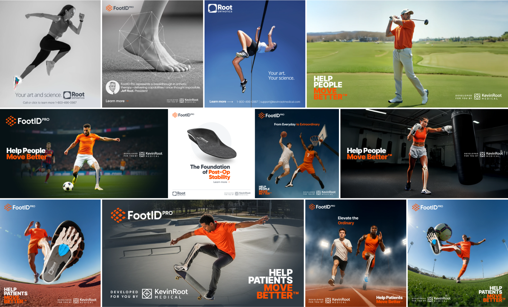
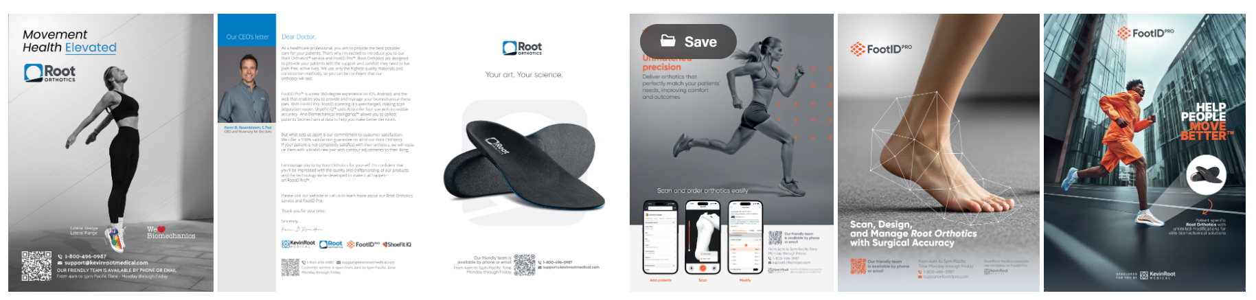
Comprehensive identity and digital design for KevinRoot Medical. We positioned them as orthotic technology leaders by blending medical precision with a dynamic, consumer-facing aesthetic.
Digital and Print Ads
We developed high-impact newsletter and magazine assets focused on Anatomical Visualization and Performance Enhancement.
 |
|---|
| FootID’s web ads |
 |
|---|
| Foot in Motion’s brands magazine print ads |
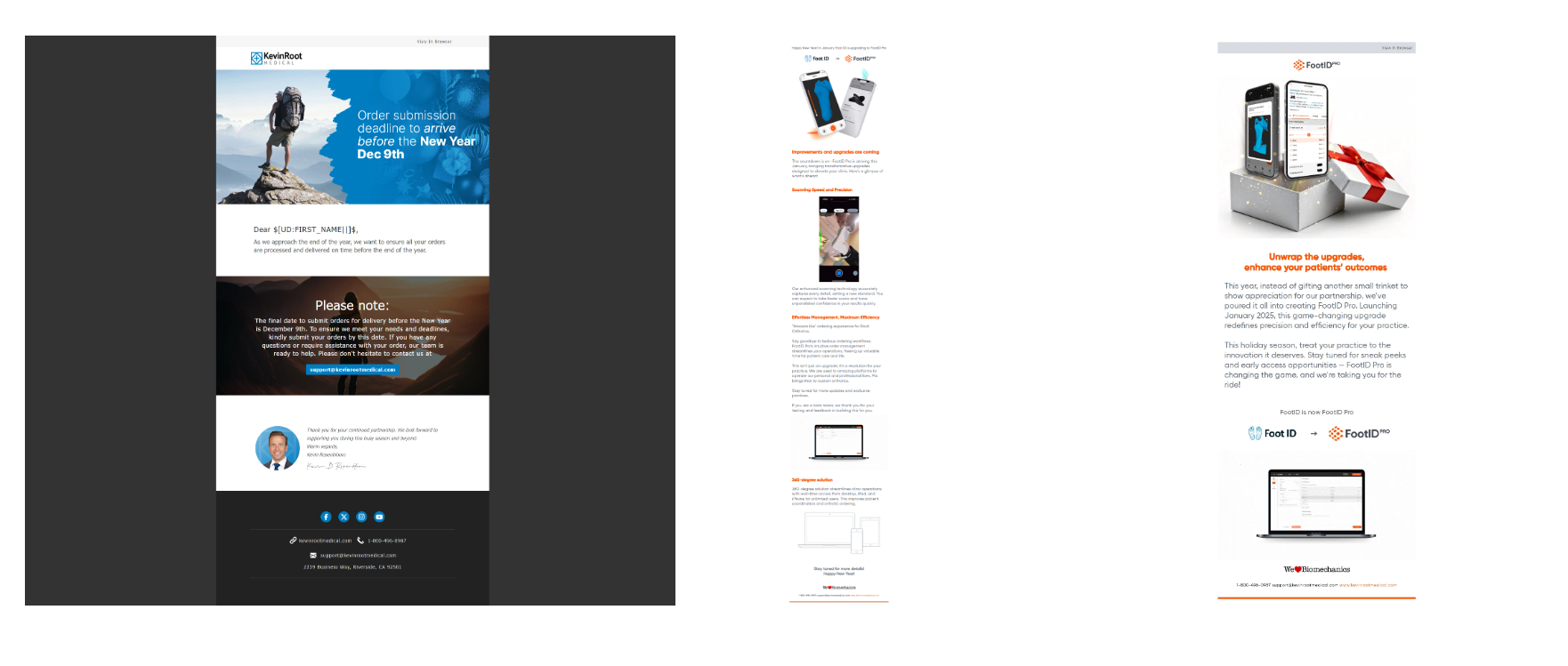
E-mail marketing
Direct mail campaigns designed for product updates and customer engagement.
 |
|---|
| Foot in Motion’s brands mailings |
Logo Design
The myFootID mark uses a heart symbol for emotional connection. The tagline emphasizes “MOVE BETTER” in signature orange to highlight the primary user benefit.
| Foot in Motion’s brands logos |
 |
|---|
| Help People Move Better section design |
Web & Strategy
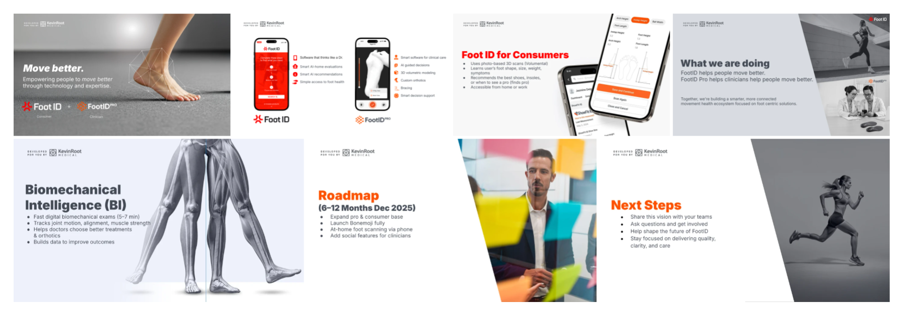 |
|---|
| FootID Slide Deck |
 |
|---|
| FootID Landing Pages and Web Prototypes |
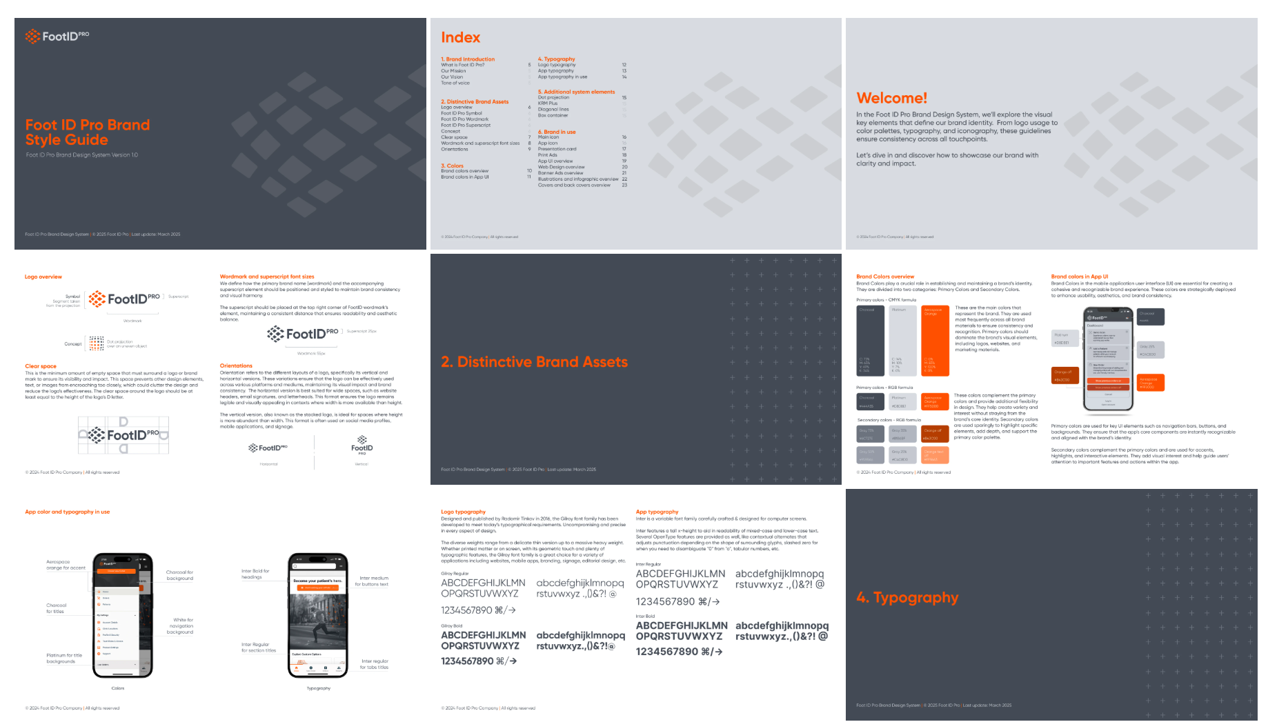
Brand Style Guide
A definitive guide establishing visual standards and consistency across all media.
 |
|---|
| FootID Brand Style Guide |
Tools: Figma, Adobe Suite, VS Code, Zoho, Shopify, AI (Midjourney, Firefly, ChatGPT).
Hire a Graphic Designer
We have the best graphic designer experts on Twine. Hire a graphic designer in Caracas today.