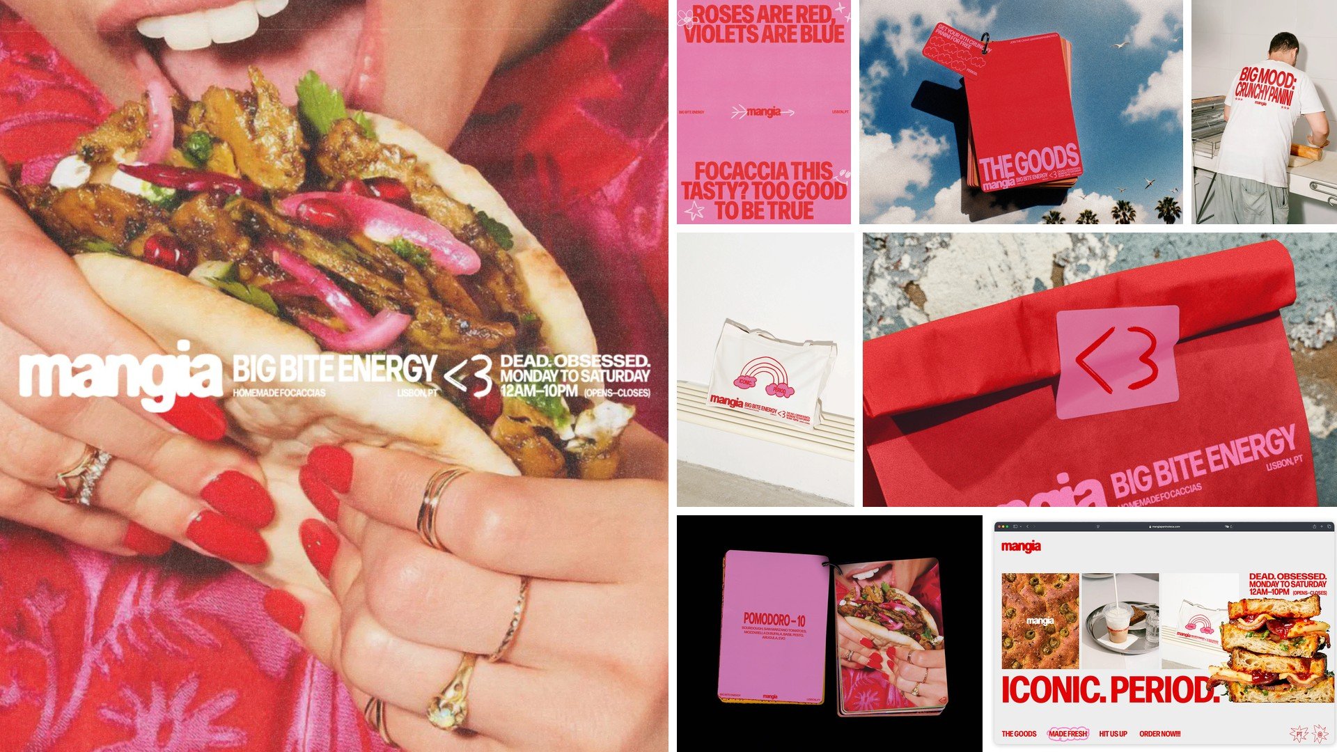
Mangia — Visual Identity / Art Direction
Francisco Ribeiro
Published
0
Identity and Art Direction for Mangia, a paninoteca in Lisbon making focaccia sandwiches. Big Bite Energy was the starting point and the tone never really calms down: hot red and pink, a condensed sans that shouts, a <3 that works as a symbol, and lines like “Focaccia this tasty? Too good to be true.”
Rolled out across menus, packaging, staff t-shirts, tote bags, loyalty cards, posters and the website.