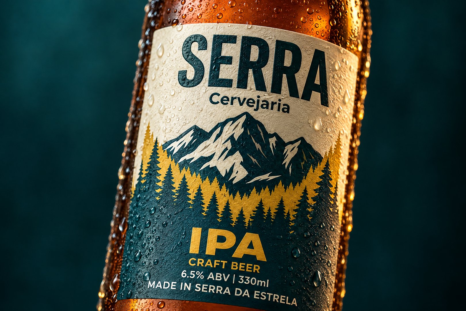
label SERRA
João Afonso
Published
A label design for a mountain-based brewery. The illustration features a flat, non-gradient style: a snow-capped mountain, a silhouette of a pine forest, and a colored band that shifts according to the beer style—allowing for the release of Lagers, Sours, or Imperial beers without needing to redesign the entire brand identity. The name uses a condensed, sans-serif typeface, chosen to remain legible within the 90 mm width of a label applied to a curved glass surface. I tested the readability at 40 cm—the typical viewing distance from a retail cooler. The final deliverables include artwork for 330 ml and 500 ml bottles, as well as cans; this includes the label layout with designated safety zones and a finalized color code, ready for the printing house.