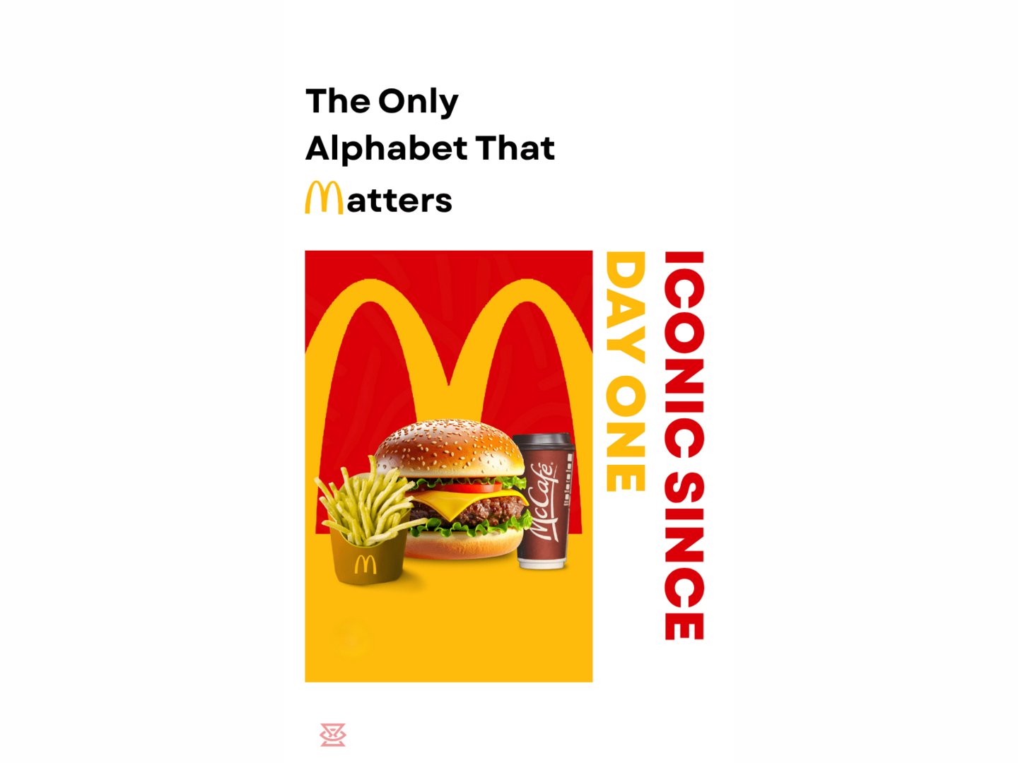
minimal ad concept for McDonald's
Mayank Kush
Published
0
As a graphic designer and brand identity specialist, I believe true minimalism isn’t about leaving things out, it’s about making every single element count.
Here is my minimalistic ad concept for McDonald’s, focusing on their most powerful asset: The Iconic Golden Arches.
The Design Thinking:
Visual Wordplay: Integrated the legendary ‘M’ directly into the headline to create an instant psychological trigger.
Bold Typography: Balanced the clean sans-serif layout with McDonald’s signature red and golden-yellow palette.
Pure Minimalism: Removed all unnecessary clutter to let the comfort combo and the core message take center stage.
Sometimes, less really is more.