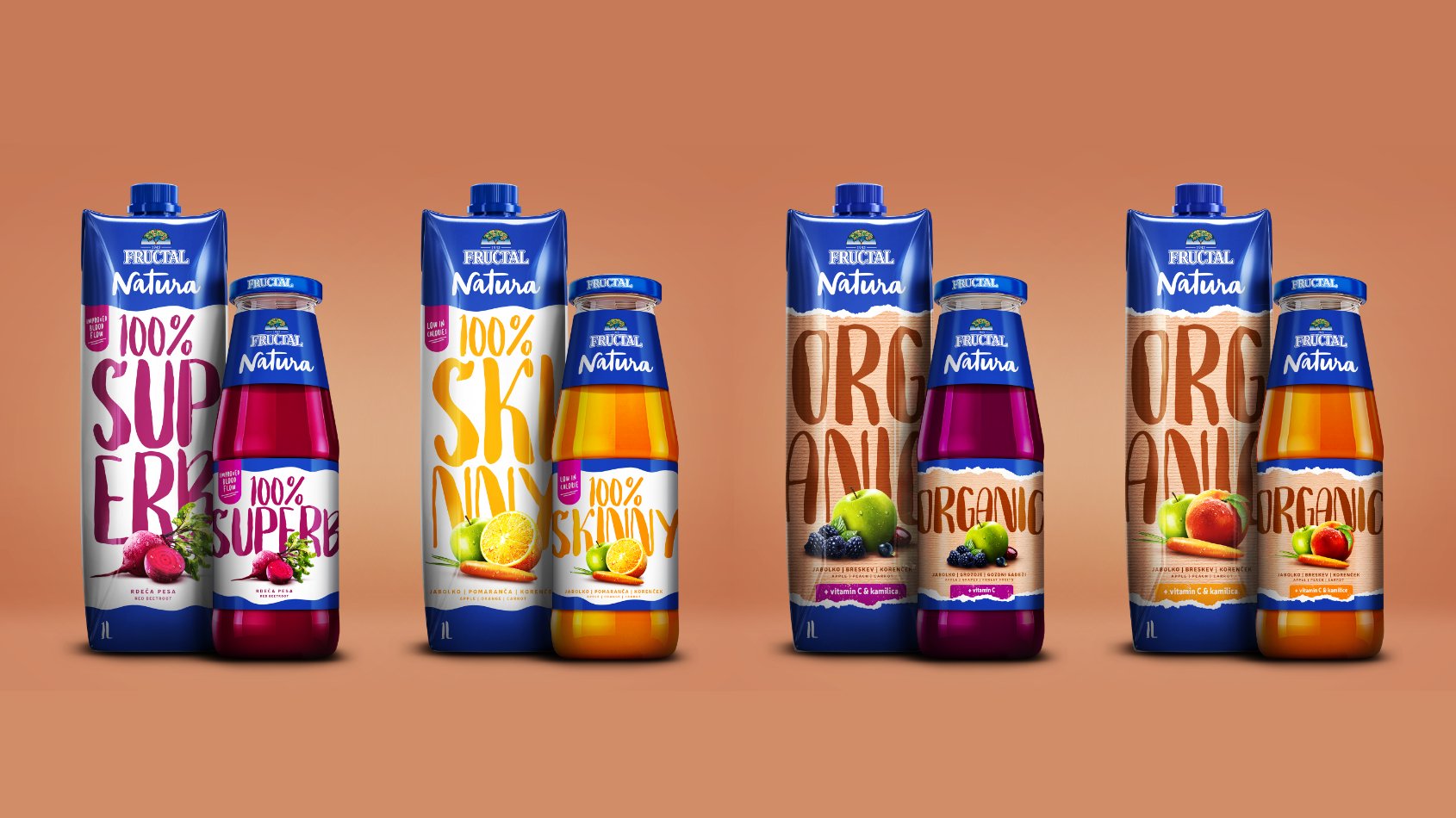
Fructal Natura — Functional Range Packaging
Milja Z.
Published
0
Packaging design for four products in Fructal’s Natura Functional range. The challenge was to make them feel unmistakably part of the same family while clearly separating the two organic juices from the other functional varieties.
I kept the Natura branding, header in Fructal’s recognizable blue, bold typography and composition consistent across all four products. For the organic pair, I introduced warm, textured backgrounds that give them a more natural feel. The other two are brighter in colour, have a cleaner layout to bring their individual benefits forward and communicate overall more modern aesthetic. Together, the designs create a cohesive range with two distinct visual expressions.