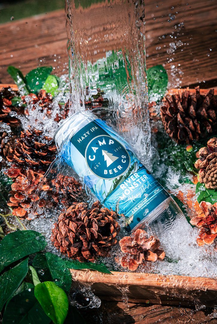
Camp Beer Company - Can Strategy + Design + Illustration
Aaron Armstrong
Published
Project Overview
This project focuses on developing a cohesive can design system that integrates illustration, typography, and art direction into a unified packaging solution. The objective was to create a design that communicates brand identity quickly at shelf level while maintaining visual interest and clarity across variants.
Illustration Direction
Illustration is the primary visual driver of the system. A custom style was developed to establish personality and consistency across the range. Each composition is built with attention to line weight, spacing, and balance so it reproduces clearly at small scale and on a curved surface.
The illustrations are integrated into the layout rather than treated as decoration. They work alongside typography to reinforce flavour cues and guide the viewer’s eye, creating a cohesive relationship between image and information.
Can Design System
The can layout is structured around hierarchy and readability. Typography is positioned to prioritize brand and product name, with supporting information arranged to complement the illustration. Consistent spacing and alignment create rhythm across all variants.
Colour is used to differentiate products while maintaining cohesion. Each palette aligns with the illustration style and supports the overall tone of the design. The system is designed to scale easily while preserving a recognizable visual identity.
Art Direction
Art direction guided how illustration, typography, and layout function together as a unified system. Defined principles around composition, hierarchy, and balance ensure consistency while allowing each can to express its own character.
Each design follows the same underlying structure, with variation introduced through illustration and colour. This creates distinction across the range while maintaining a strong sense of cohesion when viewed as a whole.
Production Considerations
The design was developed with production in mind, accounting for print constraints, colour reproduction, and how artwork behaves on a cylindrical surface. Attention was given to contrast and legibility to ensure the final result performs effectively in real-world conditions.
#packagingdesign #candesign #brandidentity #illustration #artdirection #graphicdesign