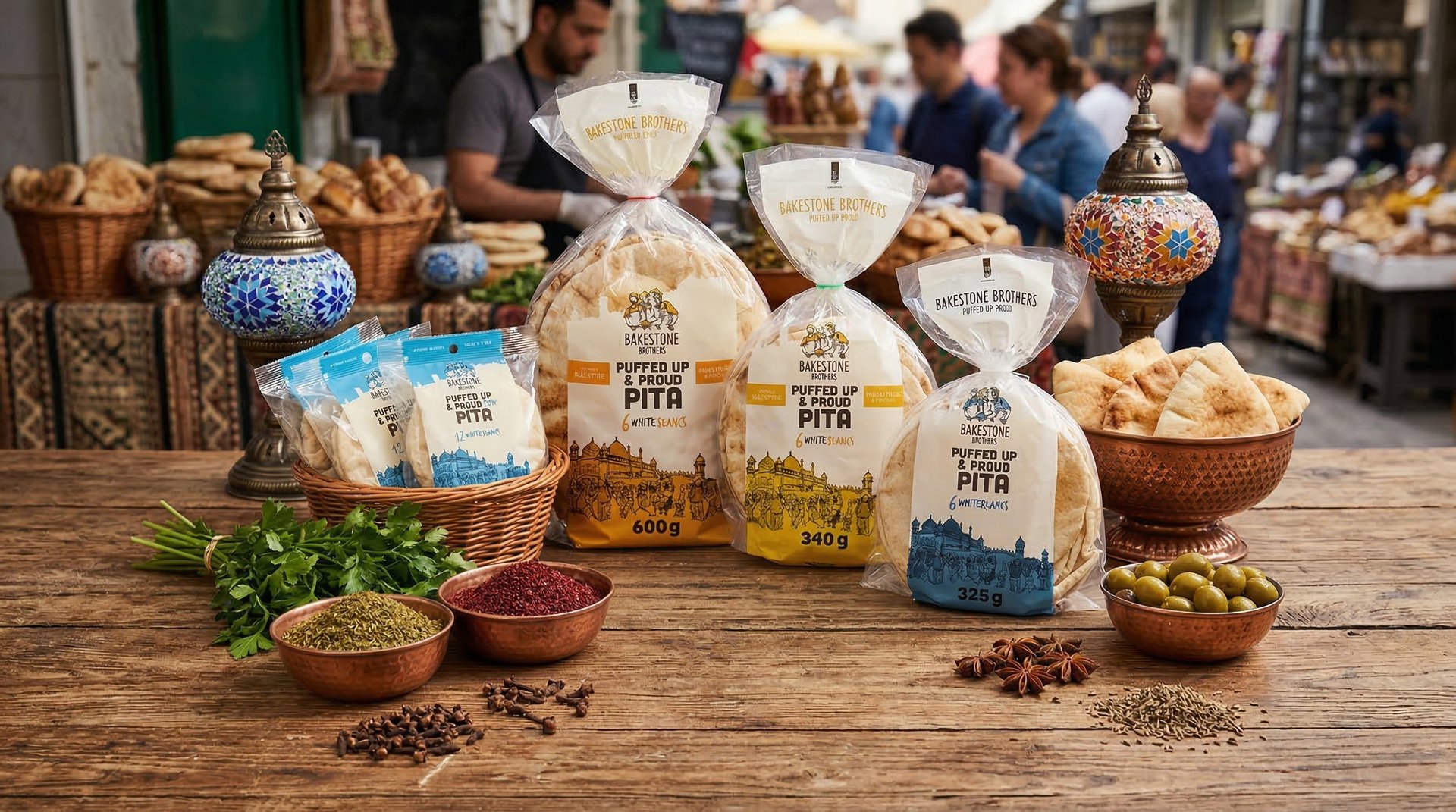
Bakeston Brothers - Packaging
Aaron Armstrong
Published
This project focused on developing a cohesive packaging system for Bakestone Brothers that balances brand storytelling, product clarity, and visual consistency across a range of packaged goods. The goal was to create packaging that feels crafted and approachable while maintaining strong shelf presence and a recognizable brand identity.
Design Approach
The design direction was built around a refined, structured layout system that supports both consistency and flexibility. Clear hierarchy was established through typography, spacing, and composition to ensure that each product communicates its key information quickly and effectively.
Colour was used as a primary differentiator between product variants while remaining within a controlled palette to maintain brand cohesion. This allowed each SKU to have its own personality while still feeling part of a unified family when viewed together in retail environments.
Visual Language
The visual language combines clean typography with considered use of illustration and graphic elements to reinforce a handcrafted, quality-driven positioning. Subtle textures and compositional balance help create a sense of warmth and authenticity without overwhelming the core messaging.
Attention was given to how each packaging component interacts, ensuring that typography, colour, and imagery work together rather than compete for attention. The result is a system that feels intentional, consistent, and easy to navigate for the consumer.
Packaging System
A scalable packaging system was developed to accommodate multiple product lines while maintaining visual consistency. Grid structure, typographic hierarchy, and placement rules were defined to allow for future extensions without losing alignment with the core brand identity.
This system ensures that new products can be introduced seamlessly while preserving familiarity across the range, strengthening brand recognition over time.
Summary
The final packaging reflects a balance of clarity, consistency, and craft. By combining structured design principles with a refined visual language, the system supports both functional communication and brand expression, resulting in packaging that is cohesive, adaptable, and visually distinctive across the lineup.
#packagingdesign #brandidentity #graphicdesign #packagingsystem #branding #visualidentity #typography #designsystem