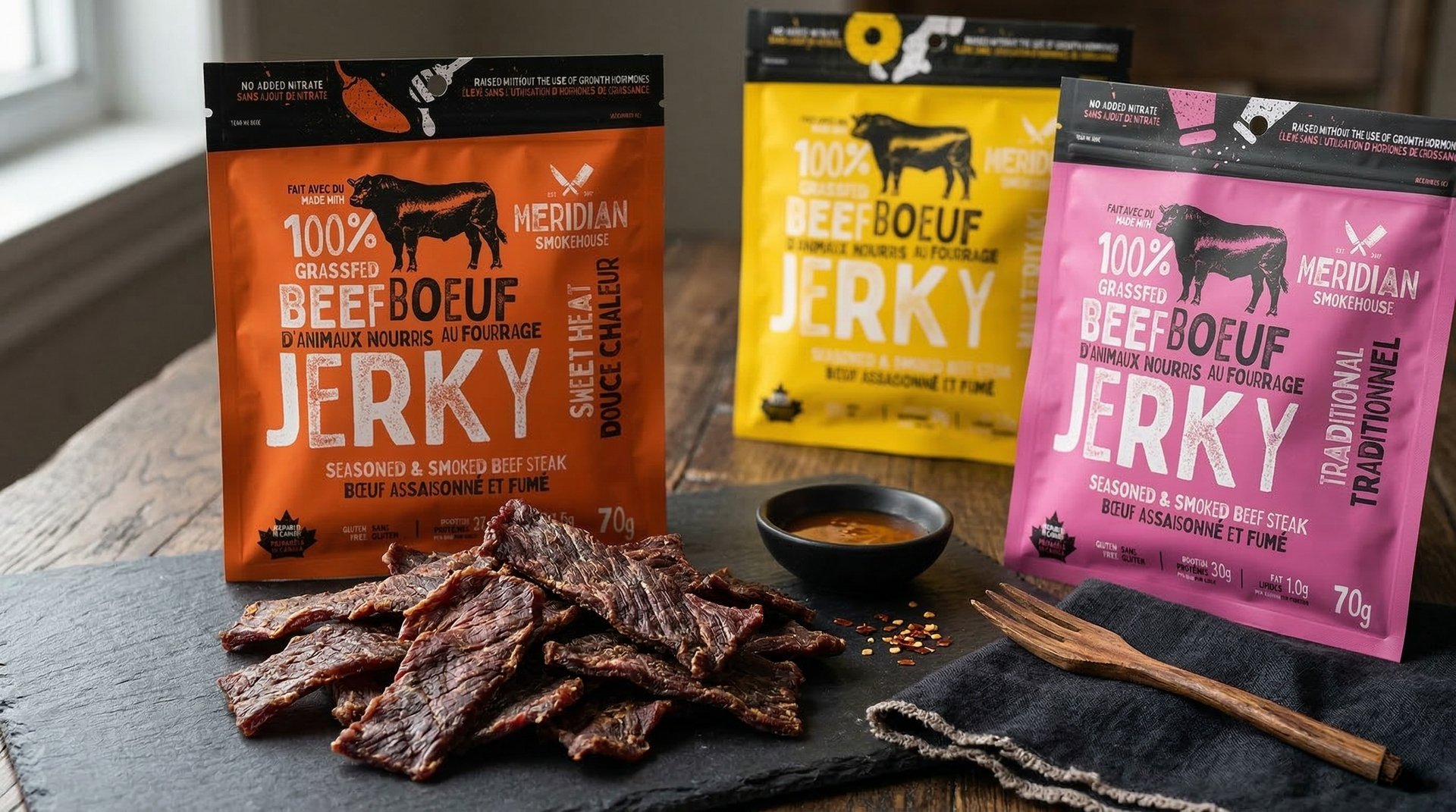
Meridian - Smokehouse Jerky Brand + Packaging
Aaron Armstrong
Published
This project focused on developing a refined and cohesive packaging system for Meridian that reflects a balance of modern simplicity, clarity, and brand consistency across a range of products. The objective was to create packaging that feels elevated and trustworthy while maintaining strong readability and a clear visual hierarchy.
Design Approach
The design approach centres on a clean and structured layout system that prioritizes legibility and organization. Typography is used as the primary vehicle for communication, guiding the viewer through brand, product name, and supporting information with clarity and intention.
A restrained use of colour supports product differentiation while maintaining a consistent and unified brand presence. Each variant is distinguished through subtle shifts in palette and composition, allowing for recognition without disrupting the overall system.
Visual Language
The visual language is minimal and deliberate, focusing on clarity, balance, and proportion. Composition is carefully considered to ensure that all elements work together cohesively without unnecessary distraction.
Typography, spacing, and alignment are treated as key design components, contributing to a sense of order and consistency across all packaging formats. Any supporting graphic elements are used sparingly, reinforcing the brand’s tone while maintaining a clean and modern aesthetic.
Packaging System
A scalable packaging system was developed to support multiple product lines while maintaining a consistent visual framework. Defined grid structures, typographic hierarchy, and layout rules ensure that each package adheres to the same underlying logic.
This system allows for flexibility in future product expansion while preserving brand integrity. New SKUs can be introduced seamlessly, maintaining alignment with the established design language and ensuring a cohesive presence across the full range.
Summary
The Meridian packaging system achieves a balance of simplicity, clarity, and consistency. Through a structured approach to typography, layout, and colour, the design delivers a unified brand experience that is easy to navigate, visually coherent, and adaptable across a growing product lineup.
#packagingdesign #brandidentity #visualidentity #graphicdesign #branding #typography #packagingsystem #designsystem