The Wax Republic — Brand Identity, Packaging & Web Design
Think Big Studio
Published
Brand development, packaging presentation, campaign direction, copy and website design for The Wax Republic by Think Big Studio.
THE BRIEF
Build a recognisable identity around a specialist wax product, connecting its first impression with the practical information on the pack and website.
THE APPROACH
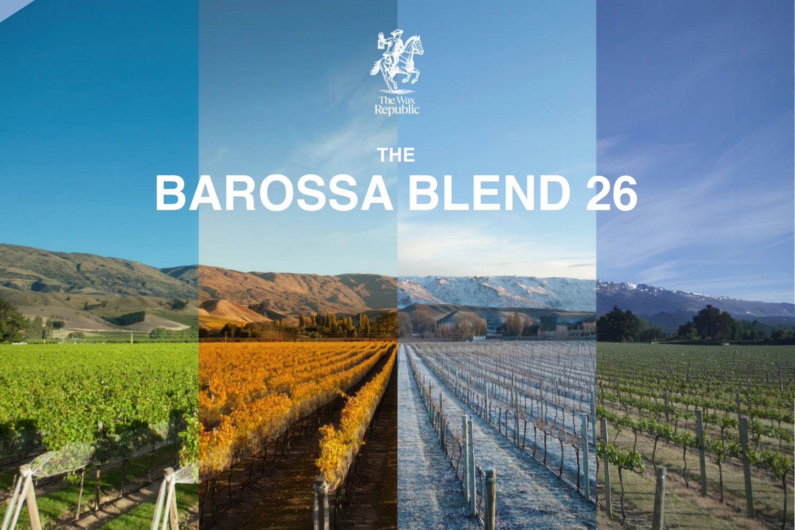
The illustrated rider and serif wordmark give the brand character. Quieter areas around product information preserve clarity. For Barossa Blend 26, landscape imagery connects the product name to a sense of place.
THE WORK
The identity, image direction and typographic voice carry across packaging, campaign creative, product copy and website design. Each application has its own job while remaining part of the same brand.
THE RESULT
A coordinated brand foundation for introducing products across physical and digital surfaces.
CREDITS
Studio: Think Big Studio. Product and campaign material from the supplied project portfolio.
Full case study: https://www.twine.net/signin