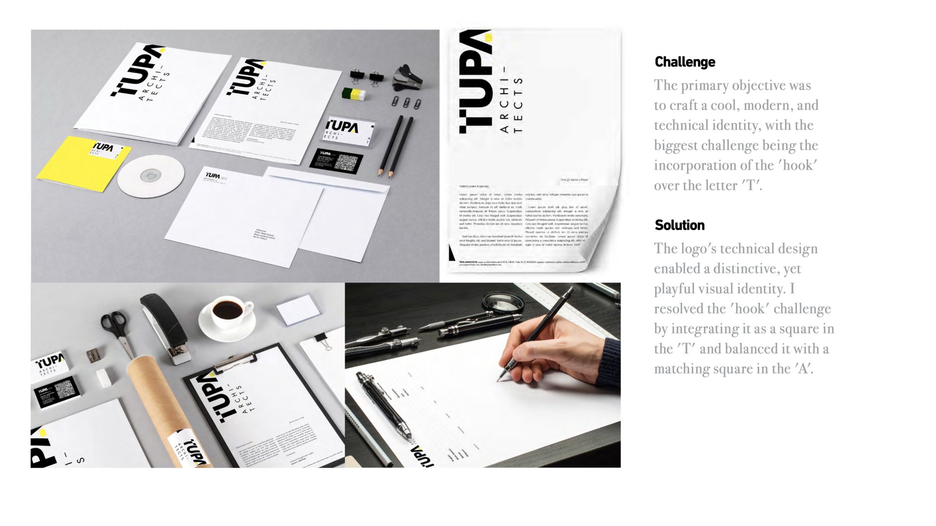
Brand materials Ťupa Architects
Karolina Rerichova
Published
0
Challenge
The primary objective was to craft a cool, modern, and technical identity, with the biggest challenge being the incorporation of the ‘hook’ over the letter ‘T’.
Solution
The logo’s technical design enabled a distinctive, yet playful visual identity. I resolved the ‘hook’ challenge by integrating it as a square in the ‘T’ and balanced it with a matching square in the ‘A’.