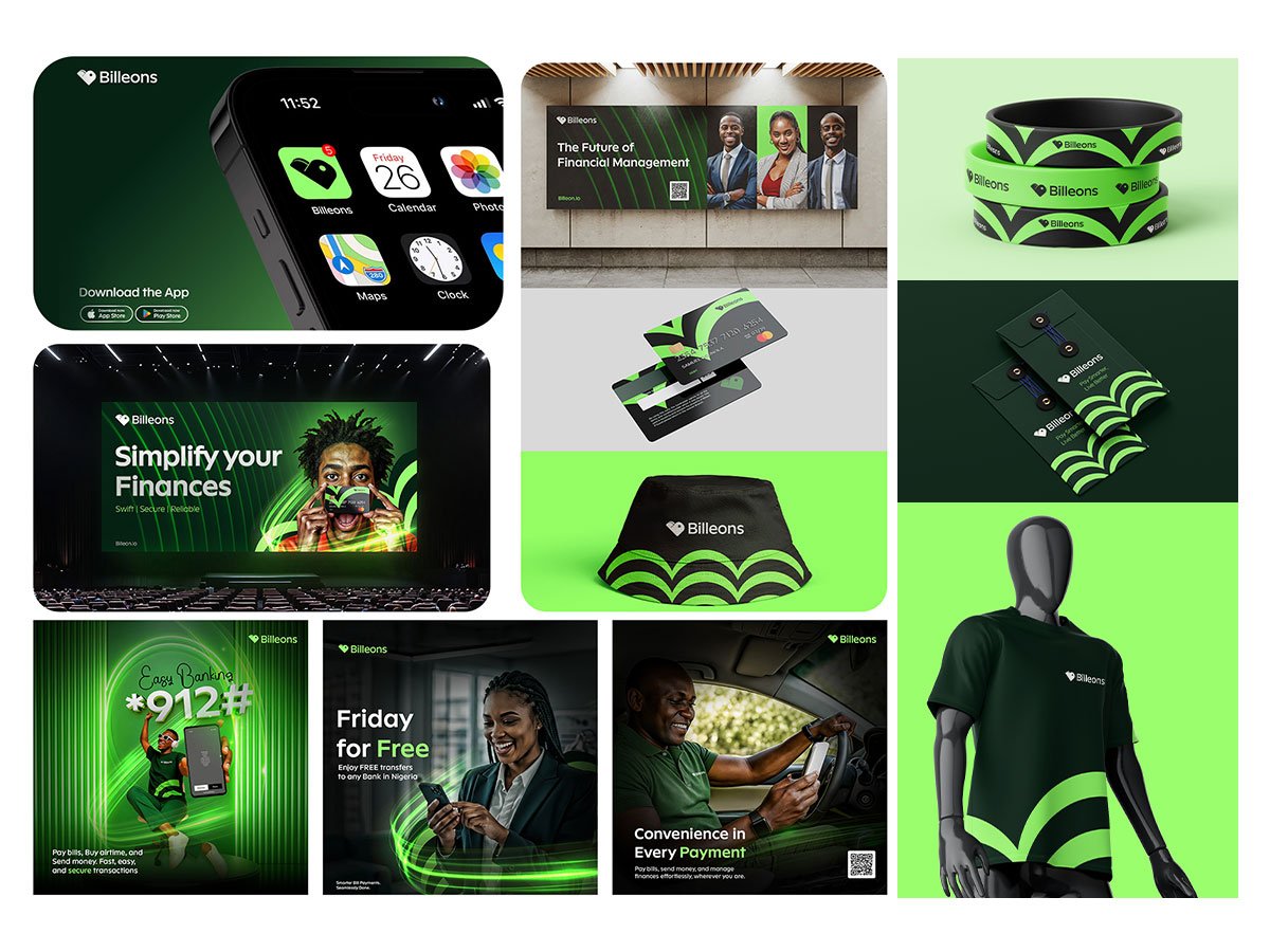
FINTECH_AD_CREATIVES
OKUNOLA SAMUEL AYO
Published
A logo that looks good on a phone is easy. A fintech brand that holds up on a billboard, a T shirt and a conference stage is not.
That was the Billeons challenge. Money apps run on trust, and trust breaks when a brand looks different everywhere it appears.
I started with deep research into the fintech space, competitor visuals and what makes people trust a payments brand. It showed where brands blur together and where Billeons could stand out.
My solution: one system built to scale.
Core system: green and black palette, one clean type style and a repeating arc pattern that works at any size.
Out of home: a billboard and a conference screen designed for distance and quick reading.
Merchandise: wristbands, a T shirt, a bucket hat and cards, adjusted for print and fabric limits.
Digital: app visuals, social media design and Instagram posts like “Friday for Free” in the same look.
Result: one identity that reads the same on a highway, at a live event, on a T shirt or in a feed.
Tools: Photoshop, Illustrator
Facing the same problem? I design brand visuals and social media posts that stay consistent everywhere your audience sees you. Message me and let’s build your system.