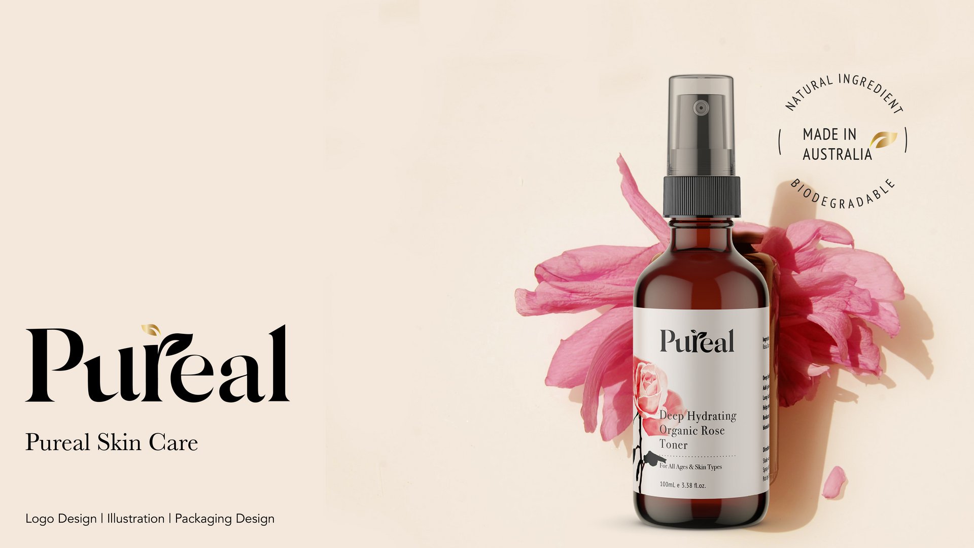
Pureal Skincare Rebranding
Sally Lee
Published
I had so much fun with this project. Pureal had beautiful packaging and had a natural look and feel of the brand previously. The client wanted to continue with the concept of watercolour drawings and the gold leaf symbol but upgrade the packaging and logo for a newer modern look while keeping the natural and organic feels to the brand. I updated the logo by utilising a modern and elegant typeface I found and combined the leafy symbol with the letter “r” for visual coherence.
I created digital drawings of each key ingredient, to emphasise on each amazing chemical-free natural extract that Pureal blends in their products. I focused on creating a bolder and stronger image that can have a presence in the packaging while steering clear from looking artificial look. #branding #illustrator #graphicdesigner #designer #logo