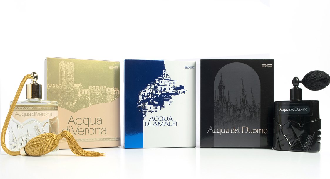
Brand and packaging design of boxes and bottles of the Christian Ros's Perfume Water line
Toni Traglia
Published
The graphics of the different products in the line elegantly interpret the views of historical Italian places.
The development of the range begins with Acqua di Verona, represented by the famous Scaliger bridge of Castelvecchio, to continue with Acqua del Duomo with the silhouette of the Milan Cathedral and end with Acqua di Amalfi, characterized by the houses of the ancient village overlooking the sea.
The physiognomy of the packages of the entire range reproduces in a sober and elegant way a behavior that combines tradition with current times. Interpreting the language of the perfume world in a valuable but not elitist way, the design of the packagings tastefully visualizes the essence of a territory.
Case and bottle of Acqua di Verona female version
As anticipated, the Acqua di Verona version was the first of the three types of products to be launched on the market. It had an immediate and unexpected success which led the customer to create the other two types.
The various types of products live both male and female. Here we see the female version of Acqua di Verona.
The image of the package was born considering the structural constraint of the glass bottle that already existed. To maintain consistency with the primary container, the graphics delimit the pink from the gold with the same profile that divides the front of the glass bottle.
The design that dresses the entire range takes advantage of line illustration which is then ennobled during the printing phase. In this case, the design of the Scaliger Bridge was reproduced with the pink color printed on a cardboard case with a metallic base.