When discussing branding and visual identity, most experts point out the importance of a strong logo. Bad logo design is a phenomenon sweeping the nation, and ruining many businesses’ success…
Decades of marketing research have shown that a logo plays a critical role in enhancing a brand’s image. Moreover, it can carry a meaning that elicits positive or negative consumer sentiments and influences purchasing decisions. And, perhaps most importantly, it holds the potential of aiding or hindering brand awareness, which, in today’s competitive business world, is everything.
But the truth is, even some of today’s top brands, have fallen victim to bad logo design. Fortunately, however, you can learn from their mistakes and ensure you choose the best of the best for your company.
So, without further ado, we present you with everything you don’t want to do with your company logo and offer a few alternatives you should try instead. Let’s get into it.
Bad Logo Design Examples: What Not to Do
Unfortunately, the internet is filled with examples of companies whose visual branding failed to rise to the occasion.
Some organizations have launched without realizing that their logo was a branding faux pas. Some went with choices that didn’t meet audience expectations. And some have created a logo that looked great but was too restrictive when introducing new assets, which was the case with the old Discord pictogram.

So how do you avoid these mistakes? Well, it doesn’t hurt to become familiar with the most common examples of bad logo design. The following are the top five errors you want to dodge.
1. Failing to set yourself apart
Arguably, the worst thing you can do when choosing a logo for your business is to blend in with everyone else in your industry.
For example, this logo by California Dental looks awfully similar to every other generic dentistry-related logo out there.

Sure, the pictogram may be clear about communicating what the business does. But, unfortunately, it fails to set the brand apart, positioning it as just another dentist’s office instead of pointing out the unique value the business brings to the table in an otherwise competitive industry.
2. Omitting the brand name
Research from 2017 shows that logos composed of a visual and brand name are perceived as more attractive than those which only feature one of these elements.
The fascinating thing is, many of the world’s leading brands only use pictorial marks or wordmarks (Pepsi is a famous example).
Now, large corporations with significant market shares may allow themselves to risk not being liked by consumers. Small businesses, however, don’t have the same privilege.
So, when choosing a symbol for your brand, make sure it’s composed of both an icon and your company’s name.
3. Using too much color
The same research study quoted above found that consumers prefer monochrome and black logos to colorful ones.
Now, admittedly, this may change as design trends evolve in the future. And, it’s important to remember that different target audiences have varied aesthetic preferences.
Nonetheless, it’s still a good idea to tone things down – especially if you want to avoid looking unprofessional or if your target audience consists of 4-year-olds, as the Playscape Playgrounds logo would suggest.

4. Sticking with outdated solutions
Another bad practice to avoid when designing a logo for your business is picking a solution that makes your company look dated.
For example, Audacity may be a stellar piece of (open source) software. Unfortunately, its logo is anything if not stuck in the early 2010s. It’s more than ready for a redesign.

Here are a few ways this logo could keep up with 2022 design trends:
- cleaning up the colors
- adding a wordmark
- simplifying the waveform
5. Ignoring the technical details
Lastly, looking at bad logo practices you want to avoid will help when investing in your brand’s visual identity. You must remember that great design means nothing without the technicalities that support a stellar aesthetic impression.
A logo that looks blurry – like the one below by Medical Alert Buyers Guide – or falls into the background won’t just fall on deaf ears.

Much more detrimental to your organization’s image, it will send the message that your brand is sloppy or unprofessional. That is definitely not something you should allow.
What Makes a Good Logo
Now that you have a solid idea of what not to do, it’s time to explore the elements that go into creating a beautiful logo for your business.
There’s one thing that all design processes have in common: they must start with in-depth research. When creating or commissioning a logotype for your company, both you and the designer must have a strong understanding of a few things:
Your business’s target audience
Your logo has to appeal to your target audience. Seeing how consumer groups have different aesthetic preferences, it’s not a bad idea to research what works amongst the people you want to make your customers.
For example, if you’re a B2B business, your best bet would be to choose a design that appeals to professionals, like the one used by Tresorit.

Your brand’s personality
The type of logo you choose should depend on your brand’s personality. That is, it should be effective at eliciting an emotional reaction that is in line with your branding.
Do you want to communicate that your brand is stable and dependable? In that case, color psychology suggests you might want to make your logo blue. Or, if you want to show that you’re an edgy company that’s not afraid to hustle for results, you might do better showing off a mean (but cute) mascot, like Adbadger does.

Your competitors
Finally, don’t forget to look into the strategies used by your competition. The point behind this is not just to identify the elements that your competitors use and that work.
More importantly, you want to do this so that you don’t end up committing to a logo that looks almost identical to that used by your biggest rival.
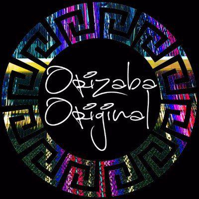
Choosing a distinctive design
The second step towards a company logo that works is to prioritize uniqueness.
You don’t necessarily have to go with an overly complicated design or choose an abstract graphic as the pictogram part of your logo. However, you should ensure that the final result stands out in a crowd while still reflecting your brand’s personality.
A great example comes from Orizaba Original, an eCommerce store that sells authentic Mexican textile products. The brand’s product range consists mainly of Baja hoodies and Mexican blankets. So, the design team decided to create a logo that reflects this aesthetic and is as colorful and unique as the clothes Orizaba Original sells.
Underline brand mission & values
Another super-important aspect of a strong logo is its ability to communicate a brand’s mission and values.
One of the best examples of a logo successfully doing this comes from Amazon. By using a simple wordmark and coupling it with an arrow that connects the letters A and Z, this brand manages to convey a hidden meaning that communicates that it’s the place to shop for absolutely everything consumers might need.

Similarly, a quick glance at the Beekeepers’ Naturals logo shows that this is a brand that wants to underline its commitment to sustainable and natural practices, which is why it features a minimalistic depiction of the insect it gets its name from.

Aim for timelessness
As you explore ideas for company logos, you must consider that it is not a temporary solution you should be looking for.
Sure, a rebrand can be a great choice for young businesses that need to regroup and restart. But research shows that well-established organizations that go this route almost always end up suffering a negative change in customer-based brand equity, which is definitely not something everyone can handle.
With this in mind, look for timelessness when evaluating logo ideas. A simple but meaningful pictogram like the one used by WhatsGood is always an excellent solution, especially when it’s combined with a wordmark.

Of course, this doesn’t mean that you have to aim for simplicity and minimalism. Classic, more intricate designs can just as well stand the test of time – especially when they’re used by luxury brands like Hermés.

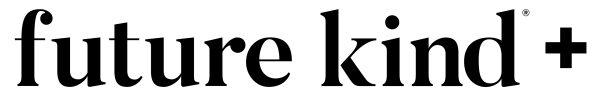
Focus on presentation & versatility
The last step that makes a good logo is keeping in mind that the visual signifier of your brand isn’t meant to work solely on its own.
Instead, when designing a logo for your company, remember that you will have to use it in a variety of settings, which means that the logo must fit in and stand out, no matter what you throw at it. With this in mind, it’s not a bad idea to go with something simple yet elegant, like the Future Kind wordmark.
Or, if that’s not your thing, then make sure to test out the visibility and contrast of your final choice on every asset you’re likely to use:
- Signs and banners
- Website
- Social media profiles (especially as a watermark on visual assets)
- Products and packaging
- Brochures
- Business cards
- Business documentation
Can a Logo Go From Bad to Good?
Is your company already established? Are you looking for ways to improve your visual identity? In these cases, you might be wondering whether a logo can go from bad to good.
The answer is a definite yes.
A quick glance at the history of the Apple logo, for example, will show that it started off as something very different than what we’re used to seeing from the brand today.
Or, for a more recent example of a rebrand, check out Pringles.
Pringles approached the rebrand saying, “it’s what’s on the inside that counts.”
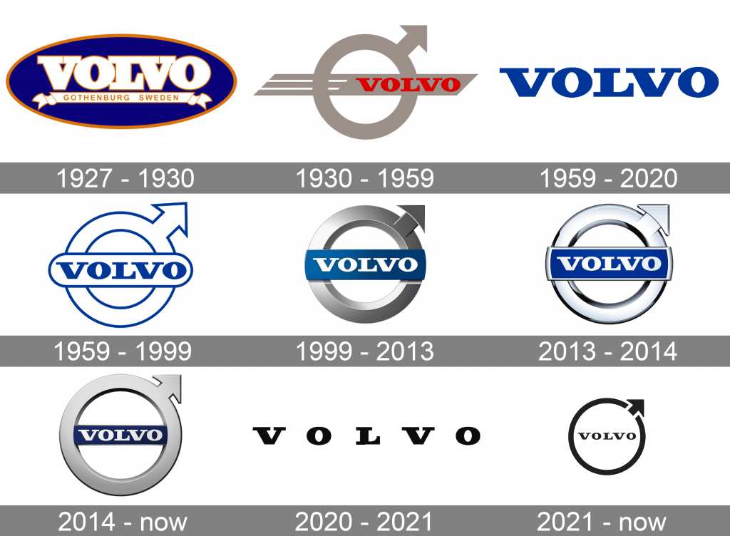
In truth, the aim of changing the logo was to make it youthful and in line with current design trends. This is something that many brands have been doing in 2021, with Volvo being another excellent example.
How to Choose a Logo Designer
Now that you know everything that goes into the best logos, it’s time to get down to business. Don’t experiment with the success and longevity of your business – go professional, and work with a great logo designer.
As you approach the process, remember that there are many more qualifiers than the price when selecting the person to create your logo. To pair up with the best person for the job, consider each candidate’s style of work and how it matches the visual direction you want to go in.
Moreover, it’s not a bad idea to take a deep dive into your favorite candidates’ portfolios. Pay particular attention to testimonials, as these will inform you about the individual’s style of work and collaboration.
After all, remember that communication and understanding are just as big of a part of coming up with a good logo for your brand. Don’t make the mistake of choosing to work with someone you’re not likely to be compatible with.
Takeaways
Great logo design doesn’t come cheap. When you consider everything it can do for your brand, you’ll quickly realize that paying more upfront can actually help you save money down the line.
So, don’t hesitate to look for the best of the best when hiring a graphic designer. And, of course, be prepared to do some serious brainstorming. Sure, considering all the ins and outs of your favorite design does mean that you won’t get a final solution in a matter of days or weeks. But if you think about the long run, it’s absolutely worth taking your time.
After all, your brand’s logo is the one thing consumers are most likely to remember you by. Make sure that it’s memorable – and in a good way.
Ready to hire? Our marketplace of over 410,000 diverse freelancers has the skills and expertise needed to skyrocket your business. From marketers to designers, copywriters to SEO experts – browse the talented bunch here!