
I came across a pitch deck, expecting to see a standard startup presentation. Instead, I was greeted by 25+ slides packed with tiny fonts, overwhelming data charts, and what appeared to be Comic Sans typography. By slide five, I had to close the document, not because the business wasn’t promising, but because the presentation was completely unreadable.
This scenario plays out more frequently than you might imagine across the startup ecosystem. Brilliant founders with genuinely world-changing ideas find themselves dead in the water, not because their vision lacks merit, but because they’ve fundamentally misunderstood how to communicate that vision effectively to potential investors.
Having spent over two decades building companies, I’ve experienced both sides of this challenging equation. My first business was in ad tech, which successfully scaled to seven figures in revenue. Now, I’m ten years deep into building Twine, which has grown to serve nearly a million freelancers across the globe.
Throughout this journey, I’ve pitched to hundreds of investors, raised investment, and reviewed thousands of pitch decks from founders around the world. That’s exactly why we created a free pitch deck template based on 101 successful decks – so you don’t have to start from scratch. 👉Download it here
The brutal truth I’ve discovered is that most pitch decks are essentially fundraising suicide, sabotaging promising startups before they even get a chance to tell their story.
The Million-Dollar Communication Breakdown
The fundamental mistake that founders consistently make stems from a misguided belief about what investors want to see during a pitch presentation. There is an assumption that comprehensive detail demonstrates thoroughness and preparation. If you show every possible feature, market analysis, competitive advantage, and growth projection, it will somehow convince investors of their startup’s inevitable success.
This leads startups to create presentations that span thirty or more slides, cramming every available space with dense information, complex charts, and microscopic fonts that require a magnifying glass to decipher. What these founders fail to understand is that some investors review over one hundred pitches every single week and make their initial assessment within the first three minutes of a presentation. In fact, you have about 10 seconds to pique their interest to even get those three minutes.
In this ultra-competitive environment, your primary objective isn’t to communicate every detail about your business, it’s to capture their attention, sell the vision, and make them genuinely excited to learn more about what you’re building.
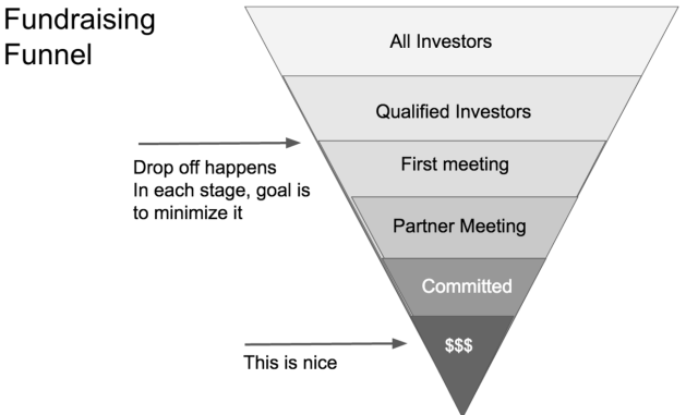
The fundraising reality: Most founders never make it past the first meeting. Your pitch deck determines which stage you drop off.
The $17 Billion Analysis That Changed Everything
Recognising the critical importance of understanding what works in successful fundraising, our team at Twine recently analysed one hundred and one successful pitch decks from companies that have become household names – Uber, Airbnb, Coinbase, Tesla, and dozens of other industry leaders.
These pitch decks collectively helped raise over seventeen billion dollars in funding across virtually every major industry and stage of company development. What we discovered through this comprehensive analysis completely challenged conventional wisdom about what makes an effective pitch deck.
The most successful presentations weren’t necessarily the most visually stunning. Instead, they shared three fundamental characteristics:
- Simplicity over complexity
Clear, focused messaging rather than information overload - Clarity over cleverness
Straightforward communication instead of elaborate explanations - Compelling storytelling
Emotional connection alongside logical justification
The Counterintuitive Patterns of Billion-Dollar Presentations
After reviewing the successful decks, several surprising patterns emerged that directly contradict much of the conventional advice circulating in the startup community.
The Power of Ruthless Brevity
Perhaps the most shocking discovery was how consistently successful companies kept their presentations remarkably concise. The numbers tell a compelling story:
- Airbnb: Exactly 10 slides for millions in funding
- Buffer: 13 slides that secured initial investment
- Mixpanel: 12 slides for significant venture capital
- Failed startup average: 27 slides with frequent rejection
This pattern reveals a crucial insight that more slides don’t demonstrate thoroughness or preparation, but they reveal an inability to prioritise and distil complex information into its most essential components. Investors interpret lengthy presentations as evidence that founders cannot focus on what truly matters for their business success.
Design as Your Silent Sales Representative
The visual presentation of successful pitch decks consistently reflected and reinforced the core brand values and product experience of each company. This alignment isn’t coincidental, it’s strategic communication at its finest.
Consider these examples of design-product alignment:
- Warby Parker: Clean, stylish presentation mirrored their mission-driven retail aesthetic
- Square: Modern, elegant slides reflected their simple payment processing experience
- Calm: Peaceful, minimalist design embodied their meditation app’s core promise
- Dollar Shave Club: Playful, memorable visuals matched their irreverent brand personality
Your pitch deck represents the first product demonstration that investors will encounter. It needs to communicate not just what you’re building, but who you are and what your company stands for. Given how critical this first impression is, many successful founders work with specialised pitch deck designers who understand both investor psychology and visual communication best practices. You don’t have to spend thousands on this, but an expert will really help pull it together.
The Supremacy of Storytelling Over Numbers
While data and metrics certainly played important roles in successful presentations, the most memorable and effective decks prioritised compelling storytelling over overwhelming statistical analysis. The most successful founders understood a fundamental truth about human psychology: data proves your point and validates your assumptions, but a story creates an emotional connection and makes investors genuinely care about your success. Your why now and problem slides are key.
Examples of powerful narrative positioning include:
- Beyond Meat: Positioned plant-based protein as inevitable evolution, not niche alternative
- Uber: Painted a vision of effortless transportation rather than just improved taxis
- Snapchat: Captured mobile photography as authentic self-expression for younger generations
- Coinbase: Framed cryptocurrency as the future of mainstream financial services
The Critical Importance of Market Timing
Every single billion-dollar presentation included a dedicated section explaining why the current moment represented the perfect opportunity for their particular solution. This “Why Now?” element proved absolutely crucial for investor conviction.
Successful timing narratives typically addressed one or more of these factors:
- Technology shifts: New capabilities that make solutions possible for the first time
- Behavioural changes: Evolving consumer preferences or business practices
- Regulatory environment: Policy changes that create new opportunities or remove barriers
- Economic conditions: Market dynamics that favour new approaches over established ones
- Demographic trends: Generational shifts that drive demand for different solutions
If you cannot convincingly explain why now is the right time for your solution to succeed, investors will likely conclude that they can afford to wait and see how the market develops before making an investment decision.
The Proven Architecture of Persuasive Presentations
Through the analysis of successful pitch decks, we identified a consistent structural framework that billion-dollar companies used to organise their presentations. This framework reflects a deep understanding of how investors process information and make funding decisions.
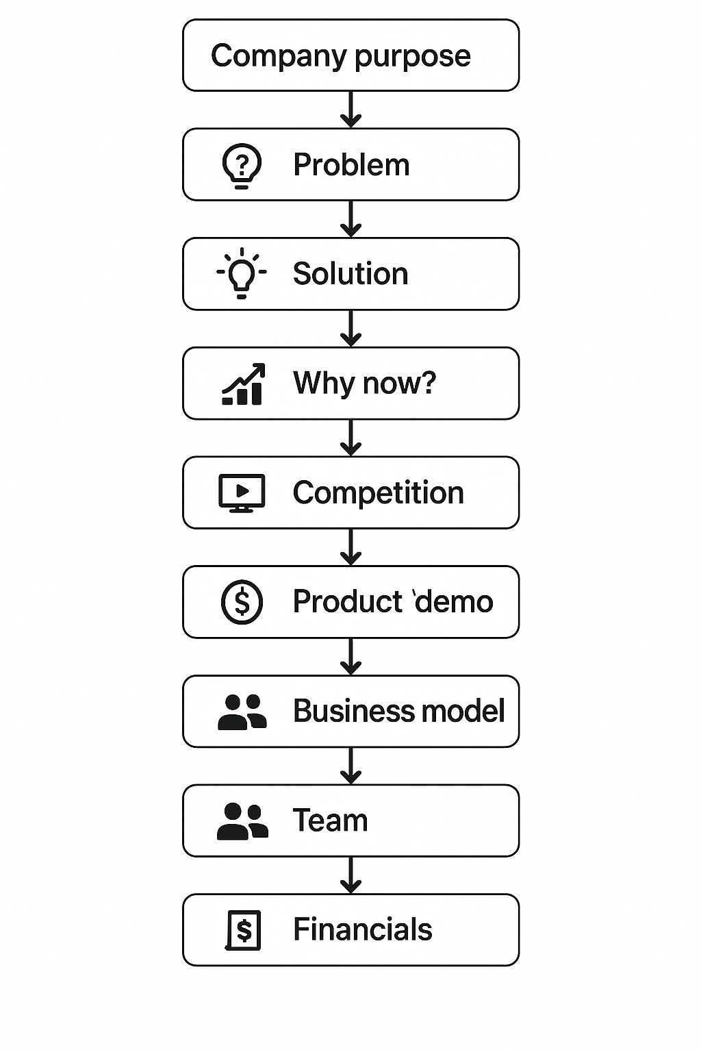
The Essential 10-Slide Structure
Slide 1: Company Purpose Define your business in a single, declarative sentence that clearly communicates what you do and why it matters in the broader market context.
Slide 2: The Problem
Paint a vivid picture of the pain point you’re addressing, making it personal and relatable while supporting your claims with credible market research and compelling statistics.
Slide 3: Your Solution
Explain how your product or service addresses the identified problem, focusing on core functionality and key benefits rather than exhaustive feature lists.
Slide 4: Why Now?
Articulate why current market conditions, technological developments, or behavioural shifts make this the perfect moment for your solution to succeed.
Slide 5: Market Size
Quantify the opportunity while focusing more on demonstrating a clear path to capturing market share rather than simply citing large TAM numbers.
Slide 6: Competition
Acknowledge alternative solutions while clearly explaining your unique positioning and sustainable competitive advantages.
Slide 7: Product Demo
Make your solution tangible and understandable through screenshots, user flows, or brief live demonstrations of core functionality.
Slide 8: Business Model Provide a clear explanation of revenue models, unit economics, and pricing strategy that demonstrates long-term business viability.
Slide 9: Team Showcase relevant experience and domain expertise that specifically qualifies your team to execute on this particular opportunity.
Slide 10: Financials Present realistic financial projections and key performance metrics that show a clear, achievable path to scalable growth.
Rather than starting from scratch, you can use our pitch deck template that follows this same structure, complete with guidance for each slide and examples from successful companies. Download the template to build your presentation using the same framework as Airbnb, Uber, and Coinbase.
The Visual Design Principles That Command Attention
Analysis revealed specific design patterns that consistently appeared in successful presentations, suggesting that visual communication plays a far more important role in fundraising success than many founders realise.
Professional Design Standards:
- Maximum of 2-3 fonts throughout the entire deck for visual coherence
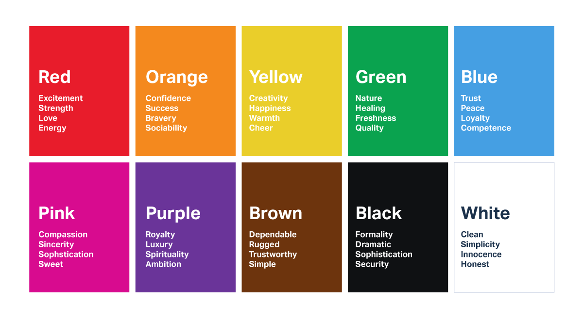
- Strategic colour choices: Blue for fintech (trust), bright colours for consumer brands (energy), grey for B2B (professionalism)
- Strategic white space that prevents cognitive overload and demonstrates confidence
- Simple, clear data visualisation with one insight per chart
Your pitch deck represents the first product demonstration that investors will encounter. Given how critical this first impression is, many successful founders work with specialised pitch deck designers who understand both investor psychology and visual communication best practices.
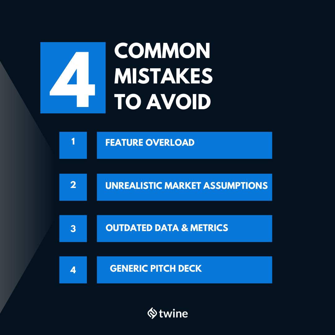
Common Pitfalls That Kill Deals
Through our research, we identified the most damaging patterns that consistently appeared in unsuccessful presentations:
- The Feature Overload Trap: Showcasing twenty different product capabilities doesn’t impress investors; it confuses them and suggests a lack of strategic focus. Focus on 2-3 core functionalities and explore them deeply.
- The Imaginary Market Fantasy: Claims like “if we capture just 1% of this $100B market” demonstrate a misunderstanding of business growth realities. Show a clear strategy for acquiring your first 1,000 customers, then scaling systematically.
- The Outdated Information Problem: Using six-month-old traction numbers or market data undermines credibility instantly. Every element should reflect current information, updated within weeks of investor meetings.
- The One-Size-Fits-All Mistake: Using identical presentations for seed stage versus Series A, or for different investor types. Develop stage-appropriate presentations that address specific investor concerns for each funding round.
The Psychology Behind Investor Decision-Making
After reviewing thousands of pitch presentations and sitting across the table from hundreds of investors, I’ve observed consistent patterns in how funding decisions actually get made. Despite their analytical training and systematic evaluation frameworks, investors are human beings operating under significant cognitive constraints that directly impact their decision-making process.
The Dual-Process Reality of Investment Decisions
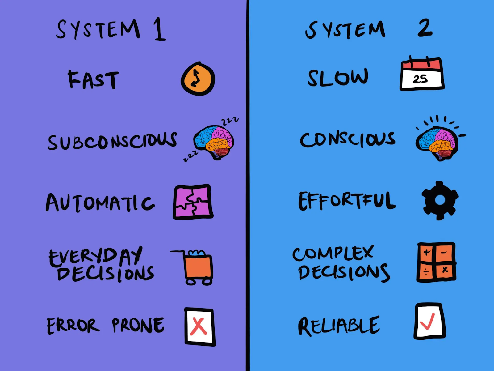
Modern behavioural economics research confirms what I’ve witnessed firsthand: investors operate on two distinct cognitive levels simultaneously. Daniel Kahneman’s work on System 1 (fast, intuitive) and System 2 (slow, deliberate) thinking applies directly to pitch presentations.
System 1 Processing (Immediate Reaction) Within the first three minutes of your presentation, investors form subconscious impressions about your competence, trustworthiness, and likelihood of success. This isn’t superficial judgment, it’s pattern recognition based on thousands of previous encounters. Visual presentation quality, communication clarity, and personal confidence create immediate impressions that either open or close investor minds to your opportunity.
System 2 Processing (Analytical Evaluation) Once you’ve passed the initial System 1 filter, investors engage analytical thinking to evaluate market size, competitive positioning, financial projections, and risk factors. However, this deeper analysis only occurs if your presentation successfully triggered positive System 1 responses first.
The Storytelling Framework That Influences Decisions
Successful pitch presentations follow archetypal storytelling structures that resonate with fundamental human psychology. This isn’t manipulation; it’s effective communication that helps investors process and remember your opportunity among hundreds of alternatives.
The most compelling presentations position the founder as the determined hero facing significant challenges, with investors cast as the experienced mentor providing resources and guidance. The journey involves realistic obstacles and clear milestones, leading to substantial returns alongside meaningful market impact.
Cognitive Biases That Impact Funding Decisions
Understanding specific psychological biases helps founders present information in ways that work with, rather than against, natural human decision-making tendencies:
Confirmation bias leads investors to seek information that supports their initial impressions. Strong opening slides that create positive first impressions influence how subsequent information gets interpreted.
Social proof drives investors to reference comparable companies and successful patterns. This explains why referencing successful companies like Airbnb or Uber in your positioning can be powerful when done authentically.
Loss aversion makes investors more motivated to avoid missing great opportunities than to maximise returns. Creating appropriate urgency around market timing and competitive positioning leverages this psychological tendency.
The key insight from behavioural psychology research is that emotional engagement and logical justification must work together. Data alone doesn’t persuade; it validates decisions that investors are already inclined to make based on emotional connection and intuitive assessment of founder potential.
Why This Matters More Than Ever
The startup fundraising environment has become increasingly competitive over the past decade. Investors are seeing more pitches than ever before while simultaneously becoming more selective about which opportunities deserve their time and capital. In this environment, presentation quality has evolved from nice-to-have to absolutely critical for fundraising success.
The New Fundraising Reality
The numbers tell a stark story. In 2015, the average VC firm saw roughly 1,000 pitches annually. Today, that number has more than doubled, while the number of deals completed has remained relatively flat. This means your odds of securing funding have effectively been cut in half, unless your presentation stands out dramatically from the crowd.
What’s Changed:
- Decision speed has accelerated: Investors now make preliminary decisions within 3-4 minutes instead of full presentations
- Quality bar has risen: What looked professional five years ago now appears amateur by current standards, which is why many successful startups now work with specialised pitch deck designers who understand current investor expectations and visual communication trends.
- Global talent pool: You’re competing against polished international startups, not just local companies
- Pattern recognition: Investors have seen thousands more pitches and quickly spot common mistakes
Final Thoughts
Your startup might genuinely have the potential to change the world and create massive value for customers, employees, and investors. But if you cannot communicate that potential clearly and compellingly, none of that matters.
The right pitch deck won’t guarantee that you’ll receive funding – there are many factors beyond presentation quality that influence investor decisions. However, the wrong presentation absolutely guarantees that you won’t receive funding, regardless of how promising your underlying business might be.
Ready to build a pitch deck that actually gets investor meetings and secures funding?
Download our comprehensive pitch deck template plus all 101 successful examples→
P.S. If you need professional help bringing your presentation to life, our network includes pitch deck designers who’ve helped YC companies and billion-dollar unicorns create presentations that secure funding. Find a designer here.