For more Creative Tools, check out the Freelancer Toolkit…
If you’ve ever seen a VW Beetle, an Eames lounge chair, or a Zippo lighter, you know how impactful design can be for the success of a product or brand. But just how important are the principles of design?
Well, science suggests that in digital spaces, design matters just as much (if not more) in compelling customers to convert. For example, a study from 2020 confirmed that visual design influences consumers’ perceived trust when browsing websites. Google later found that people made judgments about brands within as little as 50ms of exposure to a website.
Considering this data, it’s only logical to conclude that next-level design is essential in driving brand success. As it turns out, following a few relatively simple principles of design can help businesses ensure they’re seen in the best light – both on and offline.
So, if you’re looking for ways to take your website, branding, content, or product packaging to the next level, you’re in luck. The following principles of design are the ones to follow in 2022 and beyond…
Need a designer to take care of the hard stuff? Browse over 35,000 talented graphic designers ready to take on your project.
Use Negative Space Wisely
One of the best principles of design to apply in any of your digital marketing strategies is the use of negative space. Why? Well, there are a few good reasons.
First of all, using enough negative or white space allows attention-grabbing elements to stand out. This is the same whether on your site, in your posts, or even in print.
Secondly, negative space prevents viewers from becoming overwhelmed. The Google study quoted above, for example, found that the websites that had a minimalist aesthetic had a generally higher conversion from visitors.

If you look at the Edufront platform, you’ll see it features plenty of negative space, which acts as an (unseen) component. These areas draw web visitors’ attention to high-value page elements. In other words, it ensures that the unique value proposition and CTA stand out without having to compete with overwhelming visuals or too many colors.
Always Prioritize Clarity of Communication
The second principle of design to adopt is ensuring that every element on your website sends a clear message.
Many marketers make the mistake of using poor-quality image libraries, or recycling commonly-used phrases because they think these are good enough alone at communicating value or intention. The truth is, great design has to be capable of effectively conveying information.

For an excellent example of a brand that successfully utilizes visuals to communicate value, check out Instapaper.
By combining the power of a simple GIF and two simple sentences, the brand makes its unique sales proposition understood. Sure, the website goes into detail for those visitors who want more information – but by using well-chosen visuals and clear sentences, people know precisely what to expect.
Establish a Visual Hierarchy
Another principle of design that deserves your attention in 2022 – and beyond – is the concept of visual hierarchy.
Essentially, visual hierarchy was born out of the need to ensure high-value elements attract attention and are easy to understand. It’s obtained via spatial organization, i.e. layout. A design element that needs to stand out must be placed in a highly visible place, thus creating a hierarchy.
Secondly, size and contrast can communicate importance. High-value elements should always be larger than accompanying or background info. Moreover, they have to stand out visually against a background, which is why black and white design is so well regarded, even in the age of endless visual possibilities.
Finally, utilizing negative space also helps establish visual hierarchy, as it allows designers to single out the images or CTAs they want users to focus on.

For an example of this principle of design in action, check out the Compartés newsletter pop-up. This design uses size and contrast to point out how visitors get an extra 10% off by signing up for the brand’s newsletter.
Cater to Your Audience
If there’s one principle of design that even the best tend to forget about, it’s ensuring that your final product appeals to its target audience.
Often, designers and marketers choose colors, images, layouts, and even copy that appeal to their own sensibilities. While this can lead to a beautiful end result, it doesn’t always drive conversions. The simple reason for this is that the design, although objectively attractive, doesn’t truly speak to its target audience.
For this reason, when designing physical and digital assets, brands need to make sure that they’re using the appropriate elements that will resonate with their buyer personas.

For example, the company Voices caters to businesses. But, instead of going with a generic B2B visual direction, the team behind their branding honed in on production companies and creative agencies. They’ve employed a slightly playful approach to visuals with quirky talent headshots, cartoonish color palettes, and circular design elements.
Make Important UX Elements Easy to Reach
Great design is both beautiful and practical. So, if you want to strengthen your brand, you need to ensure that each of its assets actively works to make buyers’ lives easier.

As one of the absolute best examples of a design that prioritizes UX, check out the Google homepage. It includes several links to pages such as its advertising and business services, but the search bar – the most vital element, something 99% of web visitors are there to use – takes center stage and is easy to reach.
Of course, not all brands have the advantage of the whole world understanding their offer.

In these instances, companies have to add explanatory elements to their designs. However, by only providing instructions/information that is absolutely necessary – like in the case of Affinda’s invoice extractor – they can actively contribute to a positive customer experience. This is all thanks to following a simple design rule.
Don’t Reinvent the Wheel
Originality is essential in art, design, and product development. Science shows, however, that a certain degree of familiarity is better than solutions that are 100% new. There are several reasons for this:
- One research study measured the influence of familiar characters on children’s choice of objects. It found that kids tended to prefer items with familiar (cartoon) characters, even when they were of low quality or damaged.
- Original design often comes with a steep learning curve. The problem? Humans usually prefer the path of least resistance. Following widespread design rules may not be the best way to achieve originality, but, it might just be the key to creating a positive user experience…
- A certain degree of familiarity makes it easier to remember core messages. When there are no surprises in the way a webpage is designed, visitors are less likely to become fatigued. That means they’re free to spend their time reading, processing, remembering unique value propositions, following calls to action, or making a purchase.
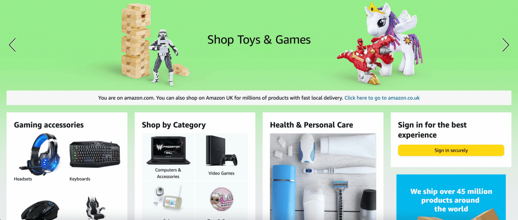
For example, everyone knows how Amazon works. Although the site’s design has several UX flaws, the reason the brand hasn’t been overhauled is that millions of people use the platform daily. If their expectations were suddenly upended, they would likely have negative emotions.
Apply Color Psychology
When we think of principles of design, we may start with this rather popular one. One that’s been around for (literally) centuries is color psychology. Why is it still relevant in 2022? Because it can help designers and marketers make the best choices when it comes to their digital assets.
The idea started with the ancient Egyptians, who used various hues to treat different ailments. It culminated with Carl Jung, who was one of the first to describe the properties and assign meanings to colors.
Generally, the reason why color psychology is influential in design is not that there is a universal meaning behind every color of the rainbow. Rather, people have been culturally conditioned to connect meaning or emotion with select hues.
For example, the idea that pink is for girls and blue is for boys is a cultural construct. Throughout the years, it’s become so ingrained in people’s subconscious that a 2012 survey discovered that those identifying as males tended to list blue as their favorite color, while those identifying as women chose red, purple, and pink.
With that in mind, businesses should be aware of the meanings associated with different colors. If nothing else, it will help ensure they avoid a faux pas and send the wrong (culturally conditioned) message. Some of the most common color meanings include:
- Blue – stability, dependability, harmony
- Red – excitement, passion, energy
- Green – health, money, fertility
- Yellow – happiness, positivity, optimism
- Orange – creativity, adventure, balance
- Purple – luxury, power, wisdom
- Black – sophistication, authority, elegance
Looking at these color meanings, it’s no surprise that John Deere’s agricultural machines, for example, are painted green. Also, Headspace uses yellow when inviting potential users to find joy. Or, that the Harley Davidson logo utilizes a bold orange to attract adventure-seekers.


Minimize Clutter
Last but not least, if you want to attract customers, don’t forget to apply this final principle of design. Minimize clutter in all your assets – even if you have a lot to say.
Research from the Nielsen Norman Group found that 79% of users scan web pages to find the information they’re after. So, if you want to ensure that they can get to that info quickly (without losing patience and going over to one of your competitors’ sites), do your best to employ simplicity.
Of course, if you have to describe complex concepts or convey a lot of vital information, you shouldn’t make any sacrifices. To guarantee that your audience has an easy time extracting value from your digital assets, do your best to remove all clutter from your designs.
Use short and simple sentences, for one. Limit your use of colors. Employ easily readable fonts. Utilize size to highlight high-value elements. Try to communicate through images wherever you can.
For inspiration, you can check out the Quetext plagiarism checker page below. Its advanced AI-powered solution is a straightforward app anyone can learn to use, regardless of their level of tech-savviness.

Conclusion
There you have it!
As you can see, none of these principles of design will require you to bust your back trying to come up with the next big thing. What they will do, however, is prevent you from making conversion-hurting mistakes or painting a negative image of your brand.
Whether you’re looking to reevaluate your online (and offline) assets, or are starting from fresh, rest assured that applying these principles of design will offer you a solid start. Once you’ve covered the basics, you can add a few advanced details to your branding, getting just the right amount of oompf to set yourself apart and wow your audience.
Ready to hire? Our marketplace of over 410,000 diverse freelancers has the skills and expertise needed to skyrocket your business. From marketers to designers, copywriters to SEO experts – browse the talented bunch here!