Discovery Early Learning Centres
Rain Lyall
Published
DISCOVERY EARLY LEARNING CENTRES
Brand audit | Identity refresh | Website | Art direction
CHALLENGE
Discovery initially wanted a simple flyer update. However, early on it became clear there was a disconnect between their strong values and how they were being expressed visually and verbally.
APPROACH
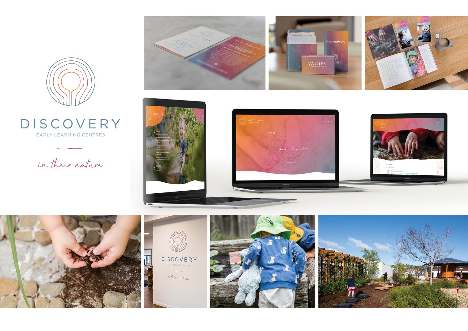
I led a comprehensive brand audit and repositioning process. This included developing the positioning line in their nature, while retaining the philosophy Imagine, Explore, Discover.
I drew their new brand colours directly from Tasmania’s natural environment, and designed their symbol to simultaneously represent the individual growth of each child, the rings of a tree, the wider
community, exploration, and the unique central-hub design of the learning centres themselves.
I also art directed photography to build a flexible content library, and designed a website deliberately aimed at parents rather than children – creating a clear point of difference in a crowded sector.
OUTCOME
The refreshed brand has rolled out across all existing centres and continues to be implemented as new centres open across Tasmania. The work strengthened brand clarity, consistency, and emotional connection with families.
discoveryelc.com.au #branding #logo #graphicdesigner #webdesigner #designer #illustrator