If you’re a business owner, a creative freelancer, or someone starting out in the way of digital tech – you’ve probably experienced infographics. But what about infographic icons? Is there really a way to revamp the classic infographic?
Let’s break it down.
Infographic Breakdown

According to the Oxford English Dictionary, an infographic (or information graphic) is “a visual representation of information or data”, including anything from charts to images and text. Infographics convey information, yet are highly engaging, so they are a precious tool for visual communication.
A typical infographic uses charts to visualize data and mixes colors and graphical elements to breathe life into facts and numbers. The more creative the infographic, the more effective it is likely to be: the key is to grab your audience’s attention for long enough to convey information successfully.

But, why are infographics so effective? Well, research has found that 65 percent of the general population are visual learners, meaning they remember and process the information provided by infographics, and other visual media, a lot quicker than anything else.
Makes sense right? We live in a fast-paced digital world, where everything is demanding our attention – new businesses, new products, new services, etc. By the time the clock hits 10 am, you’ve probably already scrolled past a dozen ads all competing for your attention – and you’ve not even had your morning coffee!
But this is what most businesses are missing. In order to create content that isn’t boring and scrollable, you have to think like your audience. What’s most likely going to catch your users’ attention, when they’re making their way through the tons of media?
Simple: easily-digestible content. Sure, that’s fine if you only have a sentence or two you want to get out there, but what if you have a lot to say? Enter: the handy infographic, a.k.a a ton of information, in a simplified, engaging form.
When Should Infographics Be Used?
To put it simply: there are a variety of purposes for an infographic. No matter the brand or business, whether you’re an educator, designer, or blogger – there’s a perfectly useful infographic out there, for your audience.
#1
Presenting survey data:
When it comes to interpreting survey data (e.g. NPS survey data, etc) – which can have the risk of being dry content anyway – using infographics is a solid strategy.
Numbers and stats can overwhelm a lot of audiences, and therefore lose much of their significance. However, if you organize your data in an infographic it becomes much easier to quickly draw meaning. For a little design inspiration, Pinterest has an awesome collection of survey data infographics here…
#2
Comparisons:
Comparisons can be difficult to display with static content – sometimes confusing the audience, rather than educating them. When drawing comparisons, infographics help organize similarities and differences by creating visual parallels that complement any information being presented.
To put it simply, infographics make comparisons become clearer. Check out this Pinterest collection of awesome comparison infographics here!
#3
Facts:
Sometimes, a simple list doesn’t necessarily display how interesting a fact truly is! When displayed using an infographic, these facts can be brought to life.
Grabbing yourself a designer, along with some high-quality icons, you can interpret the facts in a whole new light – attracting readers and turning a previously uninteresting post into an engaging and enlightening art form!
If you need a little inspiration, check out this awesome infographic on 6 Facts About Graphic Design Careers:

#4
Raising awareness:
Not all information is fun and light-hearted. Sometimes, you may need to interpret information that’s considered more nitty-gritty, but just as vital for your audience to know.
Here’s why infographics are an excellent choice of media to raise awareness – they’re engaging, so your audience will stop in their tracks to read what you have to say, AND they’re easily sharable. Want to get your message across, and fast? An infographic can be that idea that spreads like wildfire throughout your entire ecosystem of users.
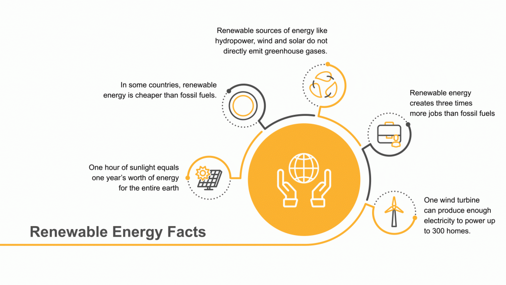
This infographic for example helps do the trick – not only is it raising awareness on renewable energy, but it also helps keep the viewer engaged using motion.
#5
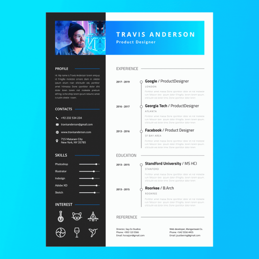
Resume:
Or what about if you’re a talented designer looking to find your next gig?
Infographics have long been used by creative professionals – mainly on resumes, as they’re a fantastic way of simplifying all of your achievements, and your experience. Plus, you can highlight your skills, and let your potential employer see exactly what kind of design style you bring to the table!
Here’s a motion graphic resume example that will certainly turn heads:
Infographics aren’t just for resumes, they can also be used in reverse by clients – organizing your job description in a clever and sophisticated visual way really sets a precedent for your brand and business…
Now you’ve realized the potential of infographics, it’s about time we introduced you to infographics’ best friend: the infographic icon.
What Are Infographic Icons?
So, we’ve established that infographics have been incredibly effective for many businesses out there. But how do you take the classic infographic that one step further? Well, with infographic icons.
Essentially, infographic icons summarize and communicate complex ideas quickly and easily. Icons are the perfect tool for representing ideas in the best visual manner and can add plenty of personality to your infographic.
Here’s a great example of animated icons in action, 6 Facts About Bees:

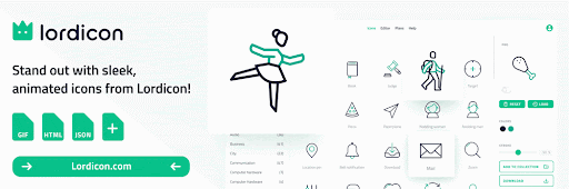
Want to try out some of these animated icons in your next infographic? Lordicon caters to all of your animated design needs.
Infographic Icons: The Power of Animation
Firstly, animated infographic icons bring movement into the picture, making your infographic much more engaging. Infographics are attention-grabbing as they are, so giving them that extra boost of excitement with animation can help skyrocket your engagement rate.
In fact, it’s easy to say users love animated content and videos. The multi-million dollar business Compare the Market, attributes a whopping 70% of its’ growth to the use of animation in its campaign. And, if that’s not enough to convince you, check this out – according to Insivia.com, viewers retain 95% of a message when they view it through motion media, compared to a drastically lower 10% when viewing through text. Maybe incorporating animation into your content is a good idea…
Secondly, animated icons create an element of surprise, which helps to drive engagement and popularity of posted content. People are always looking for something fresh, so inserting a spark of life into your infographics, (which are usually known to be static), helps keep your audiences’ attention.
Thirdly, including animation infographic icons can be used to emphasize the importance of specific data. If you really want to boost the memorability of your infographics, you can include animated icons, and effectively redirect user attention to the most significant elements of your content.
How Lordicon Can Help
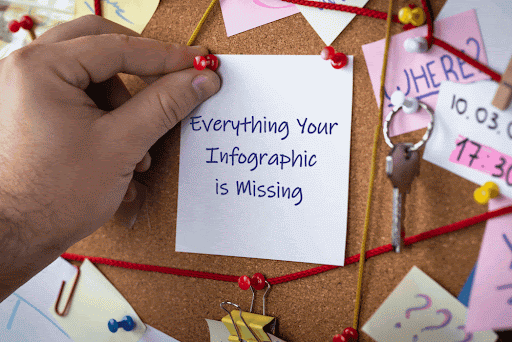
In the era of interactive content, everything your infographic is missing is animated.
With the help of animated icons, you can breathe life into your designs, capture your audience’s attention, and creatively emphasize data you find the most important.
Nowadays, innovation should not be lifeless – internet users love movement and novelty, so if you surprise them with your animated infographics, they may pay you back with outstanding engagement.
Ready to get hired? At Twine, we have dozens of top-quality jobs being posted each and every day. From design to marketing, development to copywriting – there’s a job ready for your skills. Join the marketplace of creative talent here.