So, what are the core UI Design Principles? Back to basics. Whatever you do, whether you’re a carpenter, artist, or rocket scientist, going back to the core principles of your niche pays many times over.
A strong foundation maintains structural integrity. It’s the same with the ever-expanding field of UI design. User interface design is a sector that is growing at a rapid rate – new and improved practices aside, going over the fundamentals is always a good idea.
In this article, we’ll be going over the principles of UI design, what makes good UI design and how UI design principles differ from UX design principles.
What is UI Visual Design?
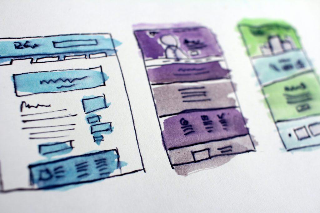
User interface design (a.k.a. UI design) is all about creating interfaces that users can interact with. It is the process designers use to build device interfaces with an eye-pleasing outlook and style. UI Designers aim to craft interfaces that users find easy and satisfying to use.
So, how do you achieve that goal, and create smart and effective interfaces with strong UI design?
Digital marketing consulting firms agree that user experience (UX) is a key factor to any marketing effort. These companies can innovate and challenge your ideas, being well versed in leveraging the power of digital strategy services.
Putting users in the driver’s seat is the first step. As in the automotive industry, they might say they like a manual transmission; alas, automatic cars sell more.
It’s simple – following the core UI design principles is the way to go if you want to achieve a seamless user interface design!
Don’t Make it Complicated
Have you ever noticed the common thread between the great musical hits – from this era, or any other?
They have one thing in common – simplicity – almost every timeless classic uses the same four chords (C–G–Am–F).
What’s the connection between a hit song, and great user interface design? Well, UI design is the same as composing a global hit: complexity doesn’t equal quality, quite the contrary.
Users, generally, tend to gravitate toward simplicity. They feel most comfortable when they can effortlessly use your product or navigate your website. The user interface should be simple, elegant and easy to understand.
Good UI follows the same software design principles – it provides users some context of where they are, where they’ve been, and the next few steps they should take.
A user interface element can be used to achieve this – think, prominent visual cues (such as highlights) that help users predict the result of an(y) action they take.
Be Consistent

Consistency is an essential trait of a quality UI design and one of the core UI design principles. The main idea of consistency is usability and learnability – in other words, if users can “transfer” their knowledge and skills from one side of a UI to another – eureka, you’ve successfully crafted a consistent UI!
Consistent navigation will guide users to find desired information quickly and efficiently, straightening the learning curve when learning various product/website features.
Consistent UI design also reduces friction, with lack of consistency in your UI design misleading users and causing an unwanted, bad user experience.
Visual Consistency
Unless it’s a deliberate design choice, you should always use the same colors, fonts, and icons throughout the product/website. Your visual style MUST NOT change for no apparent reason.
A subscribe button (CTA), for example, should look the same on every landing page. That’s why you should choose the best fonts to use, colors that complement your site, and icons that match your website’s overall aesthetic.
Functional Consistency
Every element should behave and work in the same way throughout the interface design. Users don’t want (and definitely don’t expect) any surprises in interface behavior mid navigation.
After all, when things don’t work as expected, they are perceived as broken!
Have a Familiar Interface
In addition to simplicity, an average user loves familiarity. If something works well, why change it? A consistent UI design – that follows similar, core UI design principles – is easy to understand – no instruction manual needed.
The best practice is to appeal to your users’ previous experiences when they interact with your product/website. Designers achieve this by utilizing familiar concepts, design elements and wording within their UI design.
It’s even advisable to one-up your competitors by emulating what they do best, optimizing where they’re lacking.
Remember, your app/website is new, so your users will be relieved to see familiar elements. Creativity is always a plus, but overcompensating can transform smooth navigation into a slippery user interface.
Lastly, you should never change the flow of the elements such as:
- Calls-to-action (CTAs)
- Clickable icons
- Navigation menu
- Payment process
- Common colour codes (Graphic design 101: green for a positive outcome, red for errors, etc.)
Employ Strong Visual Hierarchy

As the basics overview goes, visual hierarchy is THE fundamental element of the UI design principles. Without a visual hierarchy, your interface will be cluttered and disorganized.
But, what does visual hierarchy mean exactly?
Well, it’s the arrangement of elements in order of their significance or volume on the screen – some elements will have more visual weight and attract users’ attention effortlessly.
What’s imperative, is presenting a clear viewing order to the visual elements of your user interface design.
When discussing the eight golden rules of interface design, Professor Ben Shneiderman of the Department of Computer Science in Maryland has summed it up pretty well – check it out here!
Emphasise visual weight on primary information
The primary information should be highlighted and placed in the center, focal areas of your UI design. It’s a known fact that users don’t read the content thoroughly at first – instead, they scan it. So, use bigger, bold fonts and strong colors in order to catch the viewer’s eyes at first glance.
Secondary information should always stay, well, secondary. It supports primary information, so visually, it should complement it accordingly.
For example, the headline of this blog – The Core UI Design Principles – requires much more attention than the text you’re reading concurrently. Therefore, the headline, as primary information, is emphasized the most. Sub-headers complement it, while body text is all the good, essential stuff that fills in.
The four core elements in building a visual hierarchy within your user interface design are:
- Size
- Color
- Contrast
- White space
Streamline Actions/Steps
The primary tasks on a web page should be obvious, with actions taken by the user in as few steps as possible.
Minimizing user effort should follow a 3-click rule. What is the 3-click rule, you might ask? In a nutshell, if the users can’t find what they’re looking for in three clicks or less, they WILL become aggravated and leave your site/app for good.
Users want to put as little effort as possible – many UI design elements serve to reduce user cognitive load with an average user processing information partially. It is recommended to divide all information into chunks and eliminate everything that slows down the user journey. Cut through the noise that irrelevant information will create for your user interface design and solidify the emphasis on the core information.
Streamline your UI design: all the information across the screen should be valuable and relevant ONLY. Each screen needs to have one main focal point and/or purpose, with the primary action upfront and everything else deeper on a page, maybe with lighter visual cues.
Improve Efficiency

Make your UI design 100% efficient – that’s the goal for the best interface design!
To do this, make sure the average user can complete their main task in the most efficient way and never lose track of their work. You should also be performing a constant task analysis.
Put yourself in users’ shoes: try to emulate the user’s processes, understand their goals and streamline everything along the way.
Then, measure the effort required to complete the task. How many clicks, forms and screens must a user go through to reach the desired outcome?
This leads us to the next UI design principle…
The User Should Be the Focus
User interface design, or user centric design, is all about crafting products/websites that appeal specifically to your target audience. Therefore, designers should conduct insightful user research and figure out demographics, needs, wants and behavior patterns.
After all, you need to know and understand who your users are in order to properly cater to them: understand what they want, what they need etc.
The best way may be to talk to them directly – conduct A/B testing, surveys and any other method that takes direct user input, in order to get an accurate idea of how your user interface design is coming across.
People generally have specific expectations about the apps/websites they use. So, designing your product in a way that contradicts user’s expectations is strike one – it doesn’t matter if you believe you made a genuine upgrade, users are the jury to your UI design.
The unwritten law is to follow the platform conventions and stick to those UI design principles we keep talking about. Don’t reinvent patterns, design conventions and absolutely never try to change conventional terminology.
Remember, people come first, design comes after!
Respond to User
Every time a user performs any action, the interface should respond accordingly. The response should be near-instant. Never let your user wait, as waiting causes frustration and directly feeds the bounce rate.
If a longer wait is absolutely necessary, let your users know how long it’s going to take by using the progress gauge. If they are to fill out a long, multi-page form, inform them of their progress and how many steps are ahead of them.
Effective user input subconsciously tells users that they are in control of the process. Actions should have a clear beginning, middle and end. One of the easiest ways to communicate this to the user is to provide timely and relevant feedback.
You can use both visual and audio feedback. Although audio feedback causes more trouble and makes users nervous, it’s a good way to notify them about potential problems. It is advisable however to present them with an opportunity to disable audio.
You can take this approach even further by applying a wider area of personalization and bringing more human-friendly options. It is a bolder method, but you can allow users to change the colour of some graphic design elements that appeal to their personal taste.
Engineer for Errors

Mistakes are an unavoidable part of the user journey so you’ll have to learn how to handle them and transform them into advantages. Error messages without context and/or solution will infuriate your user.
A well-crafted error message, however, can turn frustration into conversion by pointing in the right direction.
Make it Adaptable/Flexible
Create a UI that works and looks great across many different platforms, but also different devices. A responsive UI design is a key to product/website longevity.
Giving your users a flexible system means presenting them with more control of what they’re doing, which in turn contributes to the overall user experience.
We live in a time when mobile-friendliness is one of the key ranking factors. In fact, according to Google, if the mobile version of your app/website is difficult to navigate more than 60% of your visitors will abandon it.
Conclusion
Many talented UI/UX designers make a mistake by designing in a vacuum, apart from users. While the results are often pretty and potentially ingenious, they fall flat when it comes to the fundamentals. Following our core UI design principles will help you produce an excellent user centric interface, and ensure you’re getting repeat clientele!
What is the mission objective? Producing a user friendly interface, which means it can’t be done without the star of the show – the user. Test your UI design choices and gather user feedback. Only then will you know you’re on the right track.
The interface of the future must be intuitive, responsive, exciting, predictable, and most importantly, satisfying to use.