For more Creative Tools, check out the Business Toolkit…
Consider your website to be your brand‘s digital home—its house, if you will. Anyone interested in doing business with you will wish to come in and look around. That’s what your website’s header design is: the front door that makes people want to learn more about your business.
The first thing they notice will either fascinate or disengage them. The website header design is the first thing visitors look at before scrolling down for more, so it should reflect your brand’s best qualities.
Ready to learn more? Let’s dive in.
All of our Web Designers are vetted, so you know you’re working with the top talent.
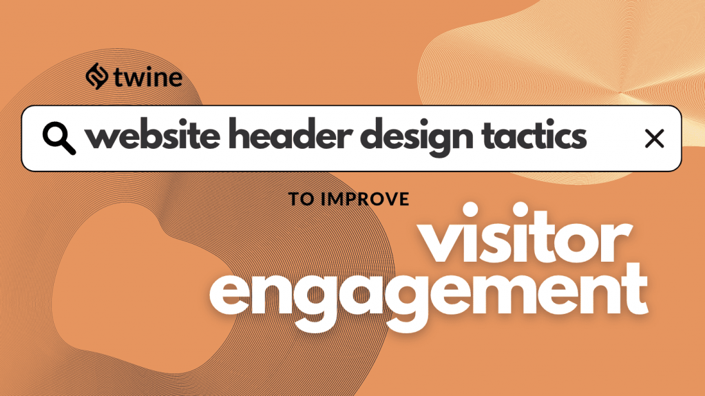
Website Header Design Tactics and Practices
The website header design is critical for incorporating numerous incentives that are helpful in boosting customer engagement. These components often include:
- The company’s logo
- Navigational elements
- A headline or a tagline
- A search option
- Calls to action
- Visuals such as images or videos
- A social proof element
- Social network links
Other than these, there may be additional items to include in your website header. Of course, there’s no universal recipe, so every company will need to pick and choose the tactics that will best resonate with their brand.
You’ll notice that some of them can even be contradictory; after all, design isn’t paint-by-numbers. We recommend that readers assess their needs before implementing the tactics described below.
Present the value of your product
Customers always approach a business with their needs in mind. They want to understand how a product or a service can provide them value, and they don’t really care about the details of the features that deliver this value. You need to ensure you communicate from this perspective in your header. Always prioritize value over features in header messages.
This, of course, has to be balanced out against also describing what your product actually does. Focus on telling the customer what these descriptions mean for them from their point of view.
It’s also incredibly important to convey your message in clear, simple language. Your products/services may have amazing, complex features, but only a tiny portion of your visitors would understand any overly-technical headlines. Catering to the less knowledgeable is always the way to go in this regard.
Other ways to highlight the value of your offer include:
- Place an explainer video
- Provide stats and success rates
- Showcase social proof
Semrush capitalizes on this approach big time. They offer tons of features for online marketing, but their main message focuses on their value. Additionally, they add powerful social proof right below the headline.

Allow users to perform intelligent searches
Headers are a great place to put a search function because this is where users expect it. The search tool is a must-have (especially for ecommerce companies), and our intuition tells us to look for it in the header.
The search tool is a simple element, so let’s summarize the best practices when creating one:
- The search bar needs to be wide enough to fit in search terms or questions of various lengths.
- There should be no cluttering, cutting, or overlapping when users input their inquiries.
- A useful search tool will have features such as autosuggestions, filters, and instant results.
- The final action of performing the search needs to be clear and intuitive. You don’t want any bugs or friction here, and you certainly don’t want users to be unsure of whether they’re doing it right. Clicking on a simple magnifying glass icon or “search” button will keep things simple and easy.
- Too many advanced search options are a don’t. Add them to the search results page instead.
MarketBeat, a finance and investing insights platform, utilizes all of the best practices for the search tool in its header as shown on its best dividend stocks page. With enough width and the recognizable magnifying glass icon, visitors can easily get what they’re after in seconds.

Add compelling CTAs
Calls to action (CTAs) are a powerful way to get people to convert, and every website header design needs to have them. Their goal is to urge visitors to take an action or to help them accomplish what they came to do on your website in the first place.
Some of the best practices for placing CTAs in the header of your website include:
- Making them recognizable with eye-catching colors and a distinctive style
- Placing them in a strategically-chosen location
- Adding a short, bold inscription such as “Sign Up,” “Book Here,” “Buy Now,” “Read More,” etc.
It’s very important to note that there should be a link between the CTA messaging and the information around it so that there’s a compelling reason for visitors to take the first step toward conversion.
In that regard, a CTA that hints at the value of your products or services will perform much better than a bland statement. Adding something compelling like “Start Using Now” instead of “Buy Now” will help you limit bounce rates.
Shopify is a great example of how to supplement main messaging with an effective CTA. With only one click, they can convert casual visitors into leads by offering them to try their service.

Display your website’s core functionality
Showing your visitors how your services work as soon as they arrive on your website can bring more value to them than anything else. You want to get straight to the point and prove to them that they haven’t landed on your website for nothing.
And sure, you can get clever with sales talk and marketing mechanisms. But most of the time, it’s better to show than tell. This is another chance to add a strong CTA by adding a functional element that your visitors can try right away. This works best for businesses that sell online tools (such as PaaS or SaaS).
UnscrambleX shows us a terrific example of core-functionality integration.
Their Scrabble aid tool is the main element of their simple web header. As soon as visitors arrive on their webpage, they can use the tool and discover a solution without having to look elsewhere.

Embrace negative space
If your brand’s aesthetic focuses on clean and simple design, it’s only natural that you’ll want to design a minimalistic and seemingly effortless header. In fact, you might want a toned down, simple-but-effective header even if your brand visuals aren’t strictly minimalist.
Attacking the visitor’s senses can be overwhelming for them and produce the opposite effect. On the other hand, simplicity can allow them to focus on the main message. Eliminating an overload of various elements can help reduce design noise and aid navigation.
It’s recommended to use clear words and concise phrases with clear, large fonts to keep things neat. Allowing elements to have enough negative space between them will make them stand out in a better light. Remember, do this only if your product or brand identity allows it. Negative space is a strategic way to draw a visitor’s attention to high-value UI elements.
Take a look at Creative Dreams, a digital design company. Their header only contains a few subtle colors, the main message, a CTA, and an illustration. In between, there’s a lot of negative space that makes all of the other elements come to life.

Bring the eye candy!
As an alternative to the above approach, putting many different elements on your website header can also work if done correctly. However, it’s crucial to make sure that the busyness of this type of header doesn’t detract from crucial elements like CTAs and value propositions. As busy as it is, the header can and should enhance the overall engagement potential of these elements.
One way to design a successful, playful header is to utilize a font that stands out or to make different parts of the header have a font of various sizes. That way, you can optically scale the elements according to their importance.
You’ll have to be very careful here, though. Use this tactic only if it resonates with your product and brand identity. If you try to be too flashy and make your header look like a Jackson Pollock painting, you might not get good results.
Heinz is quite successful at using this tactic. They’ve incorporated their signature colors into their header, and they’ve even added a fun cartoon to engage their audience.

Highlight social proof
Assuring your visitors that doing business with you is always a safe bet is priceless. And you can do that right within your website header.
It’s vital that visitors have, in the back of their minds, the notion that your brand is credible as they browse your site. Establishing this credibility early on is super important, which is why a header is a great place for highlighting social proof.
Adding a social proof element can be effortless, as you can simply incorporate your Amazon or Trustpilot star rating in a carefully selected location.
Another way is to add short customer testimonials. Visitors will like this because they are usually bombarded with brands trying to sell them things, so finding one that makes them feel like they can trust it can really help them decide.
Social proof is especially effective if your brand is operating in an industry (like finance or health) where trust can be a concern. Placing it early on, when visitors first engage with your brand, can mean a lot for further conversions.
iCliniq offers a great example of social proof seamlessly embedded into a website header. While both of these elements carry significant meaning, neither fights for the visitor’s attention. The site’s value proposition and calls to action (CTAs) are still the main focus of the header, but they don’t block out the elements that show social proof. It’s important to find this balance if you want to build trust without changing your main message.

Use an explainer video
Static images on website headers are a decent option, but for a lot of companies, videos can be even better. That’s especially true because a video can describe products and services much better than an image or even a few images.
Videos are captivating and draw the attention of visitors in an era where people are used to YouTube and streaming services. Currently, videos that use animations to explain functionality are super popular. And this is no surprise, as they’re an incredibly effective way to give visitors the detailed information they need to understand what your company actually does, which is why many brands choose to place these videos in their headers.
Videos are also an unobtrusive way to get into the details of your product because visitors have to play them, and giving them that choice is important. Never opt for auto-play.
This is especially effective for brands that have complex or unconventional products that need a lot of positioning. As with the rest of the header elements, explainer videos need to be short and easy to understand. They have to focus on bringing out the value of your products and services instead of dwelling on their features.
Duda is an incredible example in this regard. Through a short animation placed right below the main headline on their website header design, Duda demonstrates how their dashboard works for both mobile and desktop. It has helped make their otherwise complex service seem simple and straightforward.

Final Thoughts
To sum things up, your website header design is like creating a business card. It should be simple, attention-grabbing, and consistent with your brand.
Knowing how to improve your website header can help your brand boost visitor engagement, generate leads, and drive up conversion rates. These design tactics can guide you through that process.
Ultimately, always keeping things fresh will prevent your header from looking outdated so that it can consistently carry out its role in your marketing funnel.
Ready to hire? Our marketplace of over 410,000 diverse freelancers has the skills and expertise needed to skyrocket your business. From marketers to designers, copywriters to SEO experts – browse the talented bunch here!